

Hey there design enthusiasts! Today, we’re diving into the world of Japanese graphic design, a fascinating blend of simplicity, attention to detail, nature, and emotion.
From the beautiful cherry blossom landscapes to the traditional art forms, the unique cultural and historical context of Japan plays a crucial role in shaping its design principles. Let’s get started!
Simplicity
Have you ever heard of the concept of wabi-sabi? It’s a Japanese philosophy that emphasizes the beauty of imperfection and transience, and it has a big impact on Japanese graphic design.
Japanese designers are masters of minimalism and use negative space to great effect. Less is often more in Japanese design, making the designs timeless and elegant.
Attention to Detail
Japanese graphic designers are renowned for their attention to detail and craftsmanship.
Precision is key, and every element is carefully considered and executed to create a harmonious and visually appealing design.
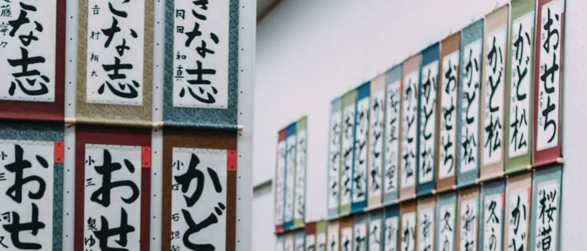
Typography is especially important in Japanese design, and designers often use traditional calligraphy techniques to create unique and engaging typographic elements.
Nature and Harmony
Another hallmark of Japanese graphic design is the integration of natural elements and landscapes.
Designers often incorporate imagery of the country’s stunning landscapes such as cherry blossoms and Mount Fuji, to create designs that are both beautiful and evocative.
The use of balance and proportion is also a key component of Japanese design—as designers aim to create designs that are harmonious and aesthetically pleasing.
Emotional Appeal
Traditional Japanese art forms, such as ukiyo-e woodblock prints and kabuki theater, have a significant impact on contemporary Japanese graphic design.
Designers often use color, imagery, and symbolism to evoke emotional responses and create designs that are both thought-provoking and memorable.
Legacy and Innovation
Despite its rich history, Japanese graphic design is constantly evolving.
While designers are committed to preserving traditional design practices, they are also always pushing the boundaries and experimenting with new techniques and technologies.
This fusion of tradition and innovation creates a unique and dynamic design landscape that continues to inspire and captivate audiences around the world.
Balance and Proportion
One of the defining features of Japanese graphic design is the emphasis on balance and proportion.
Designers use these elements to create designs that are both harmonious and aesthetically pleasing.
Whether it’s through the use of negative space or the careful placement of typographic elements, balance and proportion play a crucial role in Japanese graphic design.
Minimalism and Use of Negative Space
Minimalism is another key principle of Japanese graphic design, and designers often use negative space to create a sense of balance and elegance.
By simplifying designs and focusing on the essentials, Japanese graphic designers are able to create visuals that are both powerful and understated.
Precision and Craftsmanship
Japanese graphic designers are known for their precision and attention to detail (craftsmanship is a key component of the design process).
Designers take the time to carefully consider and execute every element—creating designs that are both visually stunning and thoughtfully executed.
Integration of Traditional and Modern Elements
Japanese graphic design is constantly evolving, and designers are always experimenting with new techniques and technologies.
Despite this—they also remain committed to preserving traditional design practices and techniques.
This fusion of tradition and innovation creates a unique and dynamic design landscape that continues to inspire and captivate audiences.
Use of Color, Imagery, and Symbolism
Color, imagery, and symbolism are all important elements of Japanese graphic design—designers use these elements to evoke emotional responses and create designs that are both memorable and thought-provoking.
Whether it’s through the use of traditional symbols or contemporary imagery, these elements play a crucial role in shaping the emotional impact of Japanese graphic designs.
Integration of Natural Elements and Landscapes
The integration of natural elements and landscapes is another hallmark of Japanese graphic design—designers often incorporate imagery of the country’s stunning landscapes and natural beauty into their designs.
Whether it’s through the use of traditional symbols, such as cherry blossoms or Mount Fuji, or contemporary imagery, these elements create designs that are both beautiful and evocative.
Emphasis on Typography
Typography is especially important in Japanese graphic design, and designers often use traditional calligraphy techniques to create unique and engaging typographic elements.
Whether it’s through the use of bold, sans-serif typefaces or delicate, script-style fonts, typography plays a crucial role in shaping the visual impact of Japanese graphic designs.
Conclusion
Japanese graphic design is a unique and inspiring combination of tradition and innovation.
Its simplicity, attention to detail, use of nature and harmony, emotional appeal, and legacy and innovation make it a truly fantastic and timeless design tradition.
Whether you’re a designer, artist, or simply a design enthusiast—Japanese graphic design is definitely worth exploring and appreciating.
Japanese Graphic Design Principles FAQ
What are the key elements that define Japanese graphic design?
Japanese graphic design is an art form like no other. The simplicity, elegance, and attention to detail that define this style of design are what make it so mesmerizing.
Japanese designers have a knack for creating designs that are both visually striking and understated (at the same time).
Clean lines, generous amounts of negative space, and a limited color palette are just a few of the hallmarks of Japanese graphic design.
Explain the use of asymmetry in Japanese graphic design and how it differs from Western design principles?
If you’re looking to add a touch of excitement to your designs, then asymmetry is your new best friend!
This key principle in Japanese graphic design is what sets it apart from other design styles. You’ll often see asymmetry in traditional Japanese art forms, such as Ukiyo-e woodblock prints and Ikebana flower arrangements.
The aim is to create a sense of movement, fluidity, and dynamic energy. Asymmetry adds a visual interest and uniqueness to your designs that balance and symmetry simply can’t match!
What are some contemporary examples of Japanese graphic design that embody traditional principles?
Be ready to be blown away by the work of contemporary Japanese graphic designers, such as Tsunehisa Kimura, Shigeo Fukuda, and Yusaku Kamekura.
These talented artists seamlessly blend traditional Japanese aesthetics (with modern design techniques) to create masterpieces—that are both timeless and trendy.
Whether you’re a fan of minimalism, asymmetry, or traditional Japanese art forms, these designers will have you in awe with their incredible designs.