

 When people think of color in logos, they generally think about them in relation to the colors that they do and do not like.
In reality, the human response to colors is about more than what we do and do not find visually appealing.
What makes this interesting is the fact that colors can influence us a lot. One major way that this occurs is through the way that we process color in logos.
Most people think that a logo is well designed or not, but there is more to it.
Colors have the ability to mix directly with our minds to trigger specific responses. This is important because it can impact how a person might interact with your brand.
Being aware of these potential impacts and understanding how to use them is an effective way to improve the overall effect of your brand.
When it comes to making design choices, having an understanding of colors can help to further your goals. If your company is able to effectively use this knowledge of colors to their benefit, it can be incredibly beneficial. This is a necessary bit of knowledge for anyone working on marketing or design.
![]()
![]() Thanks to @scotty_webb for making this photo available freely on @unsplash 🎁
Thanks to @scotty_webb for making this photo available freely on @unsplash 🎁
Blues
Out of all of the colors on the spectrum, this is the one that is most likely to force people to connect. When the majority of people think of blue, they think of scenic pieces. Oceans and skies are a common default when it comes to this color.
While this is one of the many reasons that blue is a favorable color, color psychology has more to say about it. This particular color is known for creating a sense of dependability with customers. It might be the fact that it is familiar because of the terrain, but we instinctually want to trust in the color blue.
When you choose blue as a color in logos, you are making the decision to try to bring your customers closer. This is a dependable and practical color that makes people want to believe in your brand. The shade can certainly alter the impact by making it more playful or more reliable in nature.
However, the fact remains that people have an overall tendency to trust in blues. As far as colors go, this is one that can be used for many logos across various industries.
Many companies use it to make people feel confident in their brand as if they can truly trust in the products or services. Though you might think that this would be the subtext of any brand, the fact is that blue really brings it home.

 Thanks to @JustinChrn for making this photo available freely on @unsplash 🎁
Greens
Green is one of the colors that people most easily understand when it comes to logo use. This is simply because of the way that it is most frequently used. Unlike some of the more neutral colors like blue, green tends to be used in very specific ways.
This color, which is mentally affiliated by most with health and prosperity, is effective for connecting with customers. When you look at the color in logos around you, you might notice that certain industries really use specific colors. One area where green really shines as a color is in healthcare.
When the majority of us see green, we think of two things: plants and money. While this can seem a little silly when it comes to influencing, these factors really do matter. For this reason, people have a tendency to emotionally connect green with health and well-being because of plants.
This color, which we tend to think about in conjunction with nature, makes us think about life. Many hospitals, health companies, and even dispensaries are known for using green. In the same way, many finance companies are known for using green in their logos because of the prosperity connotation.
![]()
![]() Thanks to @Elijah_sad for making this photo available freely on @unsplash🎁
Thanks to @Elijah_sad for making this photo available freely on @unsplash🎁
Reds
Depending on how you use red, you might find that the impacts are incredibly different. Further, the effects of red as a color can shift a lot from one culture to the next. Stark versions of red are known for being related to emergencies. They can instill a feeling of urgency or crisis management in people that governments tend to capitalize on.
The real reason behind this is actually the fact that red is known for being incredibly eye-catching. The majority of people would not look past a red sign because it almost always stands out from its surroundings. This makes it an incredibly effective color in logos.
In addition to instilling a sense of urgency, red has a tendency to be used in a more playful capacity. While a stark shade of red might be great for a local fire department, a softer or brighter red can be different. These other shades of red tend to be considered more bold and exciting.
They capitalize on the eye-catching effect of red, but rather than worry, they generate interest and glee. This makes it easy for companies to boldly promote themselves or a new product.
The psychological impact of using reds
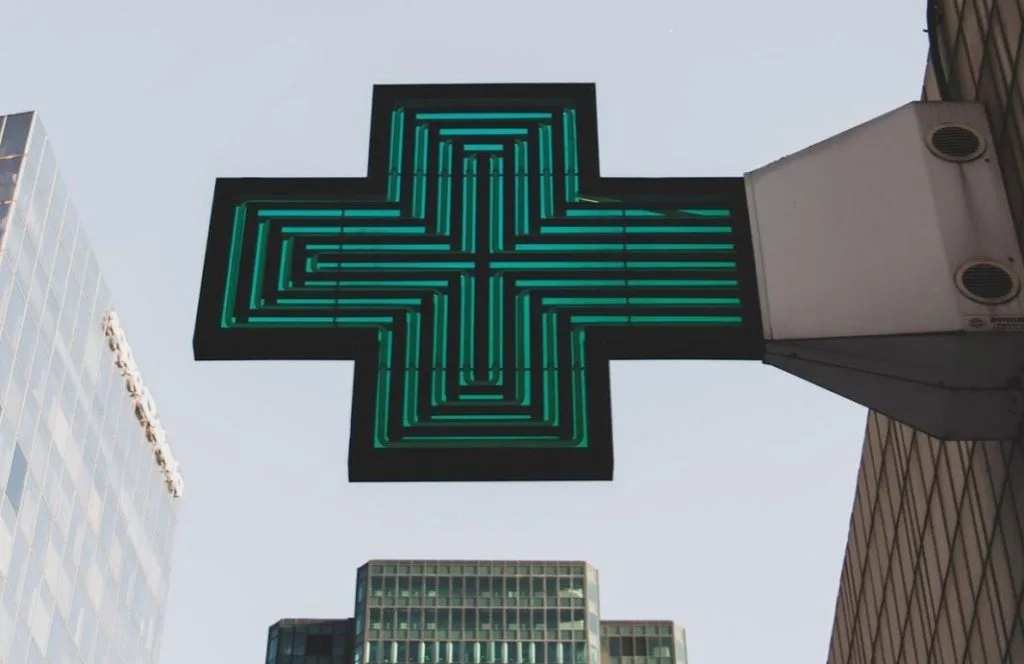
One of the more interesting psychological impacts of using this color in logos is actually habit related. Red is a color that is known to instill hunger in an audience when used correctly. You might have noticed that several of your favorite food places use red to create their logos.
This is an interesting matter of the chicken and the egg. On one hand, red is an obvious choice for restaurants because it is bold and easy to see. When you consider this relevancy from a business perspective, relying on this is incredibly important.
Beyond merely making restaurants visible in general, it makes them incredibly noticeable from the highway. This means that people who are passing through can easily pick out these restaurants. It is this visibility that encourages people to make a stop for food or drinks when passing through.
With this in mind, it is actually the center of a debate. Does red stimulate hunger as a color by itself? Or, is it the fact that restaurants have used it in this capacity, so we now make the affiliation?
![]()
![]() Thanks to @scotty_webb for making this photo available freely on @unsplash 🎁
Thanks to @scotty_webb for making this photo available freely on @unsplash 🎁
Whites
Whites and silvers are effective choices for color in logos for a few reasons. The first benefit to these colors is that they tend to look cleaner than most colors. Since white and silver are very mild in nature, it is easy to see how they instill a sense of calm.
These colors, in particular, are effective for creating a feeling of simplicity. Many people affiliate whites and silvers with a well-organized environment because they lack the chaotic nature of other colors. In many ways, whites and silvers are the most basic kinds of colors, and many brands use that to their benefit.
When you think of a room that is all white, chances are you think of the future. A sterile white and silver room is the kind of thing that we consistently see in science fiction. Since maintaining white and silver takes a lot of maintenance, it is generally considered to be well put together.
It is this futuristic and controlled feeling that companies like Apple and other technology companies depend so heavily on. The color scheme can be used to promote a calm and put together feeling that people feel confident in.
![]()
![]() Thanks to @thoughtcatalog for making this photo available freely on @unsplash 🎁
Thanks to @thoughtcatalog for making this photo available freely on @unsplash 🎁
Purples
For many people, purple is considered to be an incredibly unique color. Depending on how it is used, you might experience different feelings. However, the fact remains that purple almost always stands out.
It might be because it is a secondary color or because it is simply bold. Whatever the reason, purple is kind of an off the wall color that people absolutely love. It is the spirit of this unique nature that makes so many people affiliate it with creativity.
Purple is a color that generally causes a person to feel more creative or imaginative. We affiliate this bold and sometimes silly color with thinking outside of the box. As far as a color in logos goes, it is one that only some companies can pull off.
For this reason, you generally won’t find it in more serious industries. There are always exceptions, with some companies using lighter variations. However, the majority of companies with business focuses that are more rigid in nature will not use a color like this.
 Thanks to @advmbirkett for making this photo available freely on @unsplash 🎁
Yellows
In order to understand what we affiliate the color yellow with, we just have to ask any child. When you ask a kid to list something yellow, they will almost always say the sun.
It is this easy to make connotation that shows us just how the color yellow makes us feel. In most cases, we affiliate yellow with vibrancy, hope, and warmth. All of these can easily be explained by how we interact with the sun as a species.
When you look at a warm and bright yellow, chances are you will immediately feel uplifted. This sort of color is excellent for promoting feelings of happiness and positivity. When you use this color in logos, you can expect your customers to come away feeling brighter.
Using this sort of color makes it easy for you to show people that you want them to feel good about working with you. Many companies use this color to show off their positive attitudes or aspirations for their business goals. It is an effective way to immediately make people come away from your branding materials with good vibes.
![]()
![]() Thanks to @AnkushMinda for making this photo available freely on @unsplash 🎁
Thanks to @AnkushMinda for making this photo available freely on @unsplash 🎁
Oranges
Orange, which is a secondary derivative of yellow, works in a comparable way. Depending on the shade of orange, you can expect different connotations to be made. A brighter orange is great for encouraging people to feel that same kind of happiness that you might get with yellow.
This vibrant color option makes it easy for you to feel positive and happy. It is generally like yellow, but softer in nature. Rather than raw positivity, you can lean more on a calmer pleasant feeling.
Darker shades of orange tend to have a slightly different feel to them. Many people affiliate darker oranges with Fall or change. This makes using orange as a color in logos a fairly versatile decision. Since so many people look at it and think about changing times, it can be used effectively for logos.
By harnessing the positivity of orange with the natural connotation with change, you can make great branding decisions. It is incredibly effective when used as an accent color. Some companies use it to boost these feelings alongside other ones that another prominent color might bring.
[do_widget id=custom_html-26]Conclusion
Understanding how to use colors effectively is crucial for brand management. Whether you are using a color in logos or other branding materials, you want to use it wisely. Being aware of color theory, which helps you to learn what colors accommodate one another, is important.
However, being aware of color psychology, which shows us what it makes people feel, is also absolutely crucial. When you bring these knowledge bases together, you can achieve great results.
When you focus on the color in logos, you are making an incredibly relevant decision. Your logo will help to determine how people feel about your brand. You want to make sure that your logo is something that people will find portrays your brand well.
By making sure that your logo looks nice and instills the right emotional response, you can do wonders for your company. Focus on making educated decisions here and you simply cannot go wrong!
When you design logos, do you think about the impact of colors? Did you use colors to create emotional impact in your designs? What struggles do you have with using colors in your design?