


Often I get asked, “what are some hand lettering tips for beginners?” or “how do you start hand lettering?”
The art of lettering has become a popular style of art to put on your Instagram account and other social media.
From this explosion in popularity, it has been rapidly developing as an art form.
It is a great way to enhance a message or quote you love with others or to bring an expressive quality to your writing.
The mindset to get into hand-lettering is not unlike many other arts and skills.
It’s the best way to improve from a ‘beginner’s mindset’ or amateur mindset.
That is, you should always be willing to make mistakes, get messy, and put your ego aside.
Finding your own unique style and experimenting, not getting caught up in the ‘perfect stroke,’ is so important.
But, the skill will come in time.
You don’t need any special pens or paper to get started.
Simply follow these tips and you can quickly get started.
I broke down my process into three essential tips to help you get started with your hand lettering journey.
This process is known as the three R’s of modern calligraphy.
Research
Research is the most important of the three Rs.
Without research, you won’t have a solid foundation on which to build your skill level.
By research, I mean picking out some fonts you like that you would like to build your own style out of.
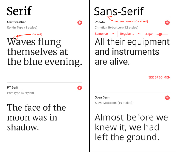
Starting with one serif font and one sans-serif font is a good choice.
Serif lettering: a style of type with slight projections off of each letter called ‘serifs.’
Sans-serif lettering: a style of type without serifs.
You might also want to find a script lettering font. Script fonts look like handwriting and are some of the most difficult yet beautiful to pull off.
To get a sense of the first few kinds of lettering you want to work with, start by paying attention to the world around you.
For example, look at the lettering of store signs, social media, the packaging of things you buy, and so on.
By getting a good idea of the kinds of lettering around you, you’ll begin to absorb the modern styles of lettering and be able to choose your favorites.
Pay special attention to how different fonts make you feel, what they evoke.
The key to lettering is using different styles to evoke the feelings you are looking for.
Once you’ve chosen your first few fonts, you’ll want to make a chart of each letter in each one.
This chart will serve as a guide for tracing each letter and learning how to shape it.
It should include both the uppercase and lowercase letters.
In later steps, you’ll be using these charts to practice your lettering over and over again until you can draw them from memory.
Once you’ve learned a few basic sets, it’s time to put all that researching and exploring to work coming up with your own styles.
This is where all the creative parts begin, using the techniques and styles you’ve learned to develop entirely new styles that evoke the feelings you want.
Hand Lettering Materials
Next, we’ll be looking at some of the materials you’ll need to get started with hand lettering.
Again, you don’t have to go all out right away, but just select some core materials of each type to get started with and build from there.
Paper


Your exact paper selection for hand-lettering isn’t as important as it is with watercolor or calligraphy.
Likewise, bleeding and feathering aren’t huge concerns except with special writing tools like brush markers.
The two types of paper you’ll be working with is your practice paper and your final hand lettering paper.
Each type of paper has its purpose.
For your practice paper, any smooth paper will do.
I suggest a premium printer paper if you had to pick something in particular.
Rhodia paper is also quite good for practice, especially their dot pad.
Dot paper can help a lot with precision in the beginning and so is excellent for practicing.
For a finished piece, watercolor paper is an excellent choice.
Watercolor paper absorbs most inks and markers effectively and leaves an impression of quality.
Other kinds of paper will work, so feel free to experiment, but this is a great starting choice.
They are more expensive than your practice paper, but each sheet will be used for showcasing each of your works of art, so it is worth the investment.
Writing Tools

One major thing to consider is how the essential lettering tools affect different styles.
For example, markers and sharpies give a certain texture, whereas brush pens are more of an artistic statement.
Likewise, fine-tip pens are quite precise, whereas pencils can introduce shading.
It’s best to begin with one type of writing instrument so you can get used to it and not have to learn a whole new style for each font.
I suggest pencil and ink pens to start with. They are great for learning the fundamentals.
After that, however, feel free to dive right into whatever speaks to you!
Let’s go over some of the major properties of each of the basic tools:
Pencils
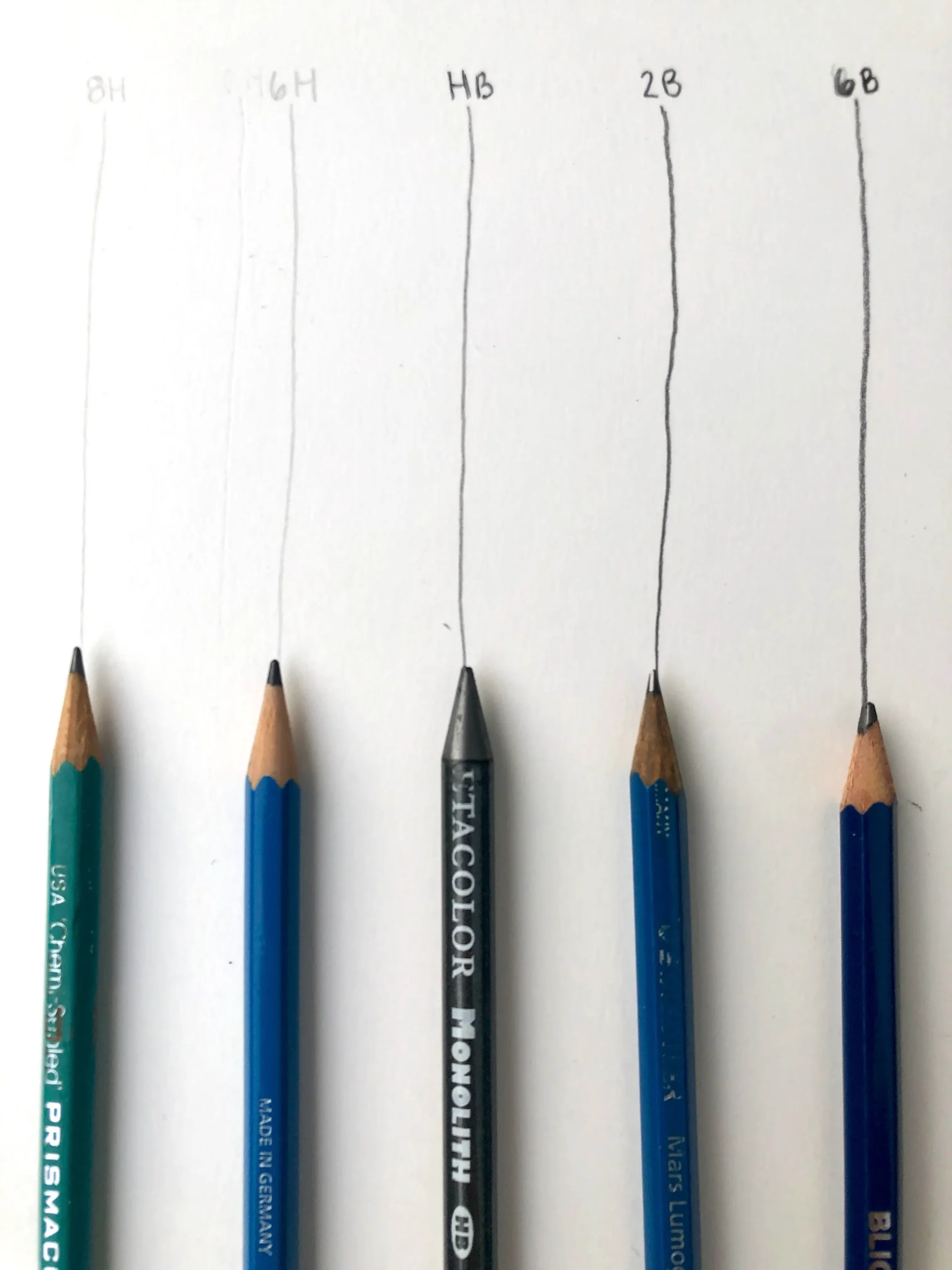
The pencil is perhaps the best tool for beginners, the most underrated, and useful for sketching.
Its most practical use is for getting down concepts and ideas quickly.
However, it can also be used to provide an underdrawing for your hand lettering, which will allow you to work closely on the composition and style.
While with normal writing, you’ll probably just use a regular pencil without even thinking about it, in hand lettering, there are lot of different options for art pencils, such as HB, 2B, 6H, and more.
You can also use a mechanical pencil, which remains consistently sharp.
You can try out an assortment of them if you like, but I would recommend just some H, H2, or HB pencils to start.
There isn’t a need to go all out on them from the start.
Eraser
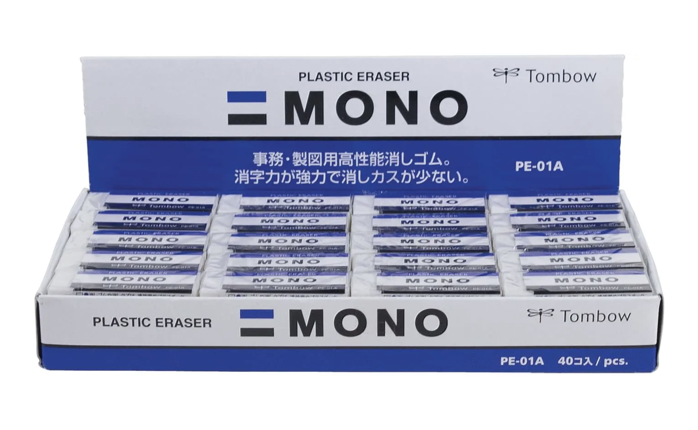
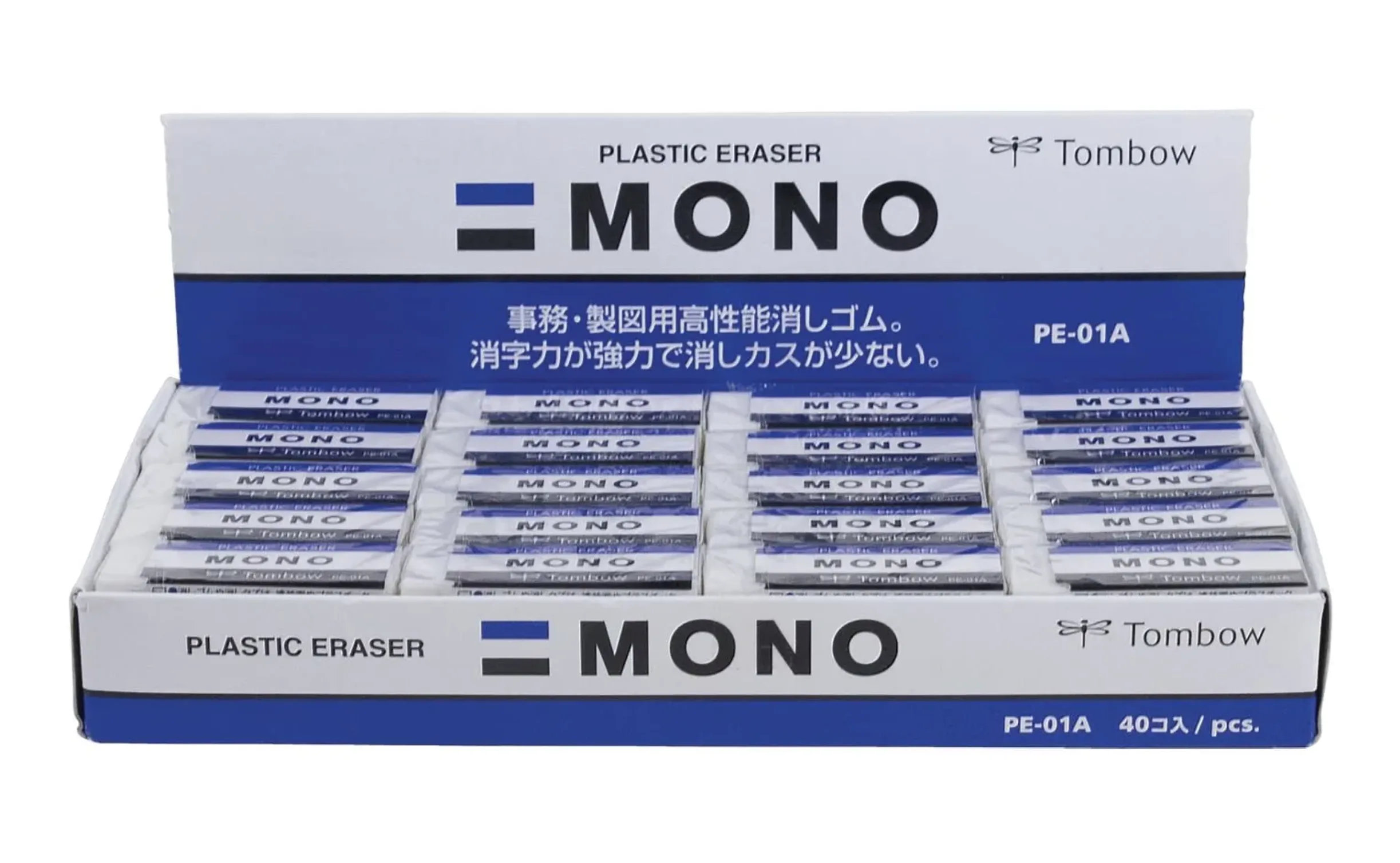
Hand-in-hand with the pencil is the eraser.
A good eraser is crucial when working with sketches and compositions in order to modify and experiment.
If you are using pencil as an underlayer, the eraser will also be used to remove all the guidelines after the piece is finished being inked.
You’ll want a kneaded eraser for removing pencil marks – kneaded erasers don’t leave crumbs, which is better for this kind of work.
You might also consider one of the pen-shaped erasers for removing marks in small areas.
They provide you with a kind of precision that normal erasers don’t.
Fineliner Pens
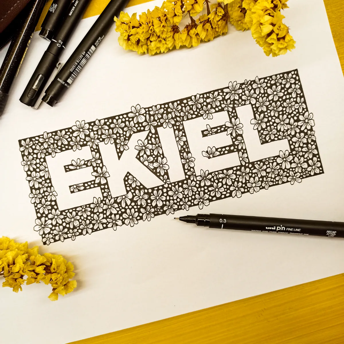
Fineliners are the most common type of pen you’ll use when inking for hand lettering.
They are excellent precision tools that allow you to control the linework exactly as you want it.
The tip of the pen for fineliners is perfect for drawing precise, thin lines.
The difference between a good fineliner and a bad one is quite large, so this is one tool you should consider investing in.
Normally, good fineliners aren’t prohibitively more expensive than bad ones either, so it shouldn’t be a problem for your budget.
Microns are a good choice here, but do your own research on some good fineliner brands and you should be able to find one that suits you.
Ruler
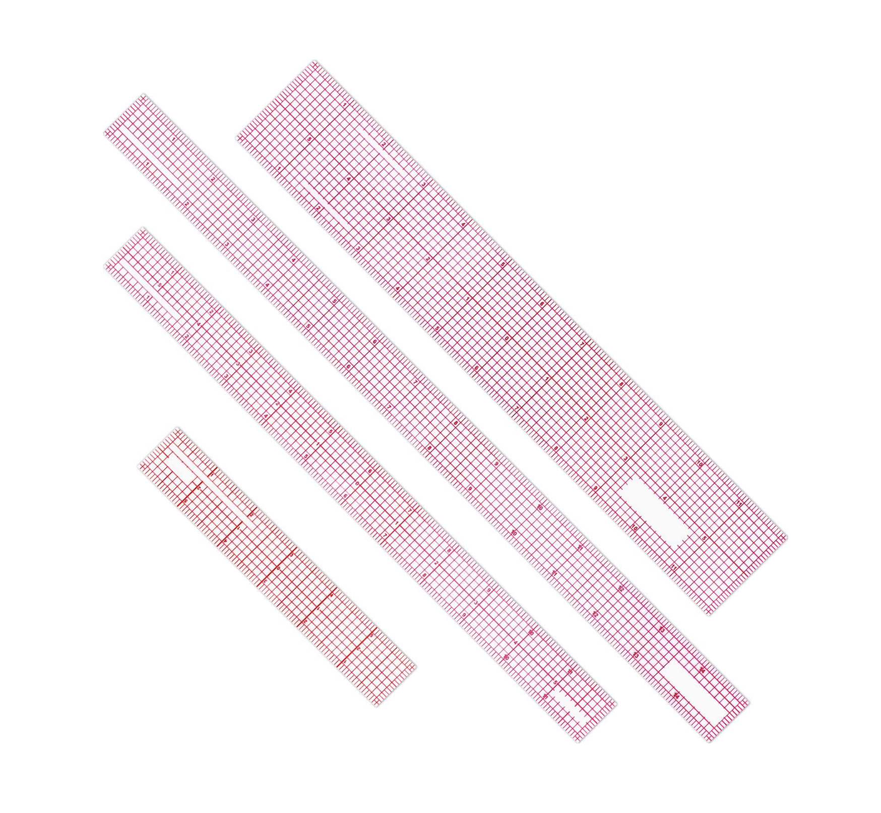

Rulers are another crucial tool for getting straight lines in your hand lettering.
They are how you keep your letters consistent with one another and well composed on the paper.
For hand lettering in particular, a rolling ruler is a great choice.
This kind of ruler has a rolling cylinder attached, allowing you to slide it up and down the page for precise parallel lines.
You’ll be using a lot of those.
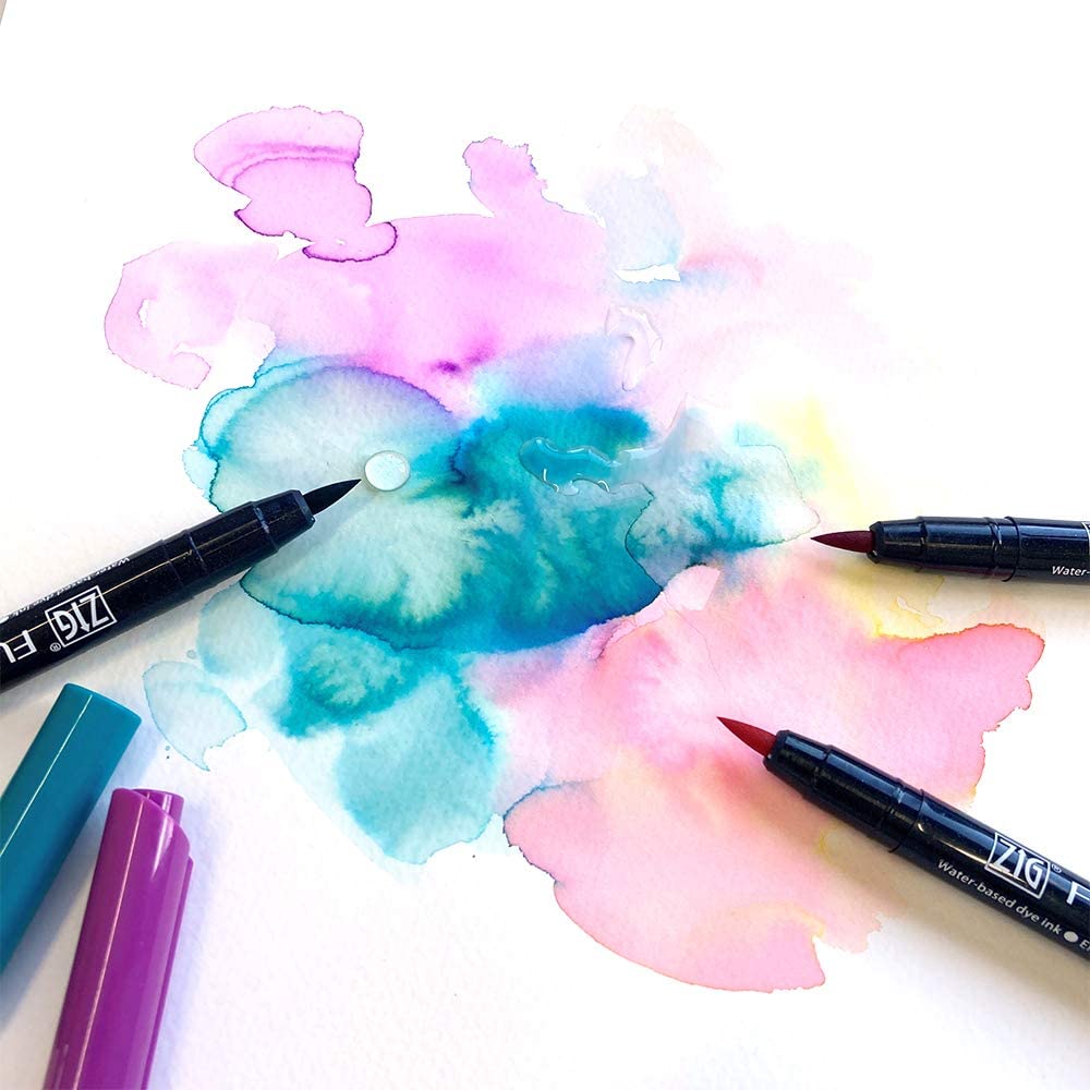
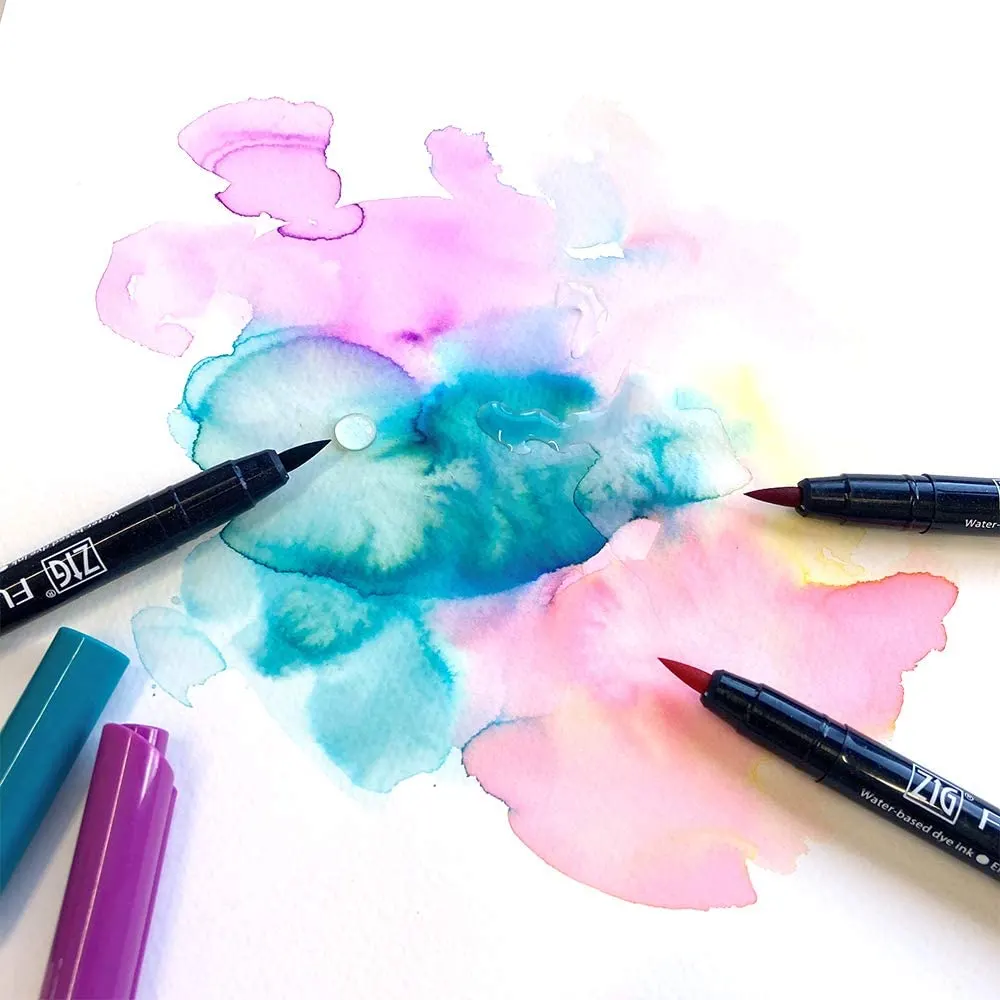
Colored markers and pens

Once you’ve mastered composing, sketching, and inking, coloring the letters is the last step.
This is best done with a thicker line than fineliners, which is why colored markers are often used.
It is also often the most satisfying step, and in some ways, it requires the least practice.
In other ways, sometimes what is most difficult is choosing harmonious colors and making everything work together on the page.
However, this is something that comes with time and experimentation.
Often people begin with Sharpies for this category, which work great, but there are many other great options to consider.
Brush Pen
The brush pen is probably the hardest to learn of the tools, so it’s not recommended for beginners.
What’s essential when holding it is to do so at the right angle in relation to the paper.
First, angle the brush pen to be about 45 degrees to the paper.
If you start straight up and down, you’ll likely ruin your nib and won’t get the right kind of pressure.
At this angle, you should get the correct thickness for the downstrokes.
Next, make sure you are holding the pen to the side, perpendicular to the downstrokes of the writing.
Thus, it should be both 45 degrees to the paper and on the side.
When you are holding the pen correctly, it should work with you as you write.
The pen itself should be supplying the thickness and thinness of the basic strokes, with you just guiding it.
Recreate
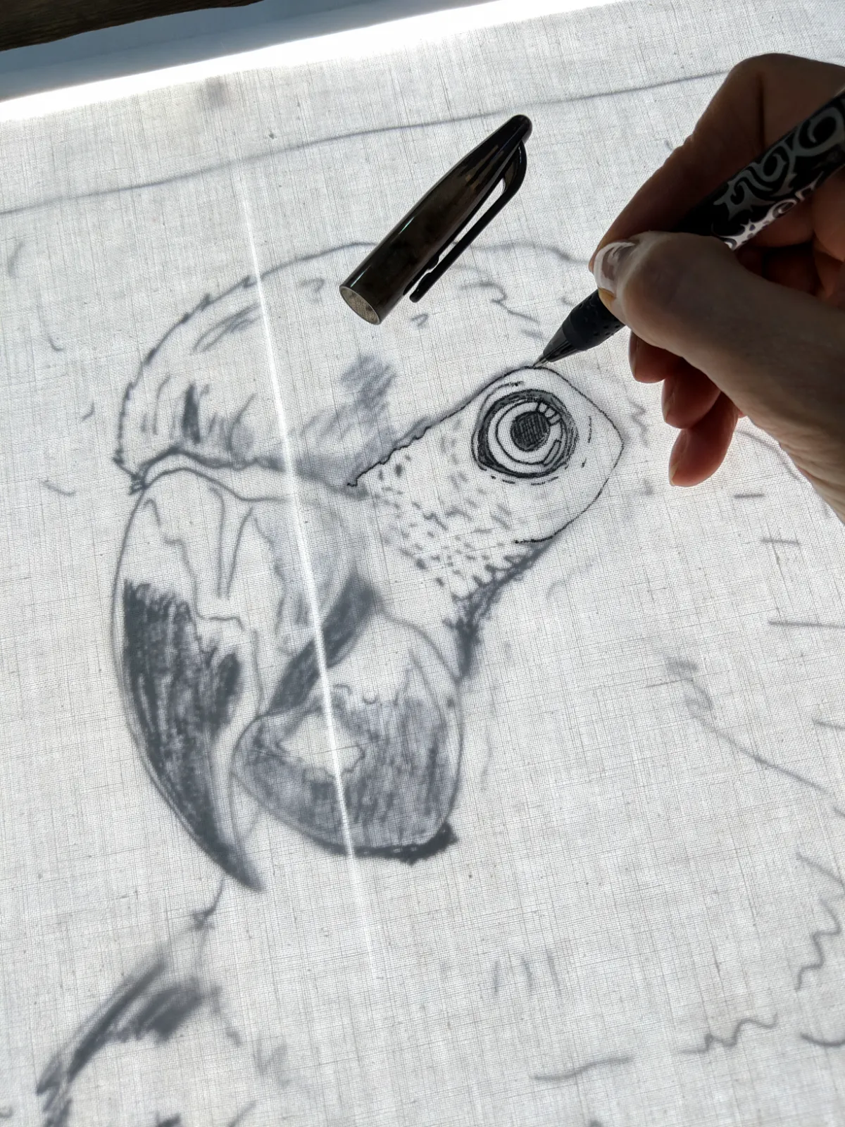
Now that you have some tools and charts of fonts you like, it’s time to begin recreating them to learn the different styles.
The first thing you can do is trace.
Copying is the best way to learn the skill of hand lettering at the start.
By precisely tracing the letters, you are training proper habits into your hands as to how hand lettering works.
You’ll have to learn the basics of hand lettering from modern calligraphy.
For example, downstrokes are thick while upstrokes are thin.
You can begin by learning faux calligraphy, which is just making the downstrokes thick after the fact to get the effect without a calligraphy pen.
Once you get a handle on how the basic strokes work, you’ll be able to start building your own lettering with the principles of hand lettering in the back of your mind.
Read Also:
- Hand Lettering Fonts: Essential Things You Need to Get Started
- Lettering Styles is Not Rocket Science, Learn Them Now
- Lettering and Calligraphy: A Visual Guide to Their Differences
Hand Lettering Step by Step
Another way you can do this is to follow tutorials you find online or elsewhere on how to hand letter.
The more ways you can find to practice, the better.
When it comes to the exact process, you can experiment with it.
Doing different tutorials, trying different techniques, and more can help you figure out how to form the best shape of the letter that works best for you.
Here is one process you can try:
Step 1
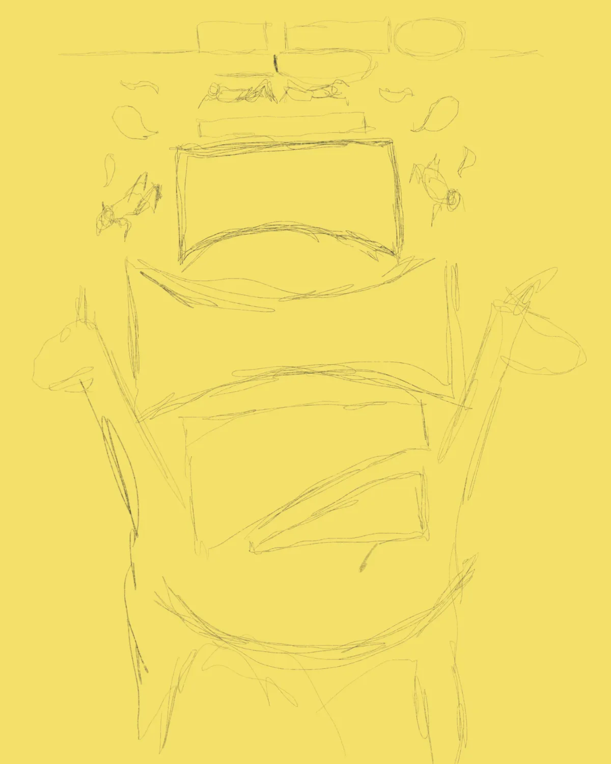
First, do some thumbnail sketches of how you’d like the lettering to look.
This will give you a sense of how the final composition will look.
Step 2
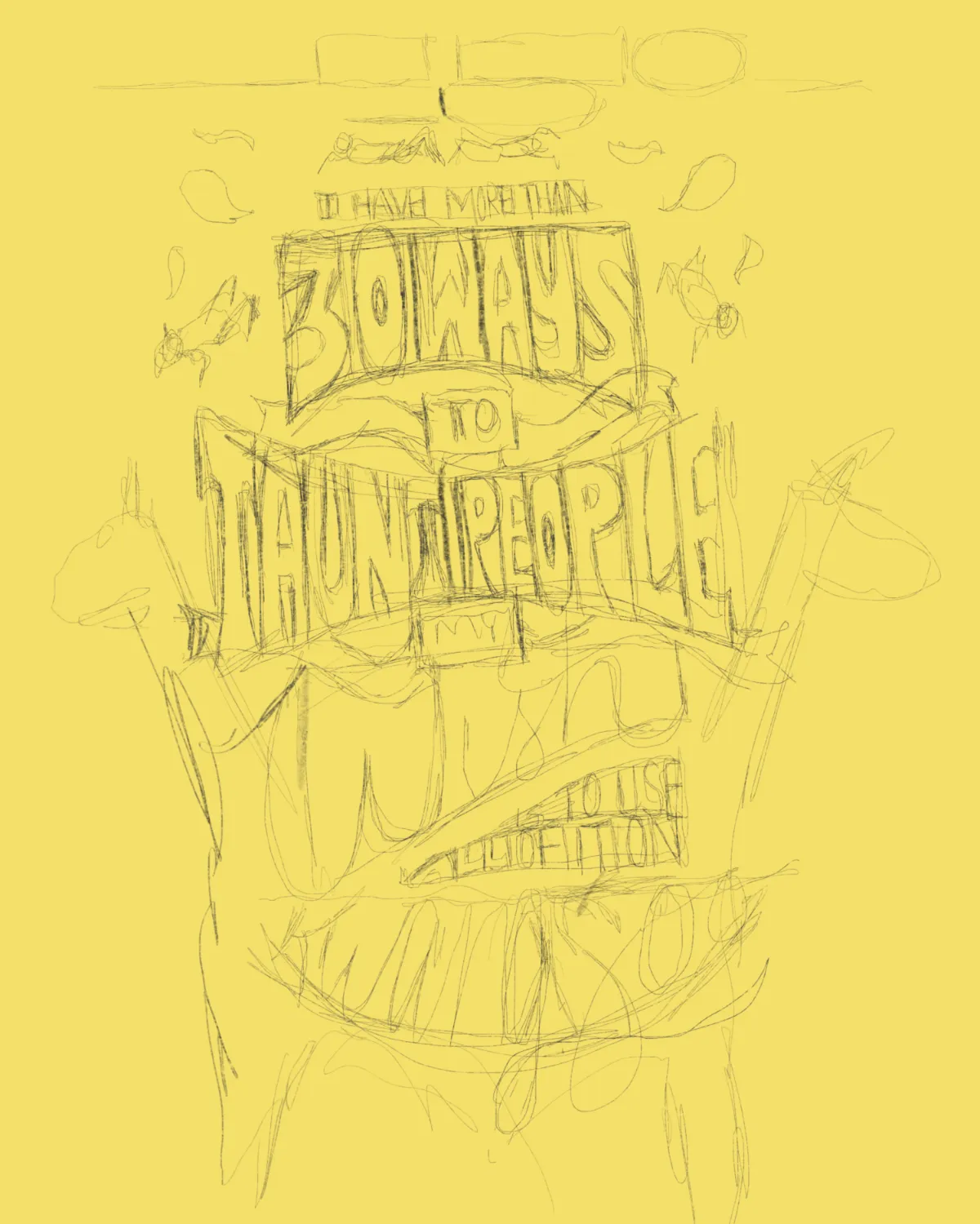
Do a pencil sketch of each of the letterforms.
This will both allow you to practice and have an underlayer ready before the final inking.
Step 3
Use your hand lettering tools to refine your sketch and draw your letterforms.
Step 4

Add embellishments and other design elements that will fit in with the final piece.
Try to find gaps in between your words and add elements in those gaps.
Remember, this is just one method you can use.
I like a decent amount of sketching and the ability to change things in the early steps, but you might like experimenting with the ink or markers at an earlier stage.
Two Essentials of Hand Lettering
If there is anything to take away when hand lettering, it’s these two core concepts.
Both are essential to any hand-lettering style and will help you understand the foundation of the form of art.
The two concepts are spacing and consistency.
Spacing
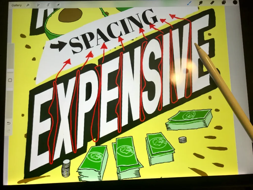
The spacing between the letters is key to creating their sense of being an artwork rather than just a font.
The most important thing to getting a sense for spacing is practice, as over time, you will develop an eye for what spacing makes sense and fills the page in a balanced and harmonious way.
The first thing to understand is that not all letters are meant to be spaced equally from one another.
This has to do with the proportion of the width of each letter.
When you reframe the spacing to make it look visually optimal, this is called kerning.
Based on the shapes and widths of different letters, a mathematically equal amount of spacing between all letters doesn’t work with the eye.
Some shapes add more space between the letters while others add less, changing what looks visually appropriate.
Unfortunately, there is no easiest way to figure out how much space you need between each letter, but there are tricks to it.
You can group the alphabet into straight letters such as H or I, where the sides provide no extra space, and curved letters such as C and O provide extra space on either side.
Give two straight letters the most space between them and two curved letters the least.
A straight letter with a curved letter should get a medium amount of space.
That should give you a solid start to kerning, and with it, a beginning to your sense of spacing when hand lettering.
Consistency
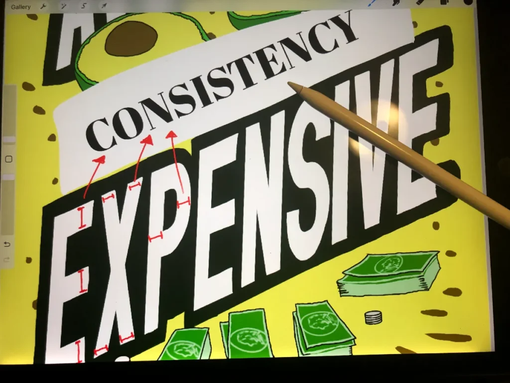
Consistency has to do with the creative side of hand lettering, and it’s about making each letter have the same visual style so they all match.
This kind of visual harmony is what gives hand lettering its wow factor.
However, things can look quite unbalanced to the eye when it’s off even if you don’t know why.
Consistency comes from many different aspects of the letterforms all matching.
For example, the thickness of each letter has to be the same, along with the consistent use of certain angles, the height of each letter form, and so on.
For example, letters should have approximately three distinct heights for the three different letter sizes: one for full-sized letters like t, one for half-sized letters like e, and one for letters that dip below the line like g.
These three heights should stay the same across all letters in each of these groups.
Thickness is another crucial consistency that needs to remain the same across all the letters.
If either of these proportions doesn’t work, the final result of your hand lettering won’t look good.
To do it right, it’s essential to use guidelines when you are first starting out.
These will improve your consistency significantly over time.
Use a ruler to measure out precise guidelines where each letter will go so that it has the same height and thickness, not unlike how we learned to write in kindergarten.
Give yourself the time and space not to rush whenever you are practicing a new style, and the consistency should come over time.
However, it may require a lot of practice at first.
Repeat
The final step is to keep going! Practice the charts and the tutorials until you’ve got a handle on a few fonts.
As you learn new fonts and the fundamentals of hand lettering, you’ll start thinking of ways to change it up for yourself.
In addition, you’ll be learning a lot from various artists and will start to see ways you can create your own styles.
You’ll want to build muscle memory with good technique in terms of regular practice.
Make sure you are using your tools right and that the lettering is coming out the way you want it.
At first, everything will look off, but over time with tracing the charts, your technique will become solid.
You can also try a lettering challenge.
You can find these all over Instagram.
Or try weekly lettering prompts.
They will help you flex your creative muscles while getting consistent practice in.
Again, what’s important is keeping yourself motivated and consistent.
As dull as it sounds, the most important thing is just to keep on doing it.
If your technique isn’t where you want it to be, keep practicing your charts carefully to build that good muscle memory.
On the other hand, if you’re finding your creativity lacking, that’s when getting more inspiration and doing more research is essential.
Finally, don’t be afraid to try out new things!
Conclusion
Hand lettering can be a beautiful craft to get into, but can also be frustrating at the start.
There’s a lot of practice and precision that some people aren’t prepared for.
However, once you get started, the satisfaction of a solidly done hand-drawn piece of lettering is immense.
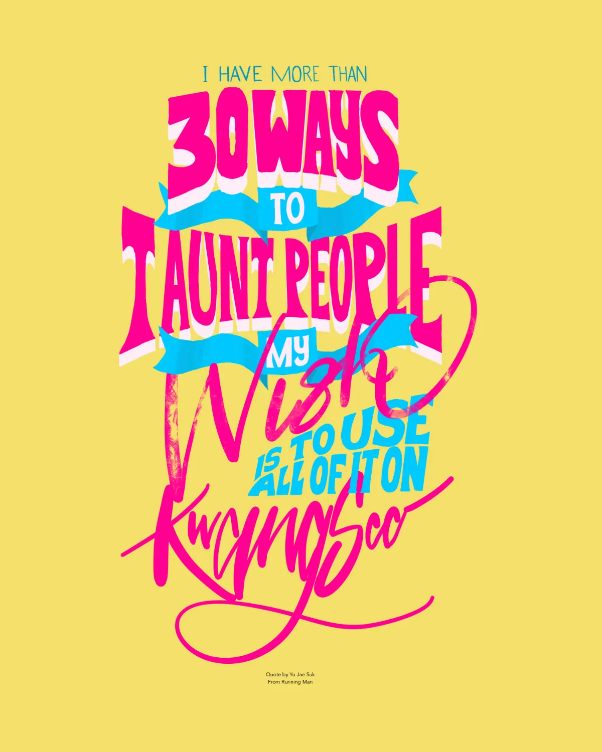
If you are struggling with inspiration for what to write, try looking up some good movie quotes or song lyrics.
These can inspire you to seek out the perfect font to match the words or create your own.
There are really endless things that can be used as inspiration, so let your imagination run wild!
It’s important to remember that this hobby is about having fun.
So practice, let your creativity shine, and eventually, you’ll find your voice. Good luck!