
Graphic design is built on a few key focuses that help to bring about great media. One of the most important aspects is that of lettering.
Lettering is a process focused around making your fonts for graphic design work. This can involve digital means or physical ones instead.
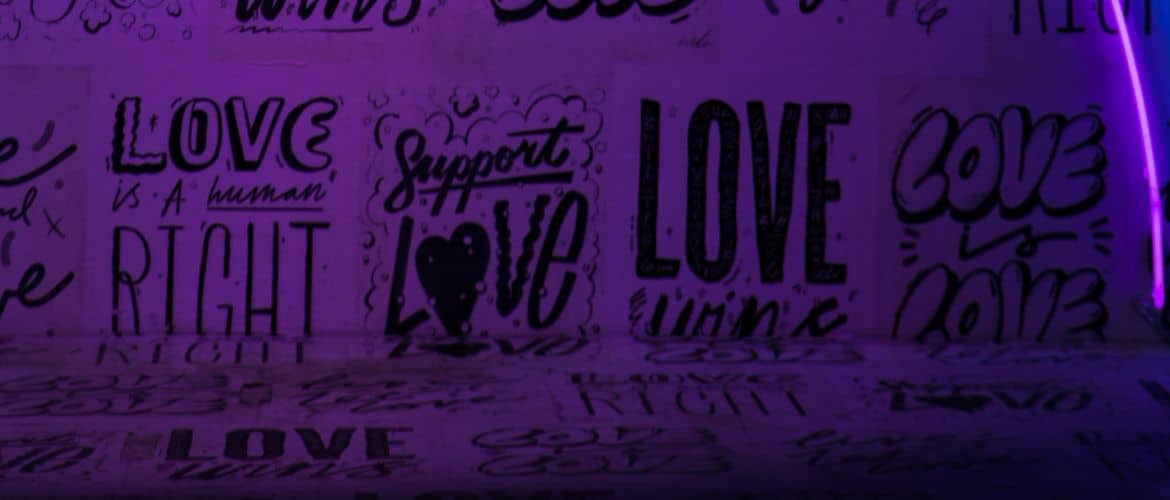
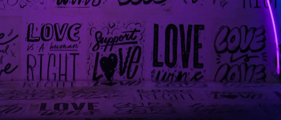
There are different types of lettering depending on what you want. You might be surprised by how much you can change a piece using only a specific style of lettering.
These different kinds of lettering hold the power to shape an entire project. Lettering is an art as much as it is a science. There are certain things that a person must do, and others that are open to interpretation. There is no wrong way to pursue lettering, but there are some general rules.
The different styles of lettering help to drive this. You can use this to help guide your lettering as you pursue this art. It is a practice that takes time, but also requires you to have some fun. As you begin to pursue this, remain open-minded about your future creations.
If you’re interested in lettering, check out this other content:
- Hand Lettering Fonts: Essential Things You Need to Get Started
- Top 3 Hand Lettering Tips for Beginners
- TypeMaker Custom Procreate Brush
 What Are Styles of Lettering?
A style of lettering is the actual design type on a given typography. These styles can vary in terms of what attributes they each possess. Each style of lettering has its unique design elements that can be used in various ways.
A style of lettering does not mean every font under it will look the same.
These traits act more as guidelines for creativity to be built around. Finding the right lettering style can drastically improve your graphic design project.
Different types of lettering appeal to different kinds of work. If you’re looking to get the most out of your project, think about what style will work best. The different styles all have bonuses and drawbacks. In many ways, they can appeal to different audiences or set the tone.
Finding the right style for your project can sometimes take time. You might want to try multiple styles before settling on one.
Understanding what the different font styles are can help you to make custom creations. These styles are governed by general rules that can be tweaked and altered. You might find that you enjoy mixing styles, and that’s an option.
Lettering is a fun practice that is completely open to your creativity. As long as you know what kind of style you want, you can feel free to explore from there. There are more styles beyond this list, so feel free to research them further if you want more!
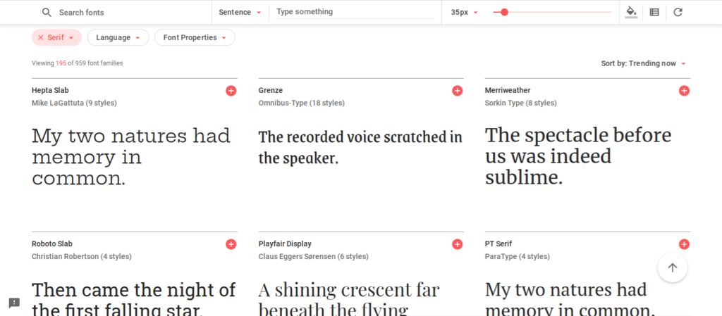
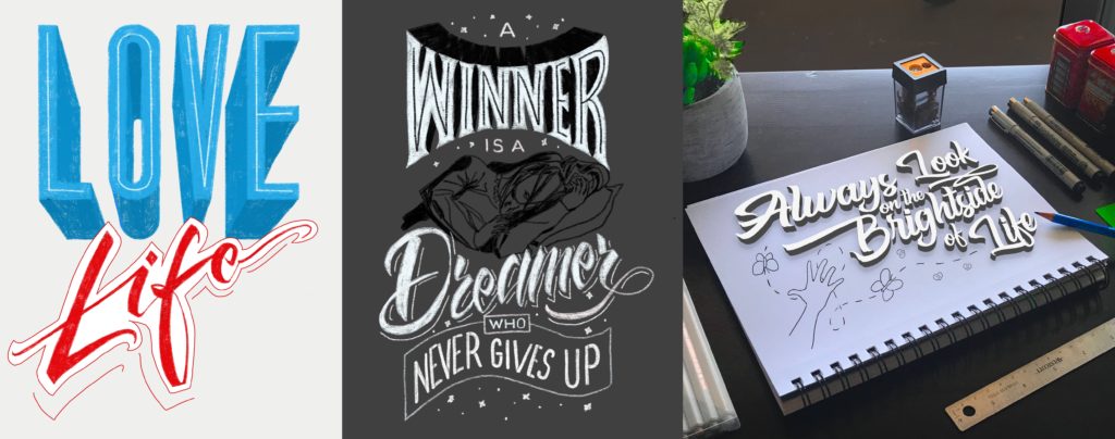
 Serif
Serif
Serif typography is known for its defined edges around the various parts of the font, which are called serifs. These design attributes, which are prominent in fonts like Times New Roman, are easily recognized. They have a defined finish to them that is great for all kinds of graphic design endeavors.
This is one of the older styles of lettering that still sticks around. People love the sharp definition of these styles of lettering. You can find a wide variety of options that fit this category.
The dignified edges of these fonts are great for a professional finish. This style of lettering is better known for its many uses. In many cases, designers will use this typography to demonstrate a specific value. It has an inherently sharp edging that people prefer to use for fancier projects.
While there are many potential uses for this font, it gets pushed towards professional projects. People just love to see this style used to display something important.
It makes everything look a little more together and well defined. This is why many industries rely on these styles of lettering.
What Serif Lettering is Great For
In many ways, serif fonts are considered to be more mature. These fonts are known for being very sharp and deliberate, helping them to deliver a message. Something about this style of lettering looks distinctly classy.
It is easy to see why we often affiliate these kinds of lettering style with older projects. These tend to be less modern and more formal.
To create serif lettering, you truly just need to add your accents. This is the most identifiable marking of a serif font. To achieve these, you just need to add flicks and edges to broad strokes.
Doing this creates a unique distinction that is commonly associated with older styles of writing. It is perhaps this very attribute that makes them so ideal for more refined projects.
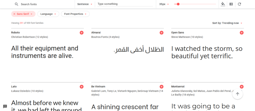
 Sans Serif
Sans Serif fonts are known for their distinct lack of serifs. Fonts made in this style are known for bringing together basic design styles without any extra edges.
Rather than relying on the sharp and dignified serifs, these fonts are known for being more smooth. This is effective for a few reasons, making these fonts very popular.
The primary benefit of this font type is that it looks disarming. Something about Sans Serif font is just naturally pleasant looking. This makes it a popular choice for modern typography.
Many people use it because of its simple and appealing nature. You can enjoy this font in a variety of modern settings effectively. These fonts are great for any kind of good news.
What Sans Serif Lettering is Great For
Another popular use for some Sans Serif fonts are built around their readability. Certain Sans Serif options can be read by people who otherwise struggle with reading.
These fonts can be ideal for people who have dyslexia or comparable problems. Many people use these fonts as a way to navigate some of those struggles.
There is even science to suggest that these fonts are better for a variety of artistic efforts. A common rumor in the writing community is that these fonts are ideal for drafting. Something about the open and clean nature of the font makes it easy to work in.
People are intended to be less focused on the writing and more on the content with this one. It is also said to be very easy to edit using this font because you can quickly identify mistakes.
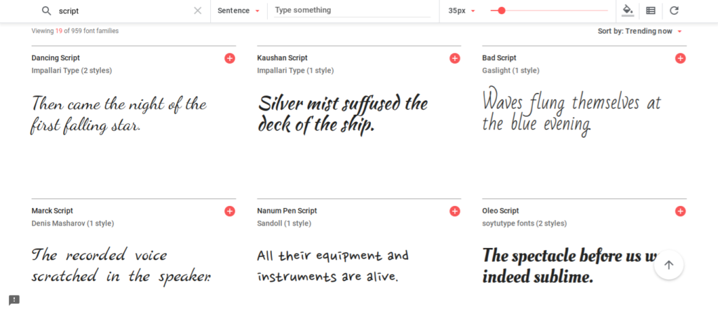
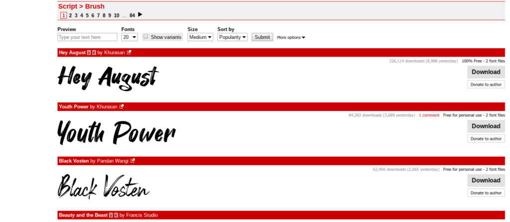
 Script
Script lettering is a beautiful process that involves focusing on the use of cursive. These elaborate fonts are ideal for bringing something extra to a piece of writing.
People love to use these fonts on special occasions. The designs themselves are easily altered to be more professional or modern. This makes it one of the different kinds of lettering that many find favorable. It’s most often seen in calligraphy.
The use of script fonts can range fairly widely. In many cases, you won’t pick this for its readability. Though Script is pretty, it is not the most reader-friendly. While you might choose to use it for a good design, it isn’t always right.
Since Script is fairly difficult to read, you wouldn’t want to put it somewhere that requires a lot of reading. It’s one thing to put it on a header, but another to make it a paragraph. Generally, these fonts are best for special occasions only.
What Script Lettering is Great For
From a design perspective, Script brings a lot to the table. It tends to bring an alluring finish to just about any project. These fonts are great for dressing up invites or making something look a little more special.
In recent designs, Scripts are being loosened up and made to fit a more modern style. This takes the otherwise professional look and makes it more approachable.
This is a favored form of the different types of lettering because it tends to be more artistic than some of the others. The smooth motions that come with making these is said to be quite satisfying.
Many people enjoy practicing this style of lettering as a therapeutic process. Something about the loops and swoops of this type are good for clearing the mind and promoting relaxation.
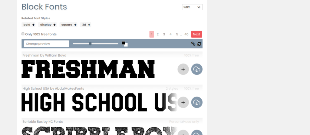
 Block Letters
Block letters are known for being popular for posters. These bold and defined letters are great for making a clear statement. Since they are so easy to read, people tend to use them for conveying valuable information.
It helps that these are relatively easy to make and good for beginners. Most people can make block letters with little to no practice at all, and it’s easy to get better.
The nature of block letters is bold and straight-edged. You will make them using empty or filled space when designing. As far as lettering goes, they are the sturdiest of all available font types.
They tend to be larger and more dense when you make them. Unlike single stroke designs, block letters have mass to them that must be considered. This is what makes them so great for headers on posters and things like that.
Making block letters is something that can be a lot of fun. Since it is mostly using straight edges, it is easy to learn how to make them. While some lettering requires a more refined touch, block letters are incredibly forgiving.
They make it easy for you to practice slowly at your own pace. You might find this as a great place to practice. It makes it easy to build up some of those fine motor skills in no time.

 Brush Lettering
This style of lettering has become increasingly popular in recent trends. Brush lettering is great for bringing the most to a modern setting. Everything about this kind of lettering is meant to be pleasant and fun.
In some ways, it is a mix of block letters and script. The result is an appealing style of lettering that is great for modern art options. It is becoming an obvious go-to for marketing teams.
Brush lettering is designed to look as if it was painted with a brush. This is what makes it so interesting. Some people approach it using specific pens or tools in a digital drawing app.
No matter what method people use, this one tends to be beautiful. Something about the smooth nature of this lettering style is unbelievably appealing. It’s easy to see why people choose it time and time again.
The playful nature of this font makes it great for marketing content. It’s ideal for companies that are in health, wellness, or anything related to DIY. The vivacious feeling of this style can make people instantly trust a company.
It feels professional and homemade at the same time. It is a more artistic type of lettering, making it appealing for those who want to perfect the craft. It’s an excellent way to improve certain skills.
Conclusion
Finding the right style of lettering for a project can be an interesting task. In some instances, you’ll likely find yourself wanting to experiment. When you’re trying out new lettering, this can be a great approach.
It allows you to explore all types of lettering styles until you find what is right. Using this approach can be great for helping you to get the most out of your design.
The different typefaces are generally used for different project types. Some lettering styles are simply better for certain projects. As you become more comfortable with the different lettering styles, explore how they can be used.
This can be an effective way to advance your existing graphic design skills. Remember, finding the right style of lettering is key. If you know what style you’re aiming for, you can let your creativity carry you the rest of the way.
Of all the types of lettering styles, what is your favorite?