
Let’s talk about colors and how they can totally change up the vibe of your design.
It’s wild how colors can make you feel different things, right?
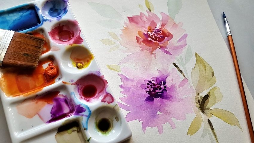
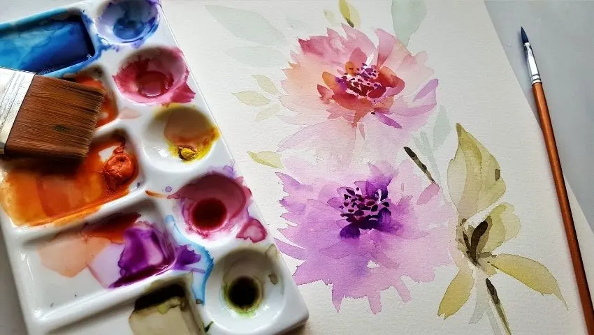
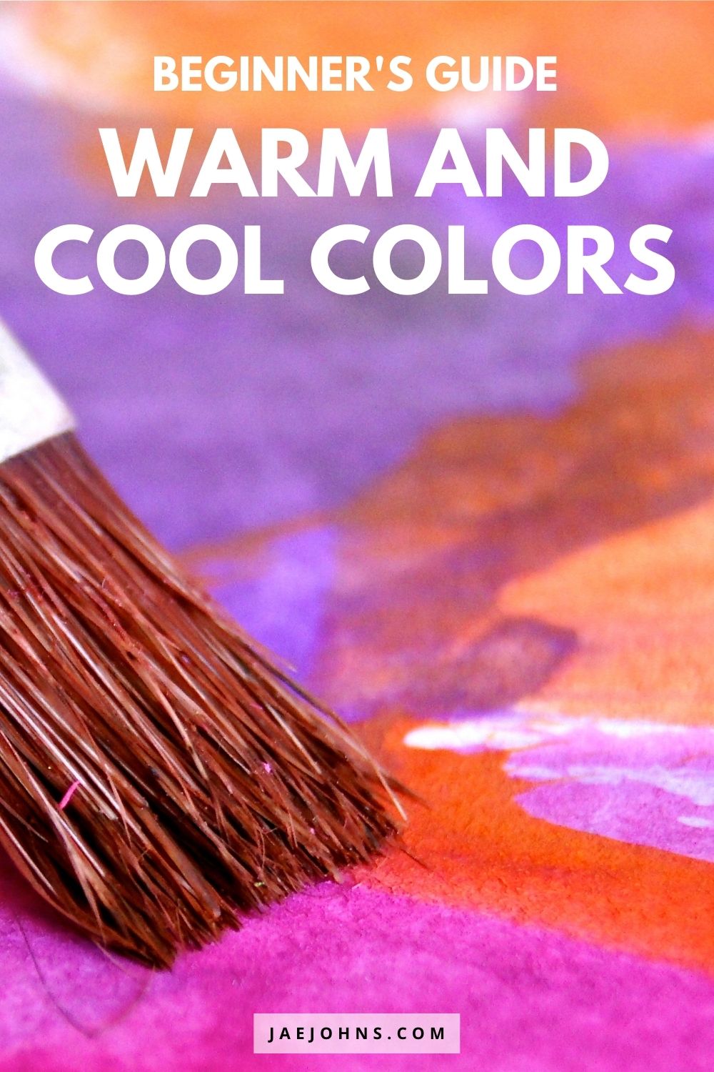
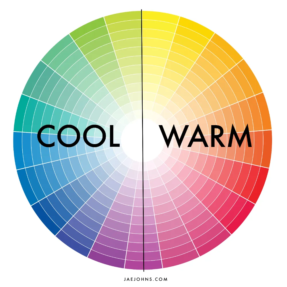
Like warm colors, such as red, orange, and yellow, can give off energy, excitement, and passion, while cool colors like blue, green, and purple can bring on a sense of calmness, tranquility, and relaxation.
In this post, we’re gonna dive deep into warm and cool colors, what they mean, and how they impact the mood and perception of your art.
Plus, we’ll share some tips on how you can use them effectively in your projects (whether you’re a pro designer or just love playing around with colors). So, let’s get into it and learn how to create some seriously impactful designs.
Warm Colors
Hey, let’s get into warm colors and what they’re all about.
Warm colors are like fire and the sun, and they give off a vibrant, energetic, and passionate vibe. Red, orange, and yellow are the most common warm colors, and they’re used to create a sense of movement and excitement in a design.
What are Warm Colors
Warm colors are colors that are closer to red, orange, and yellow on the color spectrum.
They’re perceived as advancing towards the viewer, making them stand out and grab attention. Warm colors are all about high energy, warmth, and passion.
Examples of Warm Colors
Some cool warm colors to keep in mind include:
- Red: It’s bold and intense, symbolizing love, passion, and excitement. But in some contexts, it can also represent anger or danger.
- Orange: This mix of red and yellow creates warmth and energy, representing creativity, playfulness, and enthusiasm.
- Yellow: Think sunshine! It’s a happy, optimistic, and warm color, but it can also symbolize caution or warning.
Emotions and Meanings Associated with Warm Colors
Warm colors can represent a range of emotions and meanings, such as:
- Energy and excitement
- Passion and love
- Warmth and comfort
- Creativity and playfulness
- Danger and warning
In design, warm colors can create a sense of urgency, excitement, or playfulness.
They’re often used to draw attention to important elements like call-to-action buttons, or to create a sense of movement and dynamism in a design.
Cool Colors
When it comes to using colors in design—it’s important to know the difference between warm and cool colors.
Cool colors are associated with nature and the sky, and they have a calming and soothing effect. Blues, greens, and purples are some common examples of cool colors, and they can be used to create a relaxing and peaceful vibe in your design.
What are Cool Colors
Cool colors are colors that are closer to blue, green, and purple on the color spectrum.
They have a shorter wavelength and are perceived as receding away from the viewer (which gives them a calming effect). Cool colors are associated with tranquility, calmness, and relaxation.
Examples of Cool Colors
Some examples of cool colors include:
- Blue: This peaceful color represents trust, loyalty, and wisdom. It’s often used in designs that want to create a calming and relaxing effect.
- Green: A nature-inspired color, green can represent growth, balance, and harmony. It’s often used to create a sense of peace and to promote eco-friendliness.
- Purple: A combination of blue and red, purple is often associated with luxury, creativity, and mystery. It can also represent calmness and serenity when used in cooler tones.
Emotions and meanings associated with cool colors
Cool colors are linked with a variety of emotions and meanings—such as:
- Calmness and tranquility
- Relaxation and serenity
- Trust and loyalty
- Creativity and mystery
- Freshness and new beginnings
In design, cool colors can create a sense of calmness and relaxation.
They’re often used in designs that promote wellness, health, and eco-friendliness.
They’re also used in designs that aim to create a sense of luxury and sophistication.
Warm vs Cool Colors in Design
Let’s talk about the difference between warm and cool colors in design.
Choosing the right color scheme can affect the overall mood and perception of a design.
Warm colors are known for their high energy and excitement (while cool colors are known for their calming and relaxing effect).
In this section, we’ll explore the different purposes for using warm and cool colors in design, and how to use them together effectively.
Choosing the right color for different design purposes
The purpose of a design plays a big role in choosing the right color scheme.
If you want to create a design that conveys energy and excitement, such as in sports-related designs or advertising campaigns, then warm colors are the way to go.
However, if you want to create a calming and relaxing design, such as in spa or wellness-related designs, then cool colors are the best choice.
For designs that need to convey a sense of professionalism and reliability, neutral colors such as gray or beige are often used.
Using warm and cool colors together
Combining warm and cool colors can create a visually appealing design that balances energy and calmness.
It’s important to balance the two to create a harmonious effect. One way to do this is by using a neutral color, such as white or gray, as a bridge between the warm and cool colors.
The impact of warm and cool colors on mood and perception
Warm and cool colors have a significant impact on the mood and perception of a design.
Warm colors create a sense of urgency and excitement, while cool colors create a sense of calmness and relaxation.
Designers who understand the impact of warm and cool colors can create designs that effectively communicate the intended message.
Choosing between warm and cool colors in design depends on the purpose of the design.
Warm colors create a sense of energy and excitement, while cool colors create a sense of calmness and relaxation.
By balancing warm and cool colors and understanding their impact on mood and perception, designers can create visually appealing designs that communicate their intended message.
Color Harmonies
Choosing the right color scheme is a key factor in any design, and color harmonies can be a game-changer.
Color harmony is a combination of colors that work together and create a visually pleasing design. You can use the color wheel to help you pick the right colors.
What are Color Harmonies
There are different types of color harmonies you can use:
- Complementary: Two colors that are opposite each other on the color wheel, like red and green.
- Analogous: Colors next to each other on the color wheel, like blue, green, and yellow.
- Triadic: Three colors equally spaced on the color wheel, like red, yellow, and blue.
- Tetradic: Four colors that are two complementary pairs, like red and green, and yellow and purple.
Examples of Color Harmonies
- Complementary: Red and green, blue and orange, yellow and purple.
- Analogous: Blue, green, and yellow; red, orange, and yellow; green, yellow, and orange.
- Triadic: Red, yellow, and blue; orange, green, and purple; yellow, blue, and purple.
- Tetradic: Blue, yellow, green, and red; orange, purple, blue, and green; red, green, purple, and yellow.
Using Color Harmonies in Design
To use color harmonies in design, you have to consider the purpose of the design and what message you want to convey—here are some tips to help you out:
- Complementary color harmonies work best in designs that want to create contrast and energy.
- Analogous color harmonies work well in designs that want to create harmony and balance.
- Triadic color harmonies are perfect for designs that want to create energy and playfulness.
- Tetradic color harmonies work best in designs that want to create complexity and richness.
Color harmonies can help you create a visually appealing design that effectively communicates the intended message.
Knowing the different types of color harmonies and their characteristics will help you choose the right color scheme for your design.
Tips for Using Warm and Cool Colors in Design
Hey there! Let me give you some tips for using warm and cool colors in design that will help you create a visually appealing design that effectively communicates the intended message.
Balance warm and cool colors
The key to using warm and cool colors in design is balance. Using too much of one color can be overwhelming and detract from the overall design.
So, it’s important to use warm and cool colors in moderation and balance them effectively to create a harmonious effect.
Consider the purpose of the design
The purpose of the design often determines the choice of warm and cool colors.
For example, warm colors like red and orange may be appropriate for designs that aim to create a sense of energy and excitement, while cool colors like blue and green may be appropriate for designs that aim to create a sense of calmness and relaxation.
Use contrast effectively
Contrast is an effective way to create a visually appealing design.
When using warm and cool colors together, it’s important to use contrast effectively to create a harmonious effect.
This can be achieved by using a neutral color as a bridge between the warm and cool colors or by using complementary colors to create a sense of contrast.
Be mindful of cultural associations
Colors can have different cultural associations, so it’s important to be mindful of these when using warm and cool colors in design.
For example, in Western cultures, red is often associated with passion and excitement, while in some Eastern cultures, red is associated with luck and prosperity.
Test the design with different audiences
Testing the design with different audiences can help to identify any potential issues with the use of warm and cool colors.
For example, a design that uses warm colors may be more appealing to a younger audience, while a design that uses cool colors may be more appealing to an older audience.
In summary, using warm and cool colors in design can create a visually appealing design that effectively communicates the intended message.
Balancing warm and cool colors, considering the purpose of the design, using contrast effectively, being mindful of cultural associations, and testing the design with different audiences can help to ensure that the use of warm and cool colors is effective.
Conclusion
To sum it up, warm and cool colors play a critical role in design (influencing the mood and perception of a design). It’s important for designers to understand the characteristics of warm and cool colors, their differences, and how to use them effectively in design.
Whether using warm or cool colors, it’s crucial to balance them properly, consider the purpose of the design, use contrast effectively, be aware of cultural associations, and test the design with various audiences.
By following these tips, designers can create a visually appealing design that communicates the intended message, while captivating and engaging the viewer.
Warm and Cool Colors FAQ
What are three cool colors?
When it comes to colors, blue, green, and purple are considered cool colors. These colors give off a chill vibe and are associated with calmness, serenity, and relaxation.
What are cool colors in art?
In art, cool colors refer to blue, green, and purple. These colors are often used to depict water, sky, and foliage and can create a peaceful and tranquil atmosphere in a work of art. They can also be used to suggest depth and distance, as they appear to recede in space. On the other hand, warm colors like red, orange, and yellow tend to pop and appear closer to the viewer. They give off a sense of energy, excitement, and warmth.