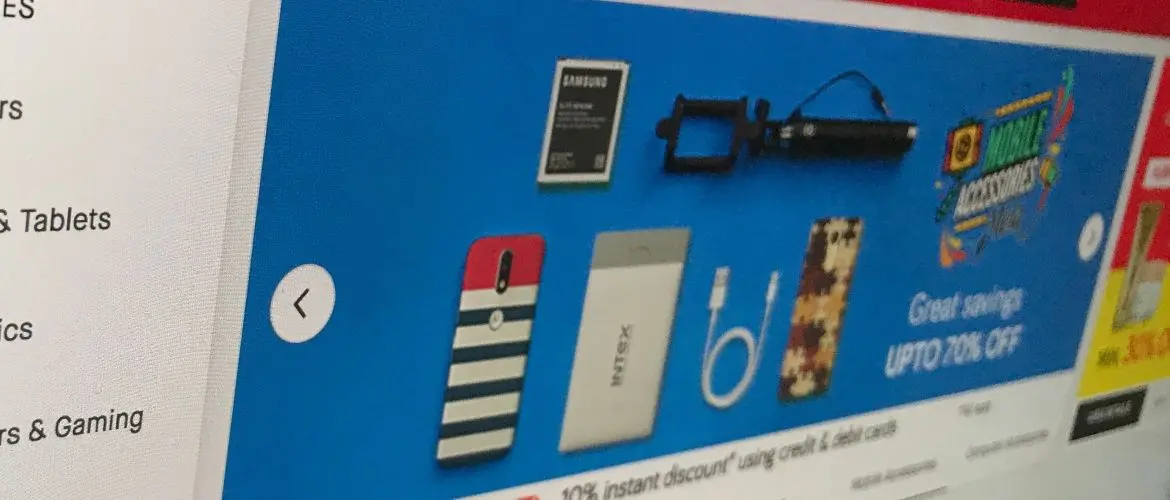
A good website banner can help you to bring in a collection of new customers. They can act as a valuable tool that lead people back to your site or store. When you make banners on a website, you want to make sure that they are well designed.
Since this can be such an effective way to manage conversion, making a good banner is key. A well-made banner can help you to increase your conversions more than anything.
The nature of marketing is digital at this point in reality. This means that if you want to bring someone to your site, you have to appeal to them in this place. Digital marketing has its own unique collection of tools that can help you to bring in more customers.
Making banners on a website is something that can be done by anyone with a little practice. Just remember that your goal here will be to appeal to your audience and tempt them back. We brought together a little of tips to help you get started.
If you’re looking for other related content, check out the following articles:
- 3 Detailed Ways To Get Ideas For Logos in 2019
- 30 Tips on How to Design A Logo
- 8 Strategies To Communicate Effectively With Your Brand Identity
- 3 Tips To Make Great Templates For A Newsletter In Microsoft Word
 1. Show Your Logo
— In order to draw more traffic to your site, you want people to know its you. A great way to go about this is to include your logo on your banner. When you are making your banner, finding a good place to place your logo can help people become more interested.
You can use the logo as a primary portion of the banner or put it in the background. The important part is that people know to affiliate you with it.
2. Keep Your Design Clean
— When you want to make a good banner for a website, you need to keep it clean. This doesn’t just mean having appropriate content, but having a clean design.
You want to make sure that your banners are easy to read and decipher. An open and well-organized design can make people more interested in your brand. This will cause them to consider the content and likely click the banner if it interests them.
3. Invite Them To Look For More
— A great way to make your banners on a website that converts is to invite people for more. Making your banners in a way that encourages clicking is key. You want the person who views it to see it and want to go back to your site. You might try offering sales, suggesting what you have to offer, or other techniques.
In some cases, keeping it low key and just looking reputable is good enough. No matter what, you want them to be curious enough to click on that banner.
4. Consider The Environment
— A common mistake people make is having one banner that they use across all platforms. While this can work sometimes, other times you want to consider the environment. Where your banner can be found will matter.
It should dictate how your banner is designed and who it is appealing to. Customizing banners on a website for the appropriate audience can dramatically increase conversion rates. Make sure that you’re always speaking to the right people.
 5. Use Proper Colors
— The last thing that you want is for your banner to be an eyesore. In order to avoid this, choosing good colors is absolutely crucial. You want to find a neutral color scheme that won’t overwhelm. This will keep your banners looking more credible which will get them more interest.
Choosing neutral colors is also a great way to ensure that you don’t end up clashing with the website that your banner is on. You can make your banners look great with the right color scheme.
6. Don’t Be Overly Wordy
— While banners on a website tend to have some written content, you don’t want too much. Using too many words on a banner is a great way to make people ignore it. You want to focus on getting the most out of your space.
It might be tempting to write a message or explain, but generally, you want to keep it simple. In fact, limiting how much-written content you put can be your draw. This can be what forces people back to your site for more.
 7. Use The Right Tools
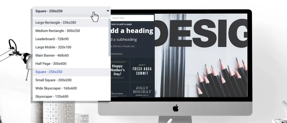
— The best way to make a banner that converts is to make sure that it is high quality. You can do this by using the right tools to make it. There are a wide variety of tools available to users to create amazing content.
You can use any of them to make professional looking banners with no experience. It doesn’t matter which one you choose, but make sure that it has the tools you need. Most people are unimpressed with a banner that looks like it has been made using Paint.
8. Show What You Have To Offer
— While some banners can get away with being mysterious, it can be easier to be upfront. Showing people what you have to offer is an effective banner strategy. If you want people to click your banner, show them why they should.
This might be a little teaser about your product or a straight-up ad. At the end of the day, people aren’t going to click if you don’t make it worth it. Show them that you are worth the second look.
 9. Keep It Symmetrical
— When designing a good banner, try to keep symmetry in mind. A healthy balance in your design is a great way to automatically raise the quality of your banner. Using this approach can help you if you choose to make your own banner. It will make your final product look cleaner and well organized.
10. Make An Offer They Can’t Refuse
— A great way to increase conversions is making a strong offer. A strong offer should be a great deal that people can’t refuse. You want to offer an incredible sale or opportunity. The fact that the sale is temporary will spark people into action.
This is a great way to compel people to start clicking immediately. Your job is to convince them that it is worth clicking on right now. Avoid being too over the top with this approach. Finding a good way to catch their interest is your best bet.
11. Don’t Be Clickbait
— An important way to increase your conversions is to avoid being clickbait. You don’t want people to look at your banner and see an obvious gimmick. Avoid using cheap words or low-quality images. You don’t want to sound like a late-night infomercial, so take time with this process.
Many people make the mistake of trying to oversell themselves and it fails. You should always assume that less is more when you are designing your banners.
 12. Be Mysterious
— This can be an effective approach to converting when executed correctly. While it can be beneficial to show people what you have to offer, you don’t have to. An interesting way to draw people to your audience is to pique their curiosity. This can be carried out by leaving some mystery to your banner.
Instead of directly telling people what your company is, it can be helpful to let them wonder. Using statements that can be engaging but don’t give it all away can be effective. If you want to do this, find obscure ways to define your business. You can use these to make people wonder what you have to offer and draw them over that way.
13. Make It Obvious They Should Click
— Despite the fact that the majority of us know to click banners, some people don’t. Making it obvious that your banner can be clicked is important. The last thing that you want is someone to look at your banner and think it’s a flat ad. If you’re using a banner, you want to compel people to click it.
Make sure that it is obvious to them that there is something behind it. You don’t need to say “click here” but it’s good to make it obvious. This might mean staging something like a button or just telling them to click. Make sure they know it leads back to you.
14. Engage Them Directly
— A great way to increase your numbers is to speak to your audience. You want to find a way to help people be more interested in you. By speaking to them directly through your banner, you are engaging them. This simple act of directly speaking to them can be great when it comes to helping them notice you.
It’s pretty simple to overlook an ad, but when it directly addresses you, things change. This approach must be done carefully or it might come off as cheap. However, people who notice this are more likely to look at the rest of the banner. This can be great for convincing people to click your ad and see what you have to offer.
 15. Use Images
— In the digital world, people absolutely love visual interactions. This is why you should always use some sort of visual aspect for your banners. It allows you to easily engage your audience with eye-catching material. In most cases, images or graphics work best.
You want to use these to catch their attention and make them look at the banner. A well-designed banner will turn this moment of interest into a conversion. You’ll want to focus on using high definition images that make sense for your business. Make sure that you keep it all on brand.
16. Choose A Clear Font
— Something like a banner gives you fairly limited design space. This is what makes choosing the correct font so important. Picking a good font can help you to make customers want to read your banner. You want to use something clear and easy to read.
Rather than trying to wow your audience with a fancy font choice, aim for something traditional. You’ll want to use plain and modern fonts to make it easy for people to read in passing.
17. Animate If Possible
— Depending on the kind of banner, you might be able to animate them. An animated banner is a modern approach to advertising that people love. A good bit of animation can not only catch attention, but draw people to your site. Using this approach is great if you can do it correctly.
Avoid using cheap animations for the sake of adding them. However, a good animation or video can work wonders for your conversion rate. Don’t be afraid to put in a little extra work to make it a reality.
18. Check Your Formatting
— There is absolutely nothing worse than a poorly formatted banner ad. When someone makes a banner and does not consider the dimensions, it shows. Having a perfectly designed and measured banner is key for increasing conversions. You want people to see your hard work and immediately notice how professional it is.
Making sure that all of your formatting is in order is a great way to do that. While there are standards, every site is a little different. Make sure you do the research and get the formatting down correctly in advance.
Conclusion
Understand how to design a banner for websites is important for advertising. Digital times call for digital measures, and these ads are one of many options. As long as you focus on quality content with your banners, they should work wonders.
The more dedication that you put into your banners, the more likely you are to see results. Making sure that your banners are well made and tailored to your audience should result in higher conversion rates!
Are your banners converting?

