

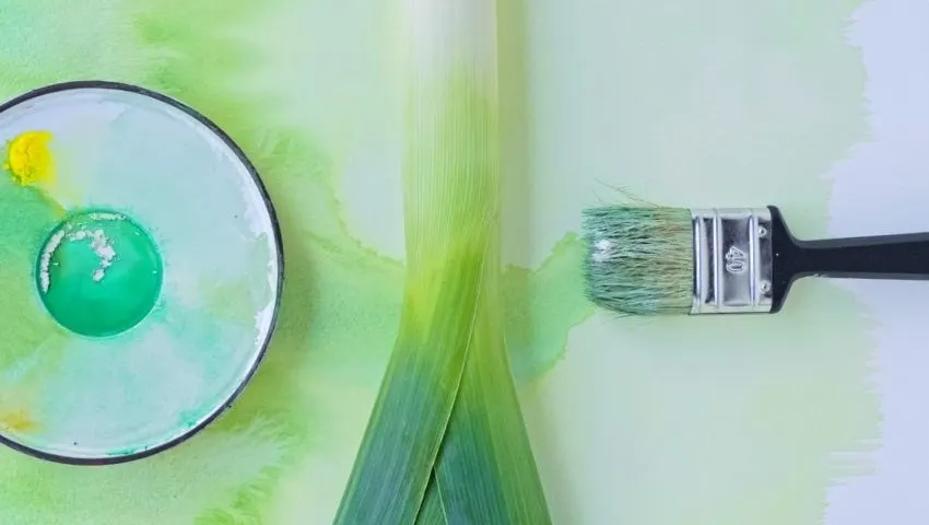
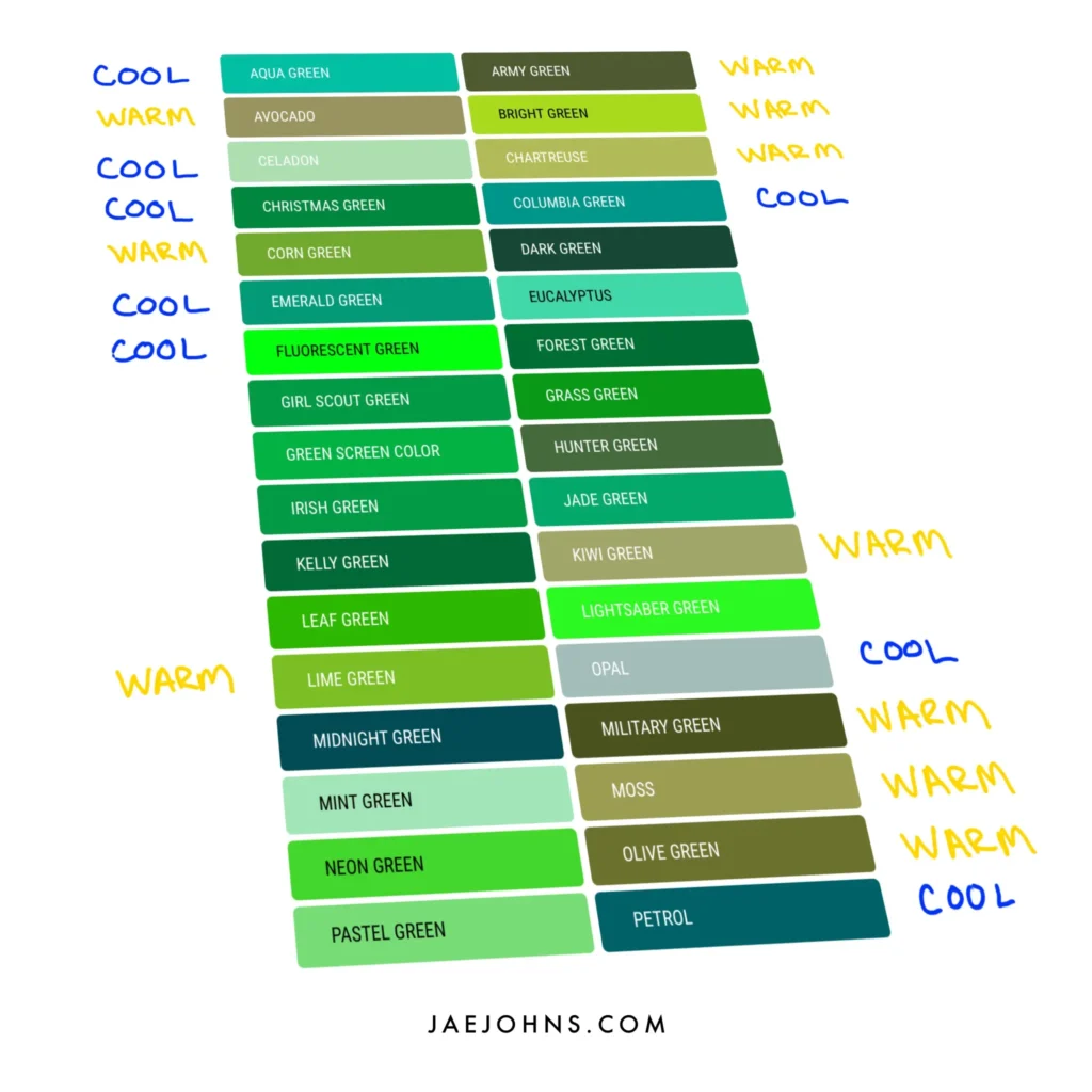
There are vivid greens, muted greens, warm, cool greens, and many other different shades of green. Do you want to learn how to make the color green you specifically want?
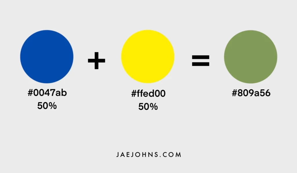
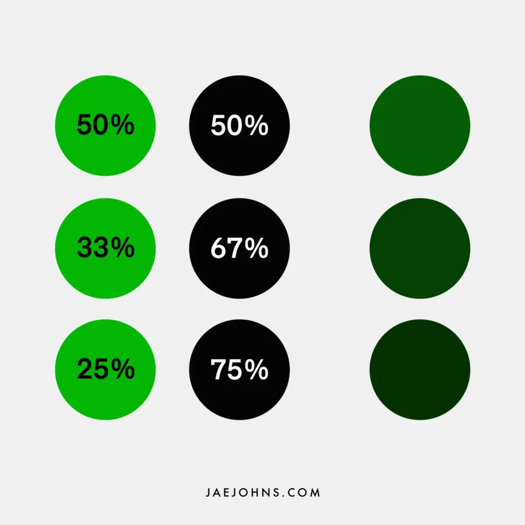
The two colors that make green are blue and yellow. The percent of blue and yellow you mix together will create different shades of green. Also, you can add red, black, and white to give your green color different characteristics.
Is there a way to mix a more vivid green, warmer green, more muted green? How about lighter and dark greens?
If you are new to color mixing, a color mixing chart is a crucial tool to explain why specific color mixes end up the colors they do.
In this guide, you’ll learn:
- What colors make green
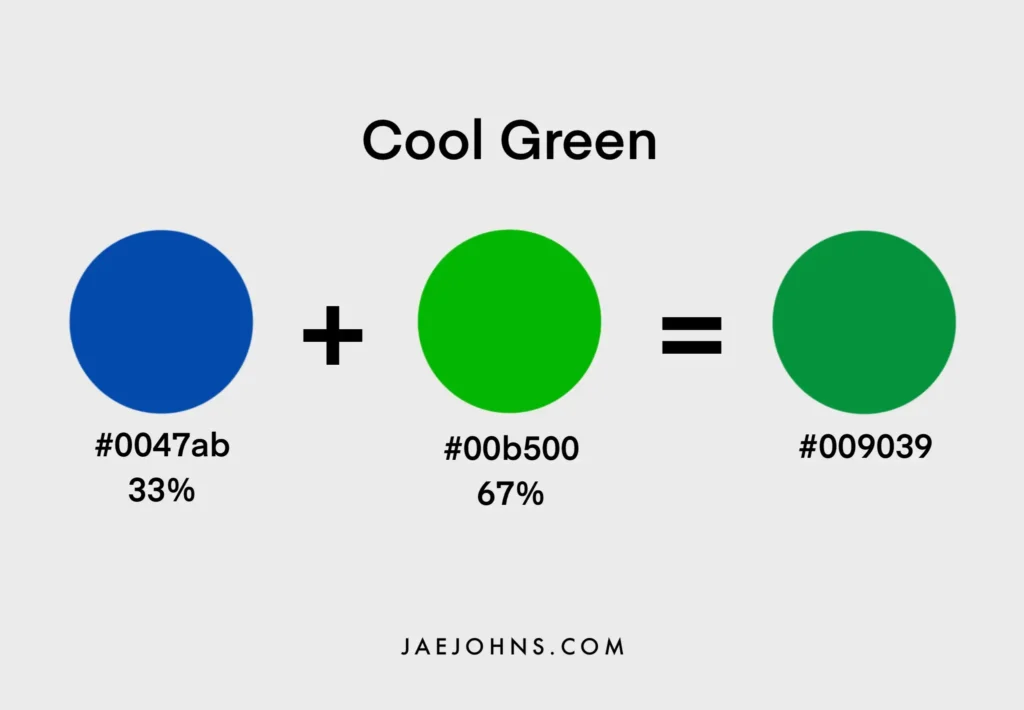
- How to make a warm green and cool green
- Why color temperature is important to painting green
- How to paint a muted green
- How to make a light and dark green
- and more

What Colors Make Green?
You can get a good idea of the color that will result from two colors mixed together by finding the midpoint between the two colors on the color chart.
If you mix an even proportion of the two colors, the resultant color should be this color on the chart.
Of course, the proportion you use of each color will lean it more towards one direction or the other, in a direct scale on that line between the two colors.
That being said, not all different shades and tints of green can simply be created by mixing two colors, at least not in a straightforward way.
This is because you’ll usually only have a few primary colors to start with, and the lines between them don’t cover the entirety of the color chart.
Given three paint colors to work with, you can cover most of the chart.
However, there are other scales of brightness and saturation that will come into play later.
Beginner Color Theory
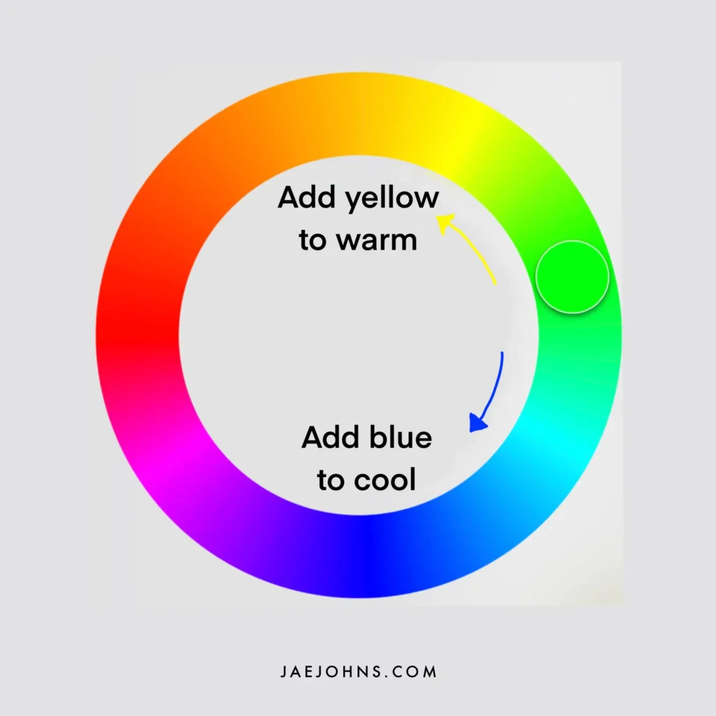
Color temperature is what allows us to think in terms of all three primary colors.
By warming up a green tone with red or yellow, you can move into those sides of the color chart.
By cooling it down with more blue, you can move it in the opposite direction.
Since red is not usually a part of the green, you won’t often mix your green with red paint directly.
Instead, the tone of your blues and yellows will often have a red tint to them, and this can be used to influence your resulting shade of green.
As we progress towards a fuller understanding of color theory, you’ll be able to answer for yourself how to move towards the kind of green you are looking for.
By experimenting with the different color mixing techniques and using the color theory we’ll be explaining, you’ll understand how to mix any kind of green in no time.
Color Mixing Different Greens
An important starting point is understanding the nuances of different shades of yellow and blue.
These create other starting points for your resulting green.
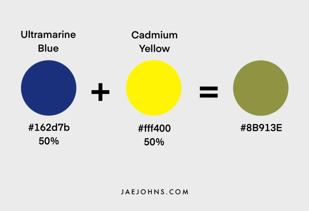
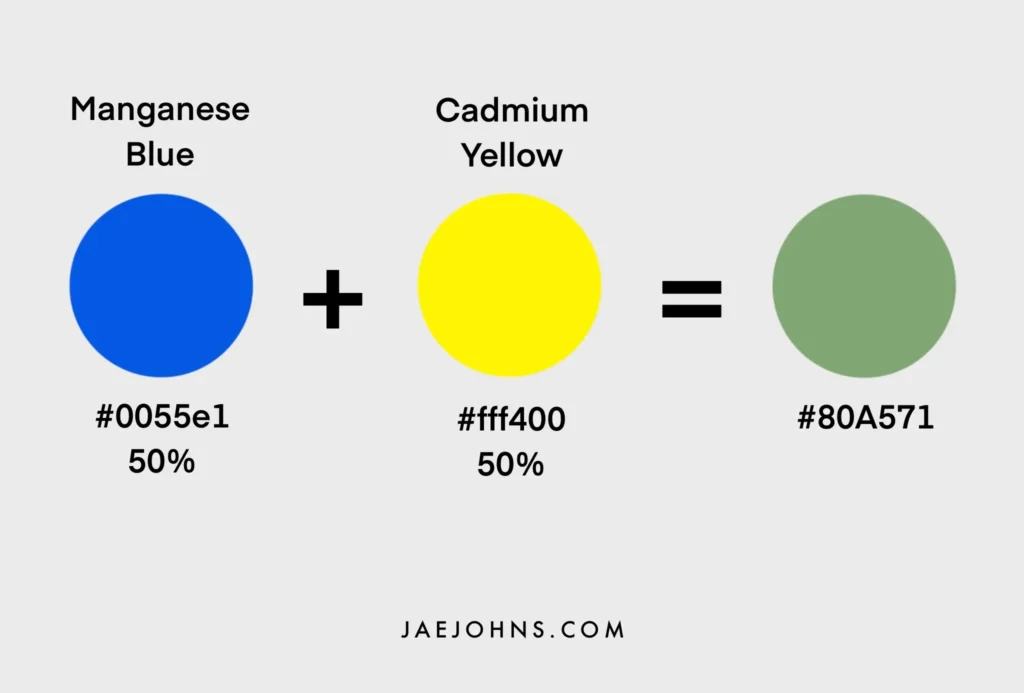
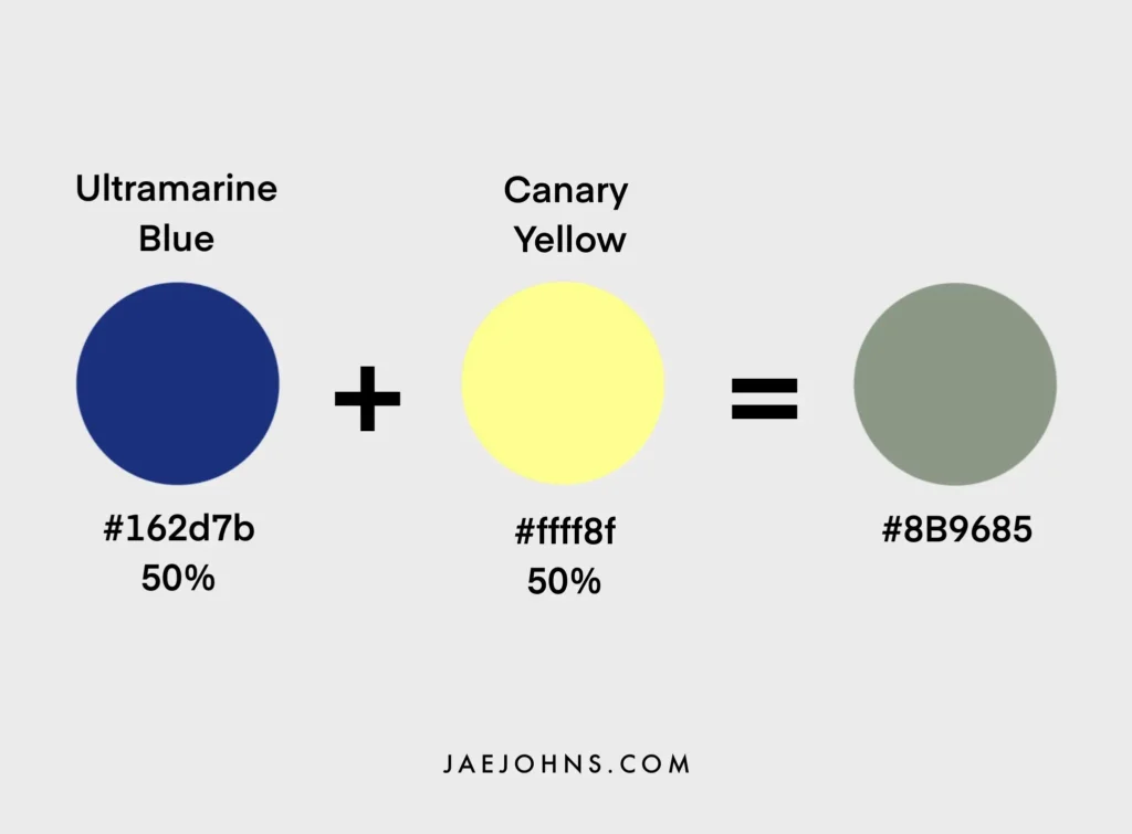
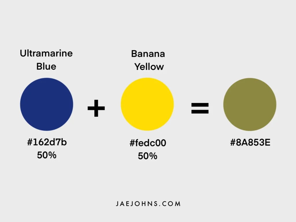
For example, ultramarine blue is closer to a red tone, whereas manganese blue leans towards a yellow.
These undertones play a significant role in determining the exact shade of green produced.
Cadmium lemon leans towards a blue tone for the yellows, whereas cadmium yellow leans towards a red tone.
These undertones are what make one color different from another color.
The measure of these differences is called color bias.
Knowing which way your base color is biased is crucial to understanding how it will influence the final color in the mixing process.
Different blues and different yellows are going to make different starting points for your resultant green.
To get a basic intuition of how this works, you can try experimenting with how the different colors affect one another.
Experimenting with Color Theory
It’s best to begin with one color the same and then try out different variations of the other color.
For example, you can try mixing ultramarine blue with three or four different yellows and notice the range of greens that ultramarine blue can get you.
By creating visuals like this of the possible ranges of green each of your blues and yellows provides as they pair with one another, you can get a good sense of the range of greens your colors can get you.
Unfortunately, color theory doesn’t stop there.
For an even more full range of greens, it’s essential to try out different proportions of blue color and yellow color.
For example, you can try ratios such as ¾ blue and ¼ yellow.
This change alone can add quite a lot of range to your possible shades of green on its own.
However, when you first start experimenting with color mixing, you don’t need a wide variety of colors.
This is just to give you an idea of how different levels of color bias can have a meaningful impact on the final result.
Just one of each color will do for most people to start with, and most artists use a limited palette for each of their works.
After color bias, we’ll have to dive a bit deeper into color temperature.
Then, how to mix warm and cool primary colors to get the result you want.
Using Color Theory with Green
We know that green is a secondary color made up of the primary colors yellow and blue, but that only gets us so far.
When looking at the different yellows and blues you have, the most fundamental way to distinguish the color bias of each color is through its color temperature.
Color temperature refers to whether the color is either warmer or colder than another shade of the same color.
The coolness or warmth of color can be seen on color wheels.
It is best not to think of color temperature as an absolute but rather as a relative color difference between two shades of the same color.
One green is ‘warmer’ or ‘cooler’ than another green, but it is harder to say if a color is ‘hot’ or ‘cold’ in general.
When one green is warmer than another, or one blue is cooler than another blue, it usually refers to the amount of red and yellow on the one hand and the amount of blue on the other.
Color Bias for Green
Try this exercise.
If you do happen to have a few different blues and yellows on you, try to rank them in terms of relative color temperature.
This might be easier for yellows.
For example, more red yellows are warmer, whereas more blue yellows are cooler.
In theory, cooler colors have more blue, and warmer colors have more red, but the amount of yellow can also have an effect.
Therefore, color temperature isn’t an exact measure.
It rather expresses a kind of effect in the shades of a color.
This is highly useful to gain an intuition for when choosing different shades for a painting to color highlights and shadows created by the light in a scene.
A cool yellow leans closer to green because it has more blue in it, whereas a warm yellow will lean closer towards orange.
After all, it has more red. This provides a good scale for the color bias of yellow.
Having more ‘blue’ doesn’t make much sense for a blue, so its coolness tends to be determined by its amount of yellow tint.
A more yellowy blue tends towards green and is cooler.
A more reddish-blue tends towards purple and is perceived as warmer.
Understanding these color biases will improve your fundamental understanding of color mixing and give you an intuitive insight into the particular green you will get when mixing colors.
Color Temperature for Green
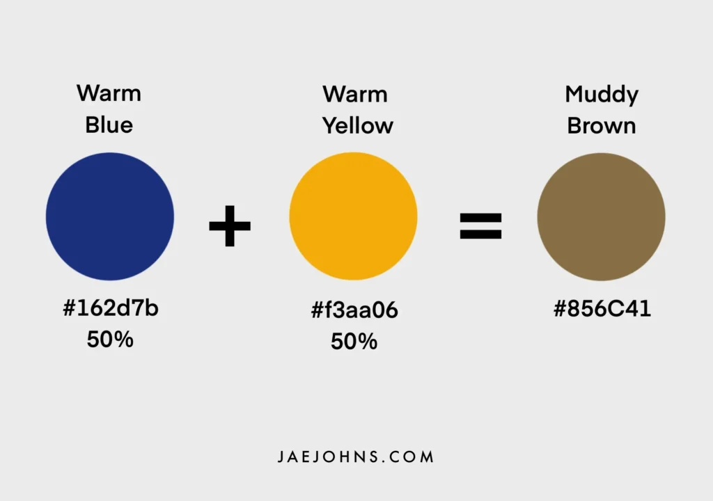
You will notice that mixing a warm blue with a warm yellow will tend to produce a less ‘distinctly’ green color.
Instead, it will lean towards a muddy brown because you’ve essentially mixed all three primary colors with the amount of red that has been added.
We’re told that the range of colors you get is determined by the ways warm colors and cool colors have their color bias, but color bias can also lead to muddier colors by introducing too much of the third primary color.
The same thing doesn’t happen with a cool blue and cool yellow because these do not add red.
However, if you took a cool red and a cool yellow, you could be adding enough blue to cause the same phenomenon.
In addition, you will get a similar muddy brown instead of a vivid orange like you might expect.
When color mixing, understanding the relationship between the three primary colors is vital to getting the resultant warmer or cooler shade you are looking for.
The Temperature of Different Yellows
The temperature of a yellow is perhaps the easiest to determine amongst the three primary colors.
A more bluish yellow is cooler, and a more reddish-yellow is warmer.
We’ve said that is best seen as a relative scale rather than an absolute one.
For example, color temperature is not seen as an absolute on the color wheel because it entirely depends on the color one begins with.
This is similar to the real-life temperature in that lukewarm tap water can feel burning hot when you come in from the cold, whereas a cool glass of water can feel downright chilled on a hot day.
From coolest to warmest, the most common yellow pigments can be ranked as follows:
- Cadmium lemon
- Cadmium yellow
- Naples yellow
- Yellow ochre
The Temperature of Different Blues
Blues are a bit more challenging to determine as a cooler blue is defined by its amount of yellow paint, not by its amount of blue paint.
One could argue that a more pure and vivid blue without any yellow or red is also quite cool, which plays into the slightly subjective nature of color temperature.
On the other hand, the warmth of blues is defined easily by their amount of red.
Ranking the most common blue pigments from coolest to warmest comes out as follows:
- Manganese blue
- Cobalt blue
- Ultramarine blue
How to control the Temperature of Green
Cooler Greens
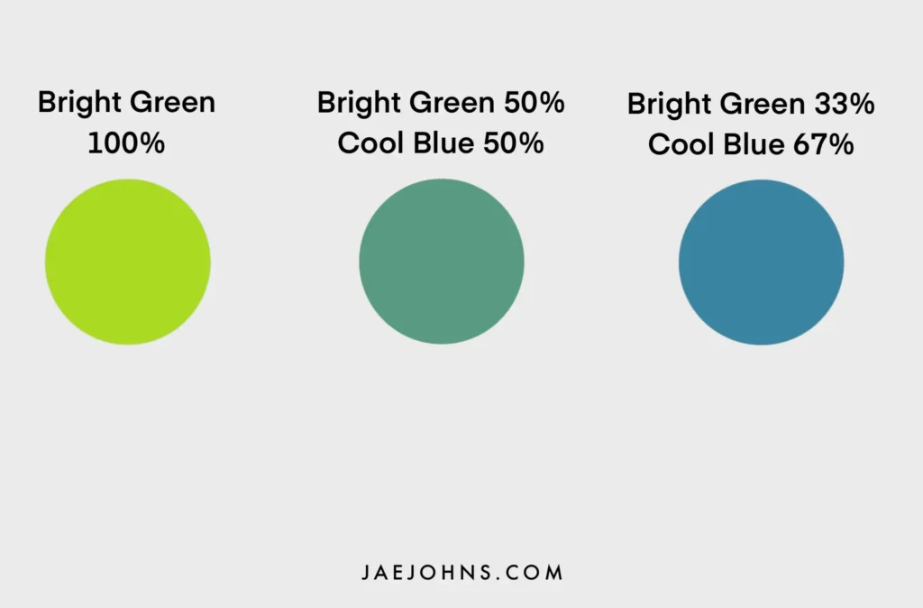
Once you have a shade of green in mind, there are many ways you can go about cooling it down.
The most fundamental technique is to add more of a cool blue to your mix.
A warm blue will add more red to the mix, creating a more earthy and brown final result.
Beyond adding more blue, you can use a bit of purple or other shades of green to control the shade’s subtleties better.
For example, purple often makes a green both cooler and darker at the same time, a good color for shaded greens in a scene.
Certain green shades also can cool down your overall green colors.
For example, using green paint will provide your green with more saturation, usually providing a more vivid green.
This helps if you look for a cool green that doesn’t shade too close to a teal or blue.
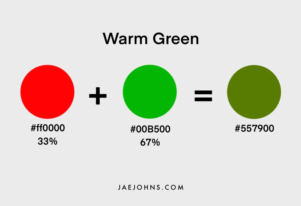
Warmer Greens
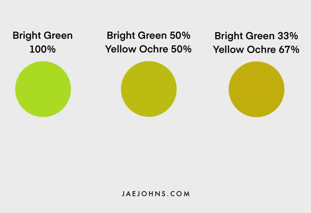
Warming green can be tricky to do properly because adding red will immediately muddy your green.
Therefore, the primary way to warm up your green is by adding more yellow.
For yellows, yellow ochre is a great place to start.
A clever way to warm up a green a lot but still avoid the red problem is to use a golden orange.
The slight tinge of red will warm up the green without overpowering it.
You can experiment with using some red for a warm green but start with a small proportion.
Cadmium red is an excellent starting point.
A Deeper look at Color Temperature
It should be noted that to be even more rigorous with color temperature, one should think of it as going in three directions and not two.
These three directions are determined by the addition of the three different primary colors.
As color temperature is currently understood, red ‘warms’ a color, and blue ‘cools’ a color.
Yellow tends to cool a red and warm a blue. This is what makes color temperature best understood as a relative term.
Digging deeper, we could understand it on a three-way scale.
Due to yellow’s particular spot, we might call it something like ‘brightness’ instead of warmth or coolness if we wanted to get more specific and technical about its effect.
Thus, if you combine temperature with lightening and darkening of a color (which is coming up shortly), we can then see five total scales on which you can adjust your color:
- Amount of red = warmth
- Amount of blue = coolness
- The amount of yellow = brightness
- Amount of white = lightness
- Amount of black = darkness
Unfortunately, the problem of absolutes rears its ugly head again.
Each of these terms is actually best described relatively rather than absolutely.
This means that once you have a color to compare to, you can say another color is warmer, brighter, or darker than it.
But given just one color, the amount of red, blue, or yellow doesn’t necessarily come off as warmth, coolness, or brightness without context.
This is crucial to keep in mind.
Saturating Green
Vibrancy, chroma, and saturation are all more or less tracking the same thing in a color.
So for green, it is its purity or overall ‘greenness.’
Suppose you are looking for the most vivid greens possible without warming or cooling the green.
In that case, this is recognized on a scale called its ‘saturation.’
You’ll have to search for a perfect combination of blue and yellow with high chroma already present in the pigmentation to get a truly saturated green.
High saturation, also called chroma, is key to getting the most vivid greens.
If you begin with low saturation colors, it is impossible to end up with higher saturation.
Instead, you’ll end up with a color closer to a grey or earth tone.
A classic mix for a vivid green is cadmium lemon with manganese blue, but there are many combinations and proportions to experiment with.
Look for high pigmentation and chroma on the blue and yellow you begin with, and make sure to mix them in an equal ratio.
Adding white will not get you a higher saturation of green.
You are likely to get the best results with cooler yellows and blues.
For example, you’ll get a muddy result if you mix yellow ochre with ultramarine blue, as these are two of the warmest shades of each color.
The saturation of yellow ochre is also relatively low, giving further reason for a resulting low chroma.
Muting Green
On the one end of the scale, the most vivid and chromatic greens breathe life and contrast into a painting.
But the other side of saturation is also essential.
Knowing how to mute your greens will give you many more options with creating shades and washed-out colors on our canvas.
These are critical effects to consider when dealing with bright lighting.
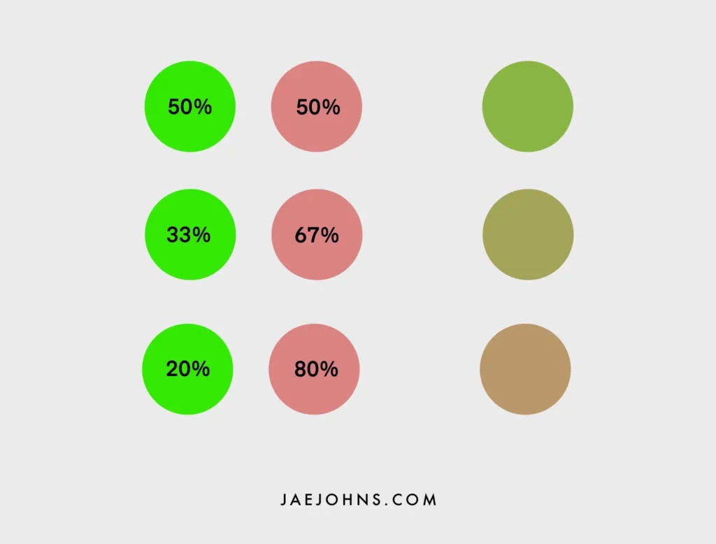
The basic way to mute a color is to add some of its complement to the mixture.
For example, green’s complement is red, so the more red you add, you will get a more muted green.
Different shades of red will affect how your green is muted.
Some reds will tend towards darkening and cooling your green, like alizarin crimson.
Others will tend towards tans and earth tones like burnt sienna.
You may also begin by looking for warmer yellows and blues.
These already lean towards some red on the color wheel and begin with a more muted green when mixed.
Low saturation yellows and blues will mute the resulting green differently.
These will tend towards a greyish green with less earthy undertones.
By experimenting with different ways to mute your green with the color wheel beside you, you can see how the relationship between different colors changes different values to the shades you get.
Building up this intuition is the key to understanding color mixing.
More on Complementary Colors
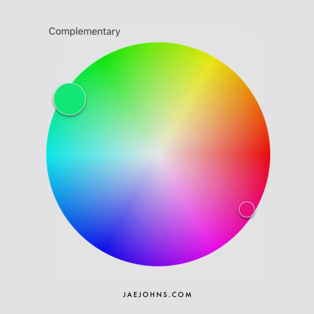
Beyond mixing green with just red, you can also mix it with orange or violet for slightly different complementary color effects.
Fundamentally, the effect is still the same, except that orange adds slightly more yellow.
This tends to warm up the muted effect, whereas violet is somewhat bluer and tends to cool it down.
These effects can also be accomplished with the initial kind of blue and yellow used.
Still, by using an orange or a violet, you can get to understand a different direction of color mixing and improve your intuition further.
Some people say that understanding how complementary colors work is the key to unlocking everything you need to know about color theory.
This is because the way complementary colors work with each other gives you the greatest amount of power to change the shade of the color you’re working with.
The Fundamentals of Mixing Green
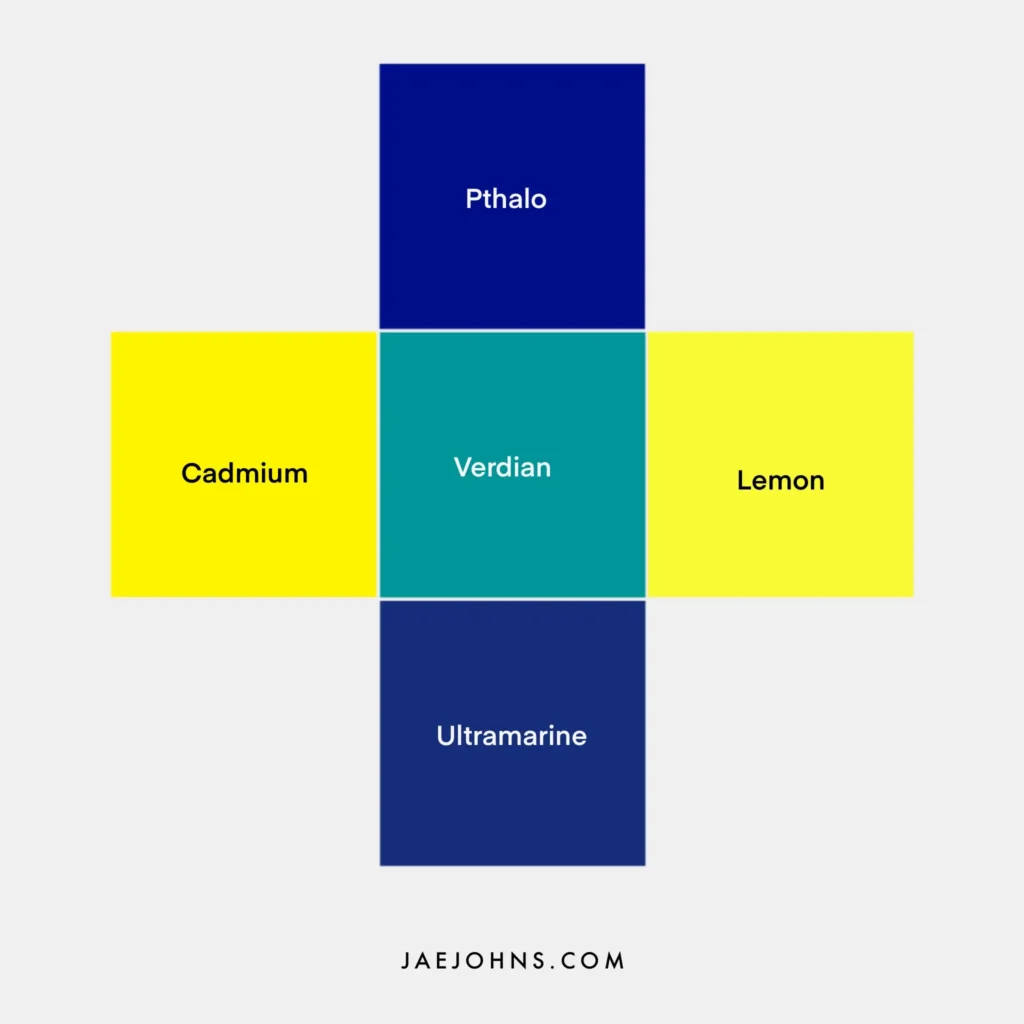
Taking what we know of color temperature and combining it with saturation, a kind of chart of greens can be made to have a basic map of the different directions green can go.
In a cross pattern, you can place the coolest blue, ultramarine, at the bottom and the warmest blue, Pthalo, at the top. On the left side, you can set the warmest yellow, Cadmium, and on the right, the coolest, lemon yellow.
By then mixing proportion shades between each of these four options, with a Verdian green in the middle, you’ll get a strong sense of the variations of green that are fundamentally possible.
Lemon yellow-infused green with some white tends towards the most acidic, saturated green possible, like the green of sunshine through a leaf.
On the other hand, Cadmium yellow-infused green with white will create a much warmer, heavier green.
Ultramarine blue-infused green with white will produce a warm, blue-green like a tropical sea.
And yet, Pthalo blue-infused green with white creates a pine forest green.
Making this kind of gradation chart can give you a sense of all the fundamental possibilities green offers and the subtle differences between them.
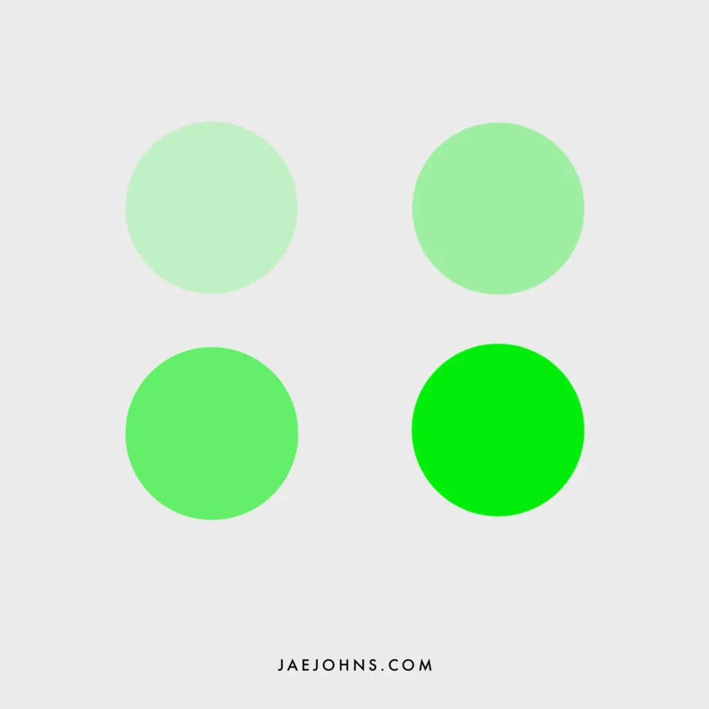
Light Green
The last fundamental way to change a color that we have not spoken about yet is to lighten or darken it.
Lightening a color is different from changing its saturation, which is its vividness, and its temperature, which has to do with the mix of primary colors blended within it.
The lighter a green is, the more something called its hue is brightened, which is different from those other measures.
In a way, you could say it’s the amount of white present in the green.
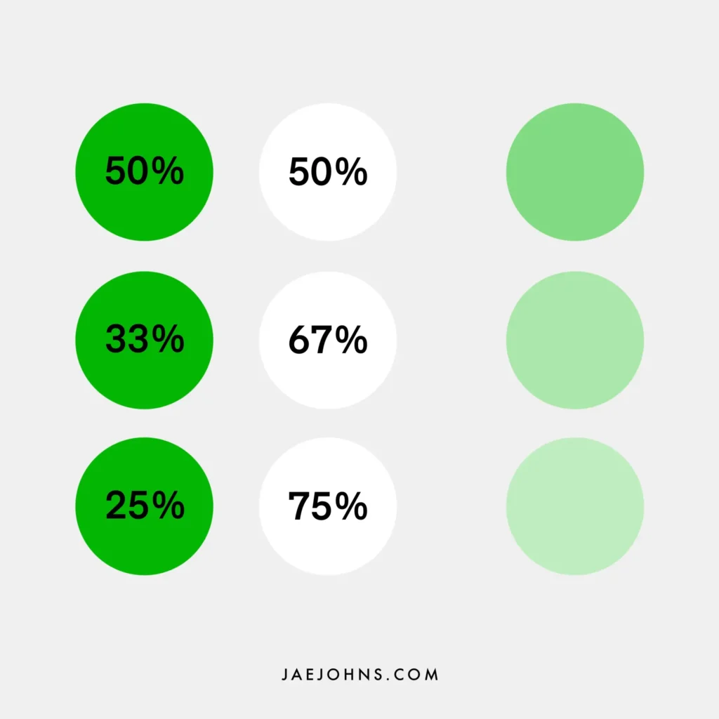
The simplest way to lighten a green is to mix it with white, which makes sense.
The result is easy to understand in that the proportion of white added will change the lightness of the green in proportion to the amount of white used.
But, this can wash out and desaturate the green, making the color flat.
Ways to Lighten Green
There are more sophisticated but complicated ways to lighten green that can avoid this problem of flatness.
Hues of green such as emerald green are brightly saturated but not necessarily lighter than other greens.
This may seem like a slight difference, but a lighter green is a different principle than a more saturated green tone. Light green and vivid green are different.
These use the principles we’ve learned about temperature and saturation to lighten the green to suit different scenes, lighting, and moods.
Knowing how to lighten a color organically is crucial to painting highlights and brightly lit areas in your painting.
In those areas where the light is catching your subject, you want to provide different gradations of brightness in color on the fly.
This can be on trees, grass, or other foliage for greens and is crucial knowledge for a landscape painter.
Mixing with white only gives your green one dimension of lightening.
However, by mixing a different shade and saturation of green, you’re giving yourself a lot more options that can still lighten the color.
The main option you have is to mix with different yellows.
Yellow is the lighter half of the blue-yellow mixture, and the more yellow you have in proportion to your blue, the lighter your green will be.
The yellow you use will also make a difference.
Cadmium yellow and yellow ochre tend to give a lighter shade of green.
Both yellow and white make for great brightening options.
Once you’ve experimented with those two and understand how they influence the resulting green, you can try other colors.
The amount of yellow tone in other colors can brighten a green depending on the red also present.
Blue tones tend to darken the green, so avoid them when looking to lighten it.
Dark Green
As one might guess, the primary way to darken a green is with black.
However, this is not considered a best practice as mixing with black tends to lose the saturation of the color.
It flattens the greens on your canvas and makes them all feel similar.
Just as lightening green is important for highlights, darkening a green allows you to create shadows for your shrubbery, a moss green for the forest floor, and greens for other pieces of the landscape.
The ability to lighten and darken shades of color in an organic way with the lighting is a crucial technique to improve your skill as a painter.
We’ll explore how to keep the dimensions of color variation within your green while still darkening it.
Ways to Darken Green
The theory behind darkening a green organically is to use complementary colors to mute the green and use cooler temperatures.
The complementary color of green is red and the cooling color is blue.
Together they make purple.
Generally, then, variations of purple make for the most potent way to get a dark green naturally.
Dioxazine purple is a great purple option for making a darker green.
It uses the complementary color principle and color cooling.
The more red you use, the more earthy green the result will be. Burnt umber is a great choice for this direction.
This should be unsurprising since adding red to a green puts all three primary colors together and creates a brown.
Brown is the most straightforward color of nature because it combines everything, occurring quite easily in chaotic situations.
The more blue you use, the darker and cooler your green will become, but less natural-looking. Ultramarine blue is a good choice in this direction.
This is because it will tend to saturate the green more and lean it away from earth tones.
Finally, a simple way to get darker shades of green is with Pthalo green, a green pigment that begins much darker than other greens.
This is a very saturated green so that it will be both dark and vivid.
A combination of cooling down your green with blues and using the complementary color principle to mute the green with reds in combination will darken it in a rich and varied way.
This avoids the flatness of using only black to darken your greens and gives you much more control overall.
Read Also: What Colors Make Purple & How to Mix Them Like a Pro
Alternative Ways of Mixing Green
Surprisingly, there are color combinations you would not expect to make green but do.
With Our newfound understanding of color theory, we can uncover these mysteries.
The most famous surprising way to get green is probably by mixing yellow and black paint.
The pigment in Perylene black is actually a very dark green and this is not atypical for many black pigments.
Mixing it with yellow can create a beautiful dark shade of green that is great for very dark green shadows.
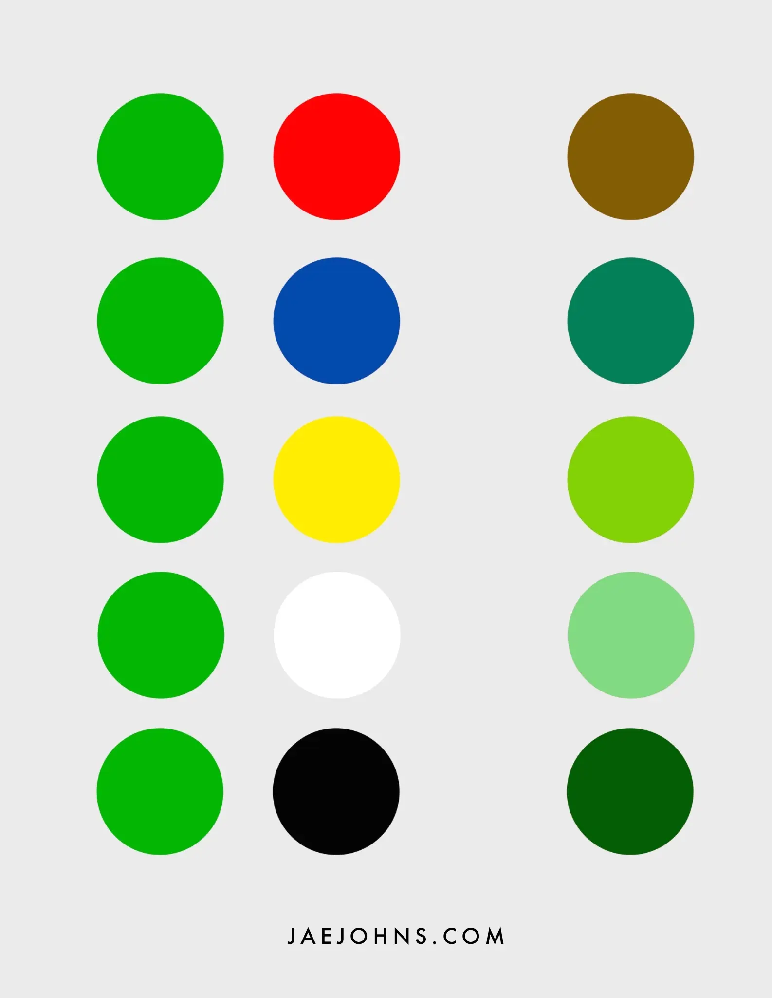
Going over what we’ve learned from the color wheel, we can now also explain what will happen with each primary color mixing with green:
- Mixing with blue will cool the green. Cooling the color is a specific way of thinking about color theory that has to do with gaining an intuition with that happens when adding more of a specific primary color.
- Mixing with yellow will brighten and warm up the green. But, unlike warming with red, mixing with yellow won’t muddy the green.
- Mixing with red will warm up but also muddy the green. This will make the green more muted and earth tone.
- Mixing with white will lighten with the green but also lose its saturation. This can make the green flat if used as the only lightening technique.
- Mixing with black will darken the green but also lose its saturation. In a different way than white, black will also flatten the painting if used too much.
Final Thoughts
Color theory is a complex and difficult system.
Gaining a full understanding of it requires lots of experimentation and gaining an intuition for many different aspects of color.
However, I hope this article has given you some insight into how the different functions of the primary colors can be developed into varying shades of green.
By extension, you can apply similar principles to other secondary colors.
The specific pigments we do have access to also play a role.
We’ve seen that the subtle cool tones or warm tones of a given yellow or blue can impact the final mixture of green.