

Hello! Today, I have a great article to share from Marco Vannini on how to make collages. Like myself, he is helping artists through educational content. In this article, he provides a link to his free digital collage starter guide for anyone wanting to make collages in 5 easy steps.

Learning how to make collages is a great way to push the boundaries of your creativity. Whether you want to pursue it as a passion, a hobby, a side-project, or simply to add another hot skill in your repertoire, know that anybody can learn to do it and it can be very fun!
Both the analog and digital medium offer a wide array of possibilities to experiment with photo collage, and fortunately for us creatives, the learning curve isn’t as steep other artistic practices. You can get started pretty easily with just a handful of tools.
At the very end, we’ve also included a list of free digital collage apps that are great to start practicing. Let’s dive in!
[do_widget id=custom_html-26]
 But first, what is collage art?
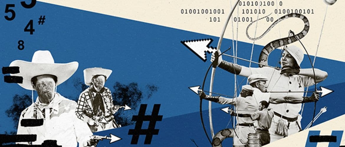
Born under the wing of the cubist movement, modern collage art made its way into the artistic landscape in the early 20th century. It’s final form consisted of colored papers, magazine or newspaper scraps, paint strokes, and even 3D objects, pieced together to create a whole.
Throughout the years, other movements adopted the art form and made it their own. Years of crafting the artwork led to its converging with technology, where we witness its evolution into the digital mediums during the last couple of decades.
To this day collage art is pinned on advertisements, fashion editorials, digital and analog illustrations, to name a few. Media agencies leverage on it to create a dreamy mood used to promote their client’s products, whilst artists continue to push the boundaries of our imagination through their make-believe worlds on paper and screens.
We’re not sure what the future yields for photo collage, yet we hope to see more artists immersing into the medium, instilling it with their individuality, personal essence, and purpose. With nothing else to add, let’s look into the top 10 tips on how to make collages.

 Tip 1: Look for free high-quality pictures
If you choose to start off analog, then sorting pieces from your favorite magazines will do the job. But for the digital adventurers out there, the exploration for images can get frustrating, really fast if you’re not looking in the right places.
Two great sites to find high-quality image resources are Unsplash and Pexels. They both offer a huge variety of free-to-use imagery carefully hand-picked and extensively curated by their teams. You can find pretty much anything that grasps your imagination. From shots of nature to business scenarios, to architectural landscapes, to portraits…you name it!
Another great paid alternative is Envato Elements—a comprehensive database of stock imagery, vector graphics and illustrations, mockups, and other resources to further spice your collage artworks. The price is worth it contemplating the vast garden of resources it has to offer which can all be put to good creative use.
To top it off, a hidden gem for those of you leaning towards the vintage or retro finishes is Flickr: The Commons, a free source bank from the world’s public photography archives.
 Tip 2: Pick a digital collage app that suits you
Going digital is indeed practical. Accidentally cut the arm off your subject, rather than the background? No hassle, you can always Ctrl + Z [undo] your way back from any unwanted scrambles. Nothing is “final“ unless you decided it to.
Not to overlook the traditional cut and paste method, however. Artists should understand the importance of bending their rod to discover inconspicuous angles, oblivious to their trained sight after years of practicing the same moves. Switching from digital to analog and back is a fantastic way to break the patterns and oxygenate your art form.
I’d recommend trying out Adobe Photoshop for its versatility and overall functionalities are unmatched, standing far above its competitors. You can find amounts of tutorials, guides, and articles on the software over on Youtube that will get you through the first section of the learning curve. From there on it is all about consistent, detailed, patient practice.
Bonus: Download my Digital Collage Starter Guide to learn my 5-step process on how to make collages using Photoshop. No complex software technicalities involved, I stripped it all down to the very basics…and the best part, it is free!

 Tip 3: Add texture to your composition
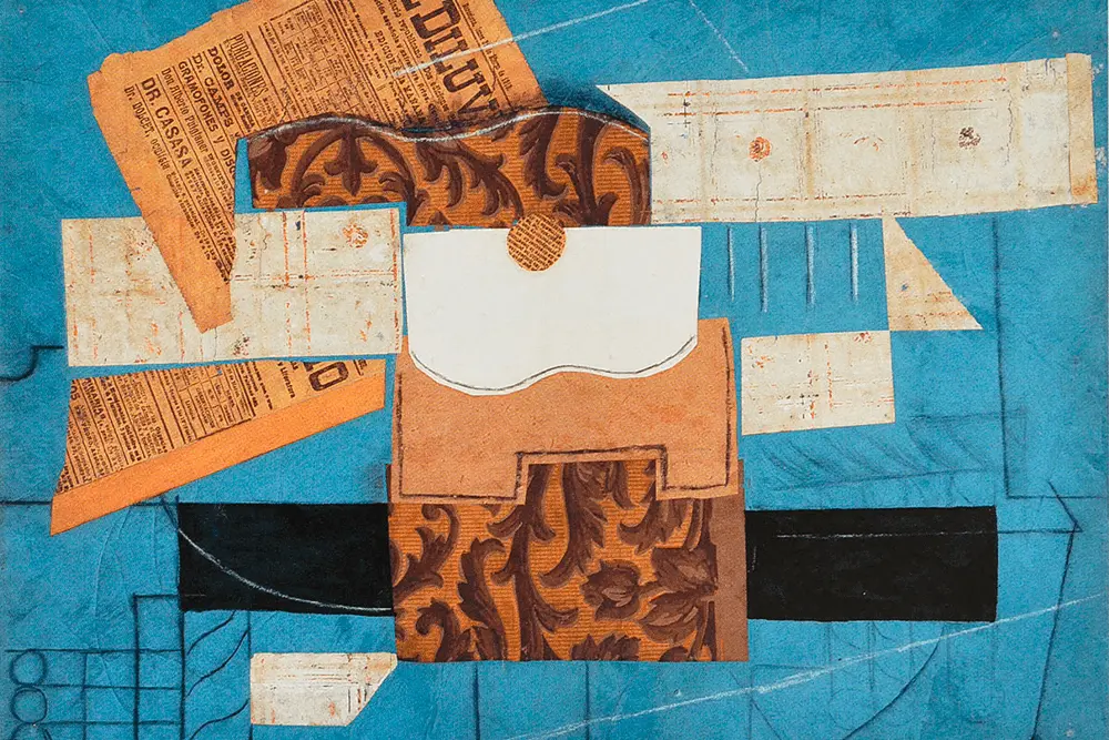
In collage, the texture is a key component to set the intention and mood of your composition. You can use anything from paper scraps to leather, to organic materials such as wood or sand depending on the finish you envision.
Texture can also be used to evoke certain kinds of emotions. For instance, steel textures transport cold, melancholic feelings—whilst dark maple sparks thoughts of warmth and comfort. A velvet cloth can be used to thread a romantic trama into your artwork, on the other hand, a jet black worn-out fabric adds a touch of suspense or dismay. Pavement is for city, as soil is for nature. Mix and match them depending on the underpinning of your collage work.
Pro tip: Keep in mind associations when you are creating, our brain is wired to connect the dots based on recognizable patterns. Use textures as a non-verbal language to implicitly communicate specific sentiments to the viewer.
 Tip 4: Choose a harmonious color palette
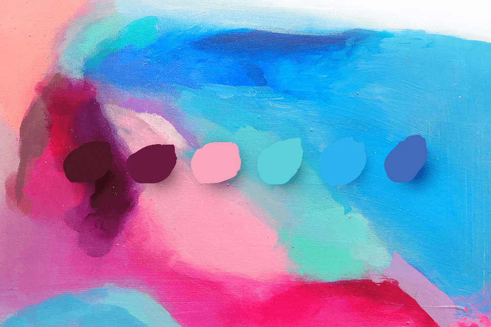
Colors add depth and sense to our material world. Without them, we’d live in a monotone greyscale reality where there’d exist no evident distinction between a rose and a fig, a toad, or a bee. Our eyesight is said to perceive over 10 million colors, so we better use to the best of our ability when bringing life to the canvas.
When I very first started collaging I recall intuitively playing it safe with my choice of colors. I felt unable to determine whether the pickings I made where factually harmonious or utter disparity. This hurdle became less and less obstructing as I trained my eye to sort color palettes objectively. Tools like Colorhunt or Design.ai were incredibly useful at first. From within you can all kinds of sleek color combinations, as well as color theory fundamentals to further nurture your practice.
What to watch for in choosing a harmonious color palette
Watch for color hues, values, and saturation and learn the distinctions between them. An overly-saturated red, for instance, may draw all of your audiences’ attention into it and evoke feelings of anger. An overly-pale darkish green may trigger a slight repulsive feeling, as we tend to associate it with icky disgusting things.
Learn your theory well and you’ll be well on your way to master the art of color. Don’t fear eccentric palettes or combinations. Moreover, seek for inspiration amongst the body of work from legends like Rothko, Twombly, or Basquiat, whom all were craftsmen at the art of coloring.
Again, use color to evoke certain emotions. Red is for romance and lust. Yellow is for happiness and action. Blue is for sadness and calm. Purple is for luxury and creativity. Orange is for determination and fun. Black is for mystery and elegance. White is for purity and trust. Green is for wealth and nature…and so on. Each color has particular traits and connotations we tend to associate them with, use them to thread the storyline behind your concept.
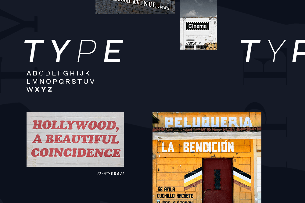
 Tip 5: Experiment with different forms of typography
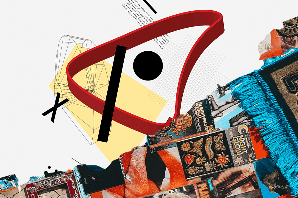
Type, type, and more type! Collage artists love to experiment with typography. Typefaces come in all shapes and sizes and are crazy fun to play with. It’s found in street posters, subway signs, magazine headlines, and pretty much everywhere we turn our head onto. Typography has been around with us for thousands of years and modern artists and designers have been using it to change how we experience the words we read.
In photo collage, type can be used as a subtle way of channeling certain key messages or ideas. Maybe as thought bubbles, handwritten statements, or randomly place letters with a subliminal message. Remember that in art, everything counts!
Typography can also be used as texture, adding depth to the different elements of your collage. Simple magazine spread cutouts or old vintage newspaper columns work wonders when used in the right context. You can overlay them with other geometric figures, organic elements like rosebuds or flower petals or even brush strokes make up wonderfully dynamic compositions.
Another great idea is to combine characters with opposing personalities, such as serif with sans-serif fonts, or brush strokes with stencil letters. Altogether they add interest and contrast to your composition, and now that we are at it, let’s discuss contrast!

 Tip 6: Use contrast enhance your compositions
You’ve probably heard more than one design guru preaching about contrast.
When used correctly, contrasts draws attention to the subject of your artwork through the elements around it; which is very important nowadays as our attention span is hitting an all-time low. Websites weigh upon it often to communicate their key messages, value propositions, and offers. The same goes for advertising. A great example of it is Apple’s 2003 silhouette campaign announcing the new iPod.
Our eyes love contrasts because it gives visual sense to what we are looking, and it can be attained through various paths. Color, shape, size, layout, and guess of course… type! In color, red contrasts over black, blue contrasts over yellow and green contrasts over white and vice versa. In shapes, squares and circles are a prime example of contrast, and in size, an ant on the foreground contrasts with an elephant in the far distance…and so on.
You can use the law of contrast when creating collages to highlight or draw attention to certain components of your composition. Klawe Rzecy, an illustrator and collage artist from Poland, uses contrast masterfully to dramatize his artworks. Take a look into his work and detail how he experiments with it in all of its different forms. Notice the drastic color blocking which sets the tone of the artwork, the play with radically different sizes and shapes. His work is a prime example of contrast execution.
 Tip 7: Add details for visual interest
Renaissance artists were big on details. They carefully outlined every form, every shadow, every light beam to bring the piece to life. Details are not necessarily are must-do for collage artists, nevertheless, depending on which pathway or art direction you choose to follow, they are a wonderful tool to add visual interest.
Visual interest in art and design can be described as those “moments” within an artwork, a product packaging, a display advertisement or else, that subtly hook your eyesight and gift you an instance of wonder. Salvador Dali was extraordinaire at it, and arguably one of the best. He painted with minute detail, and within, he gave space for his imagination to drop a piece of self through subliminal messaging and mystical phrasing that up to this date causes awe in the minds of curious lookers.
Details help add depth to your work. They are the ingredient x to your recipe, the hook to your comedic speech. Save this gizmo in your toolbox and whip it out at times of creation. Start looking at your art from different perspectives, and when you’re approaching the finish line, make an educated guess to determine if there’s room for detail. You’ll be surprised by the results.

 Tip 8: Check for balance and noise
Balance and noise could be grouped into the handful of caveats of collage art. You may understand by this level that learning how to make collages is relatively easy. However, reaching the sweet spot of expertise in which you’re able to discern between a finished work from an unfinished one, takes practice. [and time!]
Let us define both concepts rapidly. Balance is what occurs when the distribution of all visual elements across your artboard—say texture, objects, color, and space—result in a feeling of stability and harmony. The composition feels balanced. Noise on the other hand is the byproduct of tiny “flaws” that may go unnoticed to the untrained eye. It triggers a subconscious alert that “something is wrong” even though most lookers won’t be able to point out exactly what.
The result of having an imbalanced composition
An imbalanced composition often will group too many elements in certain places, figuratively “bulking” it up. This is a common mistake I see in novice collage artists. I fell into it numerous times, in fact, I still do. Similarly, a noisy composition will count with little details here and there that disturb the eye, product of artistic decisions that were made along the way. Neither makes your artworks factually wrong or ugly, as in art everything counts. They do however affect the overall harmony of your piece.
Those could be two shapes which make it hard for you to tell if they are touching, or indeed separated from each other. It can also be two shades of one color that are either too similar or radically contrasting. Those could be two textures that differ little too much in tonality and finish, making it challenging for them to live together.
I’d dare to say there’s only one trail leading to the land of perfect-compositions and that is—you guessed right—practice. The more you create, the more you fail, the easier you’ll identify your flaws, the easier it will become further on to call them out and make amends.

 Tip 9: Use white space to further contextualize your elements
An artist and designers’ best friend, white space is the secret sauce, the ace under the sleeve you’ll use to make your collage work pop. Also referred to as negative space, it is defined as the existing space between the elements within your composition. Kind of like the black matter of art and design and life altogether.
Modern trends such as minimalism are strongly rooted in the basics of white space. Open areas, reduced clutter, sparing use of objects, all constitute the fabric of its essence. White space in architecture enables breathable living spaces. In design, it facilitates the communication of messages and significantly improves readability. And in life, it could be perfectly tied onto meditation—the practice of stillness and emptiness of thought.
Use white space with confidence when creating photo collages. I encourage you to do so. One of the first traps we tend to fall into when getting started in collage art is to satisfy the urge of “filling” every space. Put a circle in there, three rectangles over there, a donkey riding a wasp here, and why not, a futurist version of a cutout of a Van Gogh’s Starry Night all across the background. Voilà!
On her way to craftsmanship, an assertive collagist should hone the skillset of removal and subtraction by developing a sense for unnecessary clutter—the result of when we get too carried away by the flow state and make a couple of extra calls. White space is your ally, your sidekick to achieve beautifully balanced compositions. Use it with purposefully!

 Tip 10: Showcase your work on social media
And last but not least, every up and coming’s artists’ biggest fear—exposure!
To support the subject, I’m going to butcher a quote of a quote pinned by Steven Pressfield in his game-changing book, The War of Art: “It plays not only to your benefit but is your righteous duty to share your creativity and art with the world. It is your gift to humanity”.
Whomever Steven quoted in this last paragraph knew exactly what he was talking about. The power of unleashing one’s individuality is unknown to plenty as most of us are paralyzed at the get-go and many miss the starting gun. Sadly, thousands of ridiculously talented creatives surpass the existential plane never having blown up their true potential.
I find it hard to understand the taboo around sharing one’s creativity. But I can only guess that it is the byproduct of years and years of self-victimization, humiliation, and societal hammers repeatedly pounding on artists’ egos. It is time for us to make a change.
Using social media for the win
The internet granted a platform for artists to capitalize like never before, and social media is our biggest blessing since the invention of the canvas. Whether you’re looking to make a living from your art, or just a side-project to unwind Friday evenings, do not underestimate the hidden opportunities behind simply posting your work onto Instagram feed—my personal favorite.
Other channels such as Dribbble, Behance, or even LinkedIn are proving to work wonders for upcoming artists. Use them to your advantage. Sooner rather than later you’ll find yourself amongst a community of devoted fans that are madly passionate about your project, eager to keep you company and willing support your living; but most importantly, a community you can constantly give back to in art, in teachings, and imagination.
Conclusion
Knowing how to make collages is a means to an end. Adopt is as a hobby, and be pleasantly surprised by its cathartic qualities. Embrace it as a life project, and let it guide you through a journey of self-discovery, art exploration, and finding of self.
Lace it with business, and expect to see returns from the lives you touch, the messages you convey, and the dreams you help contextualize. Collage is an expression of utter freedom of thought, a colorful pathway into one’s subconscious. Collage is pure, indisputable, art.
Question of the Day: What type of collages do you like to make?