
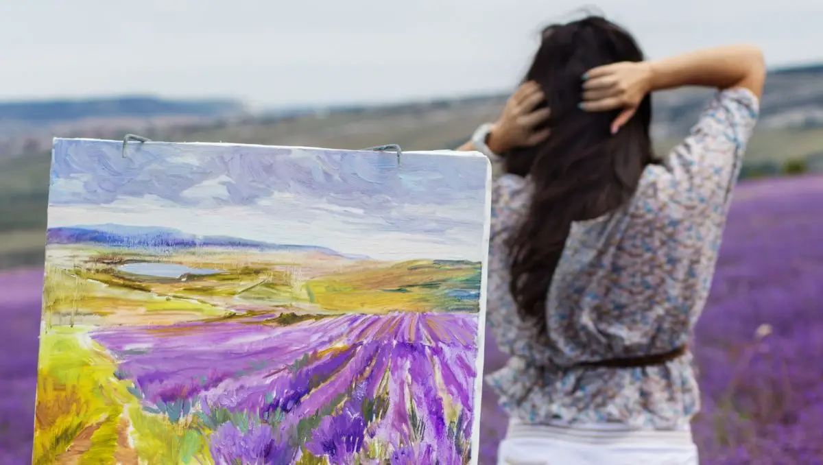
If you want a color that creates a rich elegance in a variety of interior design spaces and/or is a great background color for paintings, then use the lavender color.
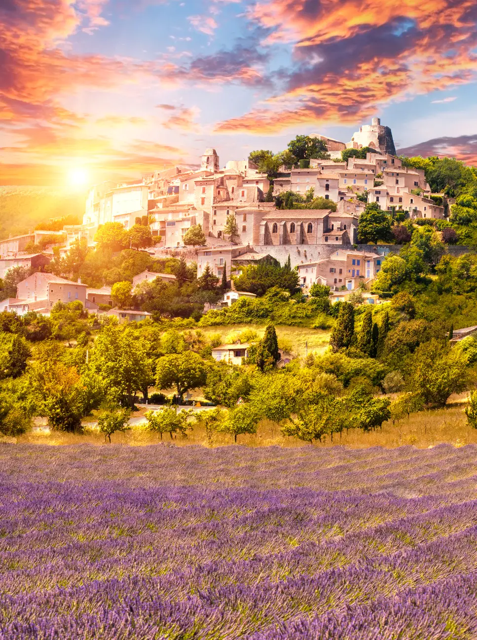
Generally, lavender brings to mind the fresh scent of fields of lavender flowers, perhaps on the hills of France or Switzerland.
The vivid color of these fields has been a motif in painting for centuries, the impossible vividness of this natural purple being such a rarity in nature.
The scent of lavender has been prized for millennia, but so too is the color a thing of beauty.
Whether you love how lavender creates a serene feeling or how it looks in complement with other colors, the pale violet color has become deeply embedded into people’s consciousness.
What Color Is Lavender?
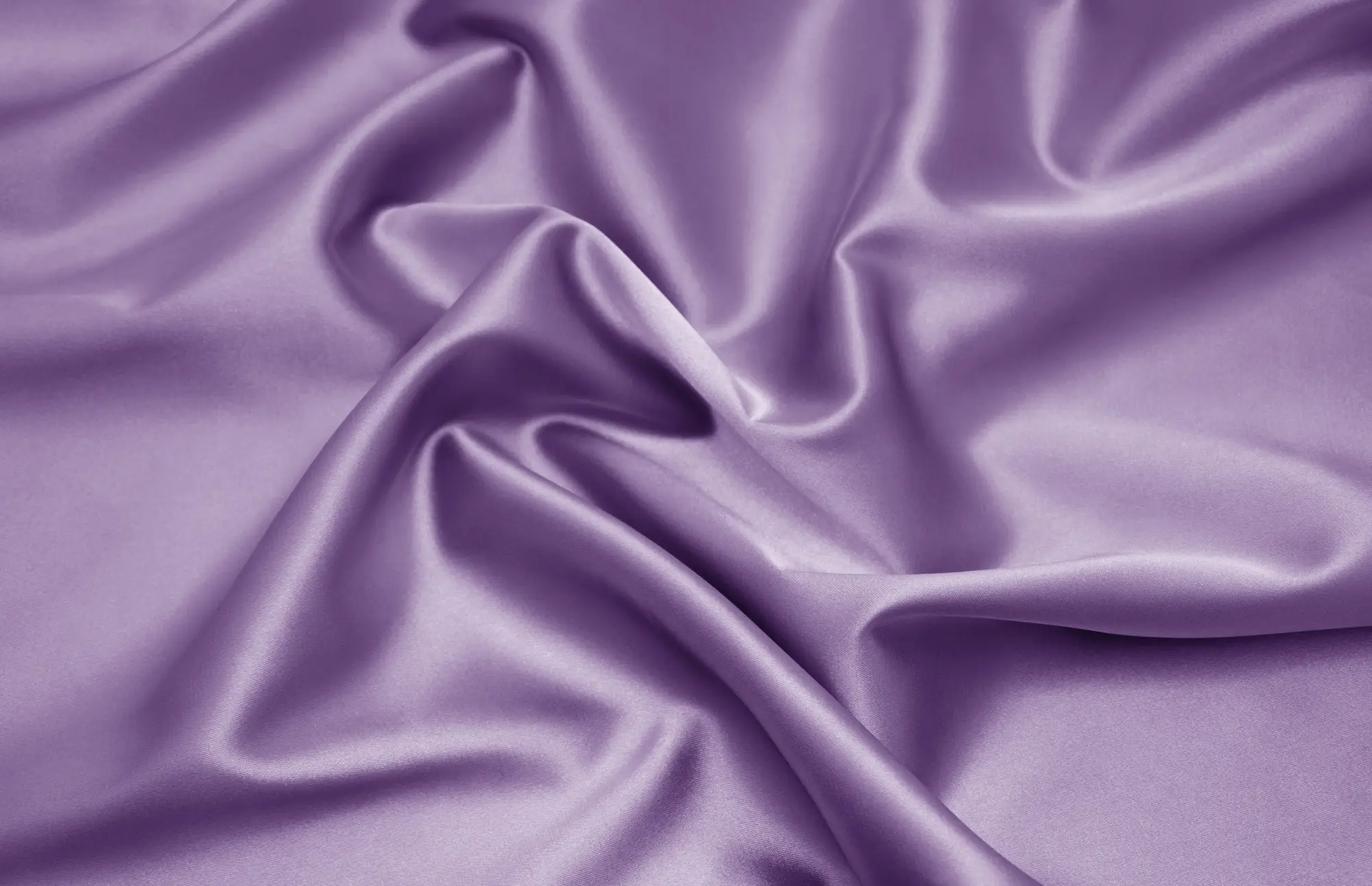
Lavender is between purple and white, a light purple, or, more specifically, a pale violet.
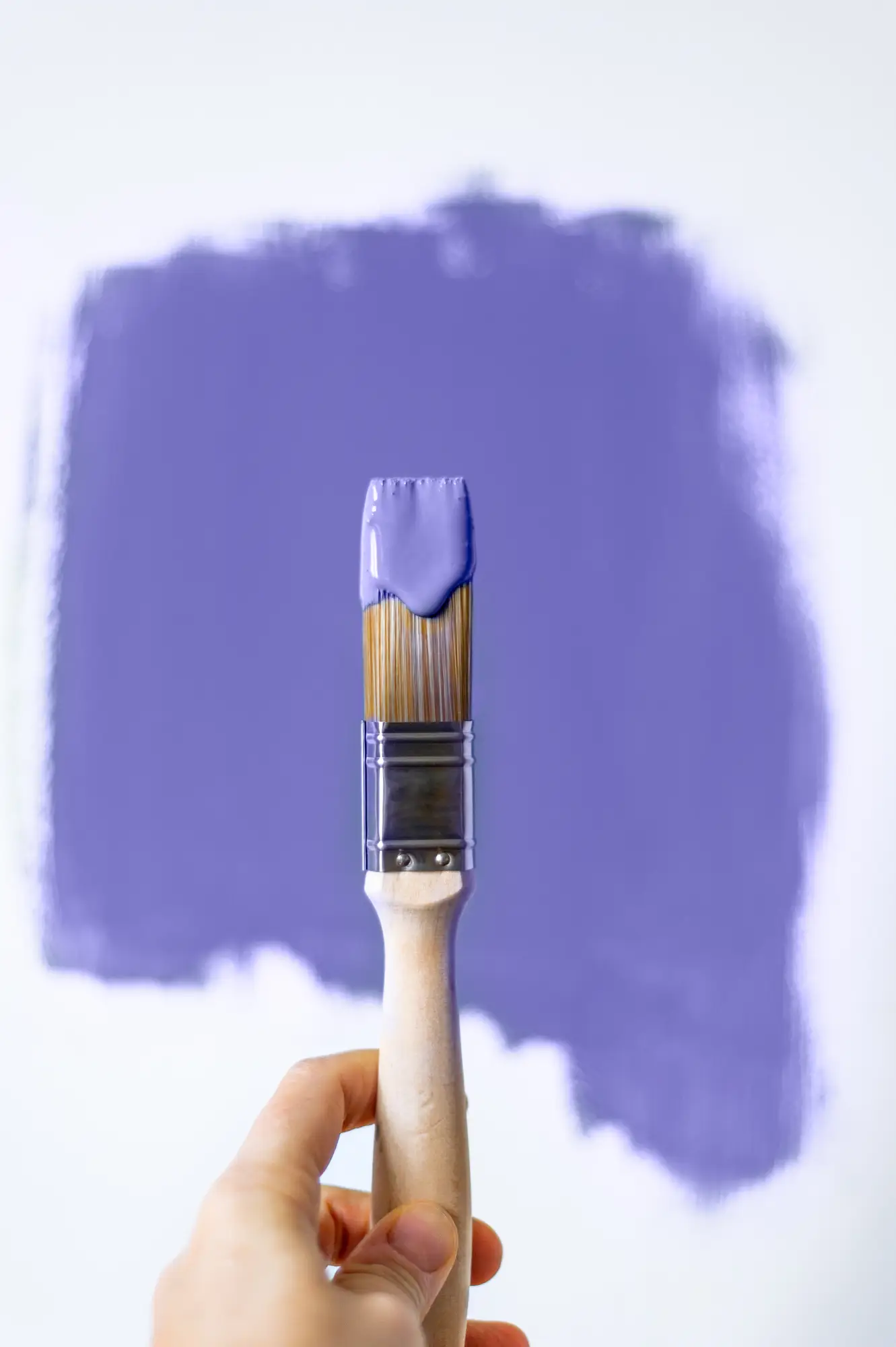
You can sometimes buy lavender paint separately or add white to purple to get the color.
The name lavender comes directly from the flower, often seen in huge fields of purple where it’s farmed.
The lavender flower is most famous for its rich, clean scent.
The color lavender is used everywhere, from French runways to high-end interiors.
It is especially prominent in wedding venues, mother’s day gifts, and Easter celebrations. However, that is not the end of its versatility.
It has recently been used for many wellness centers, healthcare facilities, nurseries, and retirement homes.
The name lavender is derived from the Latin verb, lavare, which means “to wash.”
They have been used throughout history for their clean and relaxing smell, helping to perfume one’s clothes, linens, and body.
Everyone from the Egyptians to Ancient Greece has highly prized its scent, using its oil for perfume and rituals.
The flower has been cherished since biblical times.
The color has also become associated with the flower’s general sense of calm and cleanliness.
Lavender Color Names
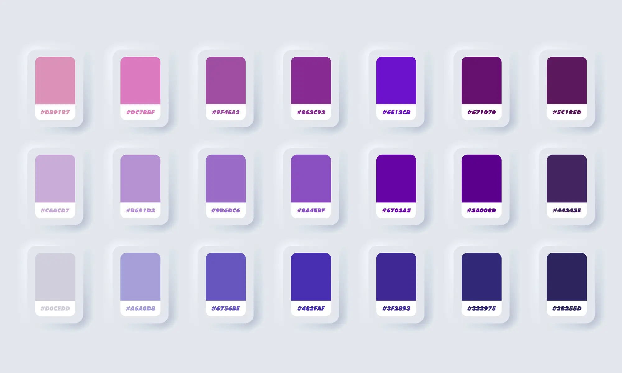
Lavender is just one color within the purple range.
Purples range from deep indigo through violets to mauve, depending on the ratio of blue to red.
Lavender sits in the violet color range, perhaps slightly more blue than red.
A blue lavender, or periwinkle color, sits within the deeper blue range, leaning towards indigo.
On the other side lies lilac, which is a light mauve.
This makes lilac a more red-toned lavender.
Other variations of lavender include light lavender, dark lavender, and pastel lavender, which all fall under different ranges of saturation and shading to the base color.
For example, a lavender-pink pushes lavender past the mauve area with a high level of brightness and red.
This creates a bright, fresh lavender with a lot of warmth.
On the opposite end, you can go for a lavender gray, which makes lavender more neutral and less saturated.
This muted lavender works almost as a neutral while still hiding a hint of color.
Thus, there are lots of different close variations on the color lavender.
Violet, heliotrope, lilac, and periwinkle are closely related to the color.
In addition, variations like lavender-pink and lavender grey provide even more options.
Lavender Color History
The use of the lavender flower has been traced back over 2,500 years, revered for its fragrance and medicinal properties.
In Ancient Egypt, it was used as part of the mummification process.
Ancient Phoenicians used it while cooking and bathing, and Arabians perfumed their hair with lavender oil.
Throughout history, lavender oil was used in countless soaps and cosmetics.
The flower’s calming and antiseptic properties made it highly versatile.
These properties have extended to our associations with its color, which is seen as calm, subtle, clean, and healing.
Because the color purple is relatively rare in nature, the sight of lavender evoked particular feelings almost unique to it.
Purple Dye and Royalty
We know that making purple dye was exceptionally difficult, and so its use was reserved only for royalty and the highest religious officials.
Ancient leaders were seen as connected to their God or gods, and so the color was also deeply associated with spiritual power.
This makes it a symbol of reverence, awe, and wealth.
Lavender isn’t quite as ostentatious as deep purple used for royalty but still holds many of its associations.
It was only in 1856 that this power of purple would begin to wane with the advent of mauve chemical dye.
The synthetic dye allowed the average person to afford purple clothes, and by the 1890s, it revolutionized the fashion industry.
In art, there are uses of purple, including lavender tones, dating back to Neolithic times. Ancient humans used manganese and hematite powder to draw on cave walls.
Lavender Color Meaning
Lavender is laced with meaning from its historical connections with purple and the flower.
Generally, it’s considered an elegant color, often used in weddings and high-end events.
It’s unique without being as flashy as a deep purple.
It can also symbolize purity, devotion, and grace due to its religious affiliations.
Due to its connections with the flower, it evokes a sense of calm and creativity, as purple is often considered an artistic color.
Furthermore, it’s more associated with femininity than masculinity, although it’s a surprisingly common ingredient in men’s cologne.
Generally, it’s seen as nostalgic, delicate, and romantic.
Due to lavender’s association with springtime, it often has a sense of renewal, rejuvenation, and new beginnings.
To make the paint color, you needed cobalt blue and madder, which gave a dark purple you could then lighten with white.
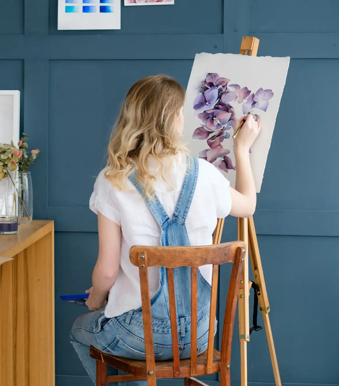
Gustav Klimt was a huge fan of purples, using everything from dark purple to bright violet, including lavender.
Monet, of course, was also a great fan of the color, using many rich purples in his works, paired with beautiful greens.
Finally, it’s also a romantic color, like most purples.
It’s a gentle reminder of love, less intense than a red or pink, which symbolizes passion.
Lavender is about a more intimate and long-term connection and can be used to show love for mothers, sisters, other families, and close friends.
Lavender Social and Political Meaning
Not only that, but purple has been a color of creative, rebellious spirits for a long time.
Lavender fits into that trend, although more lightly and subtly.
It can be considered the more mature, rested version of a mauve or bright purple. It can represent wisdom.
Other interesting uses of color include its symbolism in the Women’s Suffrage movement, which is often used for many feminist causes, including lesbian movements.
By the 1970s, lavender and purple became part of the psychedelics movement, bringing its associations with creativity to the forefront.
Furthermore, the color has taken on even greater religious significance for the contemporary world due to the book and movie, The Color Purple. In that work, it symbolized spiritual awaking.
Lavender Color Theory
The graceful, calm nature of lavender gives it some interesting choices of pairings.
It’s often best to pair it with bolder colors to balance it out.
However, creams and other luxury colors can also be used to keep the serene feeling.
The opposite of Lavender on the color wheel is light, warm green.
Maximizing this contrast gives a strong color sense to lavender.
Green and lavender also make up a few of the spring tone colors, more of which you can add to get a general sense of spring.
Lavender goes great with many different neutrals, including creams, off-whites, and greys.
Adding to these, you can try an orange-yellow, which complements lavender and neutrals nicely.
Finally, you can try a monochromatic color scheme for lavender.
This would use various shades of purple to achieve a subtle effect on the eyes, bringing out the undertones of each purple and achieving a cohesive overall look.
Complementary Colors
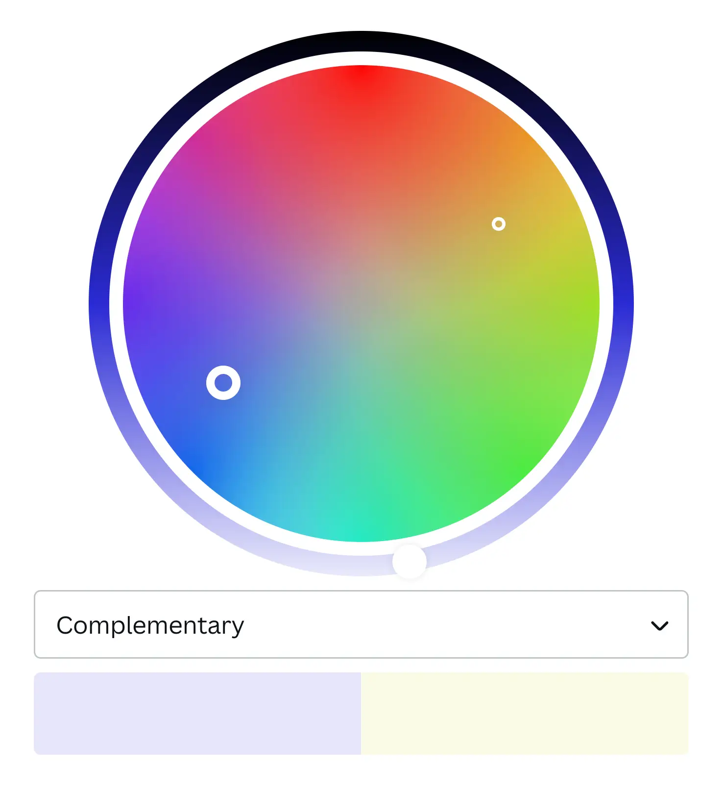
Complementary colors sit exactly across from each other on the color wheel.
For lavender, that direct complement is light yellowish-green.
Light and grass green are very popular in combination with lavender around Easter and Mother’s Day lavender.
This is likely because they evoke springtime nicely when paired together.
You can also go bolder with the green, choosing a darker or more saturated green for a complement.
Pairing this with lavender will increase the overall contrast, although it will draw the eye to the bolder color.
Still, lavender often works best as an accent color, so that can be something to keep in mind.
Beyond just the main complement, you can also use the split complementary colors.
Split complements are the two colors adjacent to the main complement.
For lavender, these are light yellow and light green.
Contrasting Colors
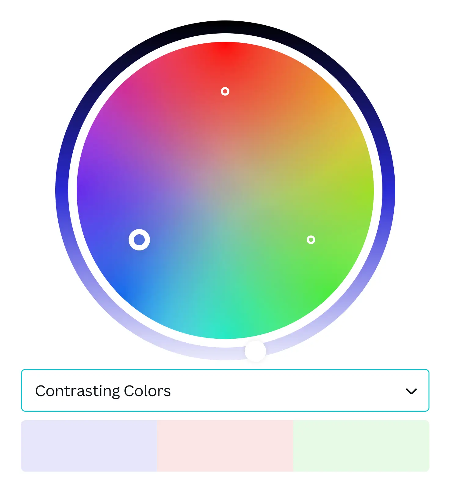
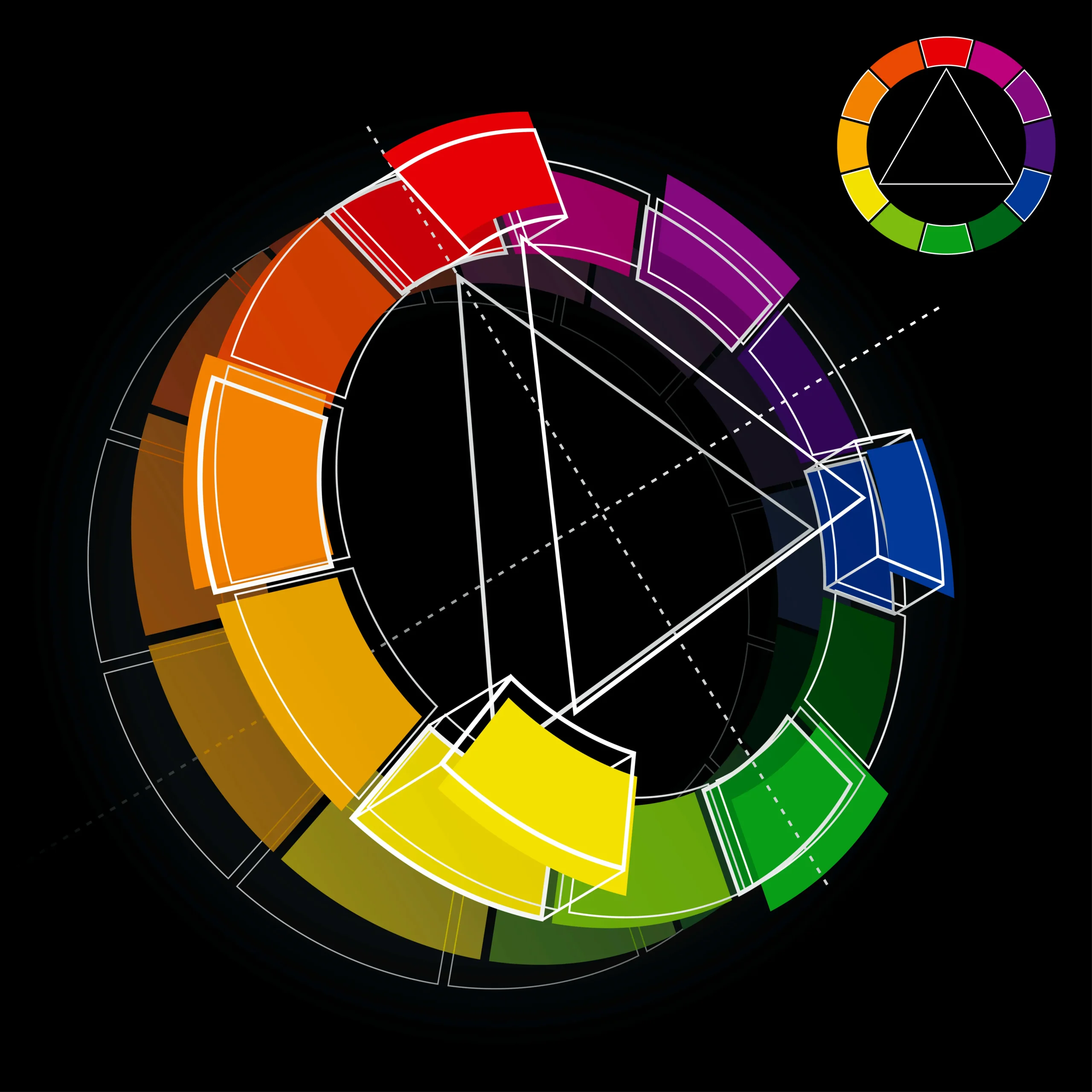
Another color scheme with contrasting colors is to go for a triadic color scheme.
To make a triadic color scheme, think of your base color as one point on an equilateral triangle.
Then, draw out the other two points of the equilateral triangle on the color wheel.
The two other colors of the triadic color scheme are where the other two points or corners of the triangle land.
For lavender, these are light red-orange, and pale light green.
Together, these three colors make a wonderful harmony with one another.
With a triadic color scheme, you do have to keep in mind a good balance between all three colors for the effect to balance out.
Too much of one color can overpower the other two.
Is Lavender Color Warm or Cool?
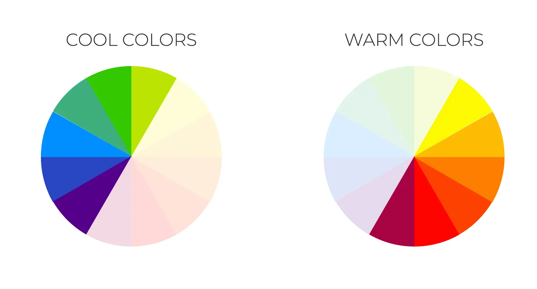
Lavender is a cool color.
Especially if we compare it to lilac, you could say that lilac is a warm shade of light purple, while lavender is a cool shade of light purple.
This is not to say that lavender is especially blue-toned, as that honor belongs more to periwinkle.
Still, generally speaking, in the range of purples, people tend to notice its blue undertones more strongly than its red ones.
A warm shade has more red or yellow than other shades in the same color, giving it red and yellow undertones.
A cool shade uses more blue or yellow than other shades in the same color.
Generally, color temperature is a relative standard more than an absolute one, meaning you have to compare colors to those used around it in context to know whether it will come off as warm or cool.
For lavender, since it leans a bit more towards the blue side, it comes off as a cool color.
Lavender Color Shades
We’ve already covered the names of a few different shades of lavender, but there, the color can be quite versatile.
You can go lighter or darker with the amount of white used, making it very easy to manipulate color.
You can also go redder towards a mauve or more blue towards a periwinkle with minimal effort.
These variations of lavender are very popular, especially for giving it different undertones.
Light Lavender Color
| Color Name | Hex Code | RGB Code | CMYK Code |
| Light Lavender | #e5cffb | 229, 207, 251 | 9, 18, 0, 2 |
Light lavender takes the standard lavender color and adds even more white.
It lends lavender an even more pastel, easter tone, evoking springtime.
It is a bit less saturated than your standard lavender, making it more neutral and muted.
Dark Lavender Color
| Color Name | Hex Code | RGB Code | CMYK Code |
| Dark Lavender | #734f96 | 115, 79, 150 | 23, 47, 0, 41 |
Where light lavender adds more white, dark lavender uses less in the initial mixture.
It evokes a richer purple, connected to royalty and elegance.
This is the closest lavender to a true purple or violet on our list.
Pastel Lavender Color
| Color Name | Hex Code | RGB Code | CMYK Code |
| Pastel Lavender | #d7b4f3 | 215, 180, 243 | 12, 26, 0, 5 |
Pastel lavender is just a bit deeper than light lavender, with a bit more saturation.
It’s a great choice if you’re looking for a strong sense of a lavender color, and need something a bit more subdued than a strong purple.
Lavender Blue Color
| Color Name | Hex Code | RGB Code | CMYK Code |
| Lavender Blue | #ccccff | 204, 204, 255 | 20, 20, 0, 0 |
Lavender blue is a more blue-toned lavender, still holding that lavender core but moving in a much cooler direction.
It is also called periwinkle, named for the flower that shares this color between violet and blue.
Lavender Color Combinations
Lavender can fit into various color combinations or schemes.
The easiest of which is a monochromic color scheme.
A monochromatic color scheme uses variations of the base color through differences in hue, shade, and saturation to bring texture and dynamism to the color space and keep it all harmonized by being the same color.
Neutrals and patterns can be used with a monochromatic color scheme to break it up further and add more texture.
A complementary color combination is also possible.
The complement of lavender is light green, and together they make a kind of pastel easter look.
It’s a popular combination for various light-hearted and soothing events and spaces.
You can also look into lavender’s split complements, which are light yellow and a more true light green.
These are directly adjacent to the complementary color and allow you to add variety to the contrasting colors with lavender.
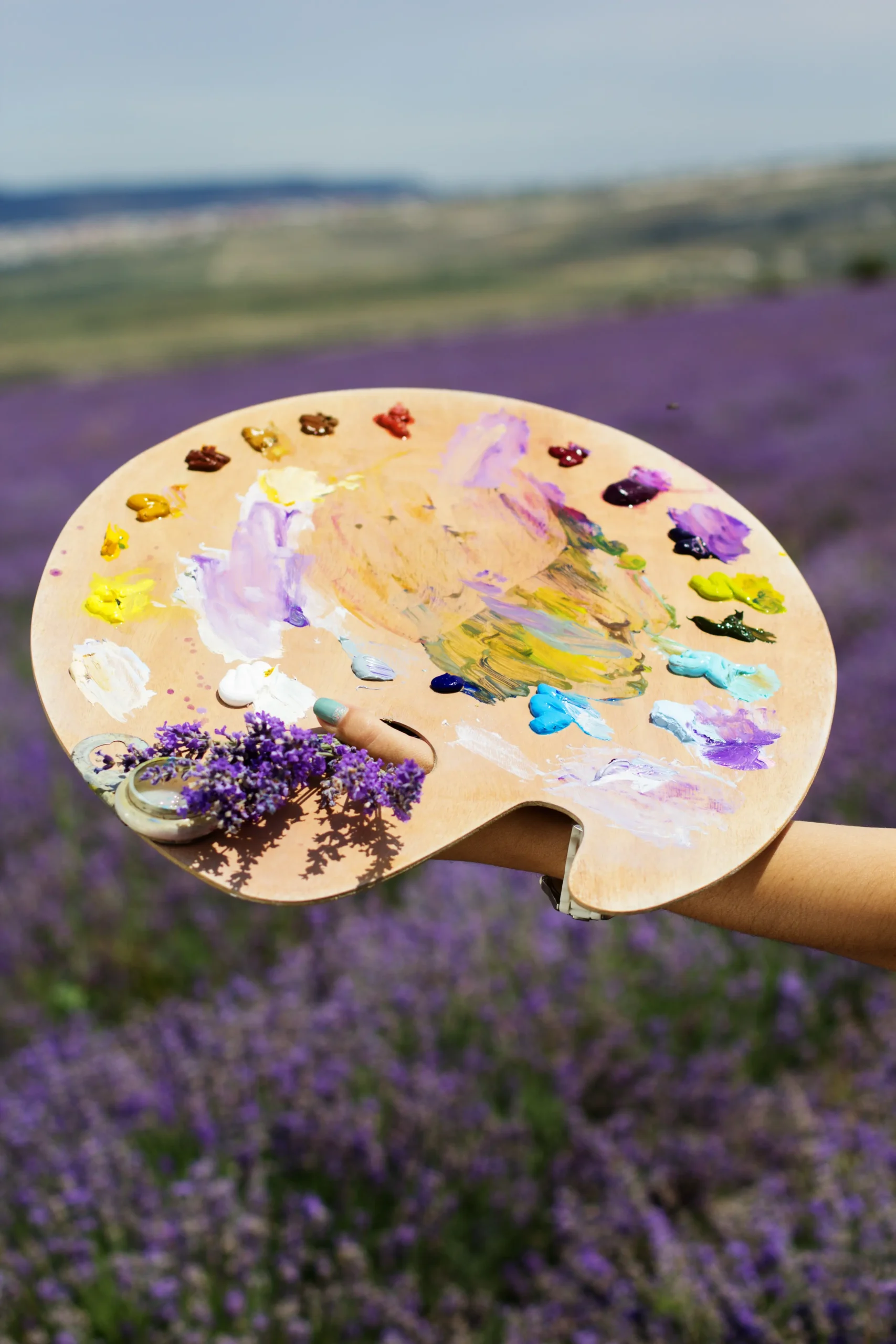
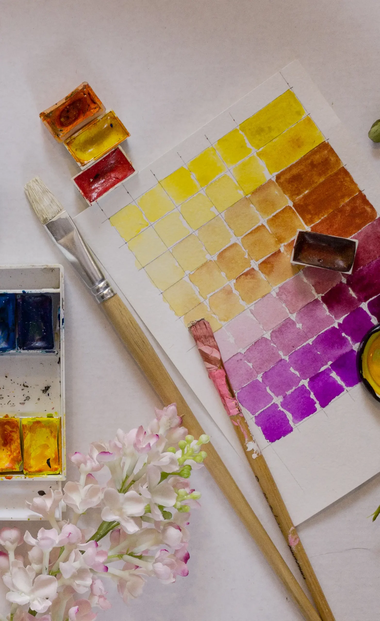
How to Make Lavender Color with Acrylic Paint
Making lavender with acrylic paint is quite easy, but it does take a specific method.
Here’s a simple way to do it:
- Start by making a dark purple out of two parts blue and one part red. We can see that this base is cooler than a more even blend of blue and red, but it doesn’t come out as indigo.
- Then, add one part white to one part of the dark purple to reach a lavender color. This will lighten the purple directly into a lavender.
- Add more white as needed to reach the brightness of lavender you’re looking for.
How to Make Lavender Color with Watercolor
Making a lavender watercolor is not all that different from acrylic.
You’ll want to get your pigments ready and watercolor palette mixer, then follow these simple steps:
- First, add two parts crimson, one part Prussian blue, and one part ultramarine blue. The two blues help to balance the color into the true violet range, but it is possible to use just one.
- Similar to the acrylic paint but with a larger ratio, the trick from here is to add two parts of white to one part of the purple we just made.
- Mix thoroughly and you should get a lavender tone. You can add more white as needed to get the right tone.
How is Lavender Different than other Common Colors
Lavender Color vs Lilac
| Color Name | Hex Code | RGB Code | CMYK Code |
| Lavender | #e6e6fa | 230,230,250 | 8, 8, 0, 2 |
| Lilac | #C8A2C8 | 200, 162, 200 | 0, 19, 0, 22 |
Lavender and lilac are both variations of violet-purple named after the lavender and lilac flowers respectively.
Lavender as a color is more cool-toned, while lilac is more warm-toned.
Sometimes, lavender is used to refer to a wider range of colors that can even encompass lilac.
Still, there is a specific sense to lavender that distinguishes it from lilac.
Lavender Color vs Purple
| Color Name | Hex Code | RGB Code | CMYK Code |
| Lavender | #e6e6fa | 230,230,250 | 8, 8, 0, 2 |
| Purple | #800080 | 128, 0, 128 | 0, 100, 0, 50 |
Lavender is essentially a light or pale purple.
Overall, it lands on the bluer side of purple, whereas a mauve or lilac lands on the red side.
Purple is generally the umbrella term for all the blue-red colors, from indigo through violet to mauve.
Lavender sits somewhere within the violet tones, lightened with some white.
With some more blue tone, it becomes periwinkle.
Lavender Color vs Periwinkle
| Color Name | Hex Code | RGB Code | CMYK Code |
| Lavender | #e6e6fa | 230,230,250 | 8, 8, 0, 2 |
| Periwinkle | #ccccff | 204, 204, 255 | 20, 20, 0, 0 |
Where lilac is the more red-toned version of lavender, periwinkle could be considered the more blue-toned.
Sometimes, periwinkle is also called lavender blue, because it is simply a much more blue-toned version of lavender.
Periwinkle’s blue side stands out, making it a unique, noticeable color.
Lavender Color vs Pink
| Color Name | Hex Code | RGB Code | CMYK Code |
| Lavender | #e6e6fa | 230,230,250 | 8, 8, 0, 2 |
| Pink | #ffc0cb | 255,192,203 | 0, 25, 20, 0 |
Lavender is more of a purple than pink color.
When a red is mixed with lots of white, it makes pink, but when a purple is mixed with white, it becomes lavender.
Pink is often used in interior design and painting but can be an overpowering color.
Lavender tends to suit a wider variety of purposes.
Lavender Color in Interior Design
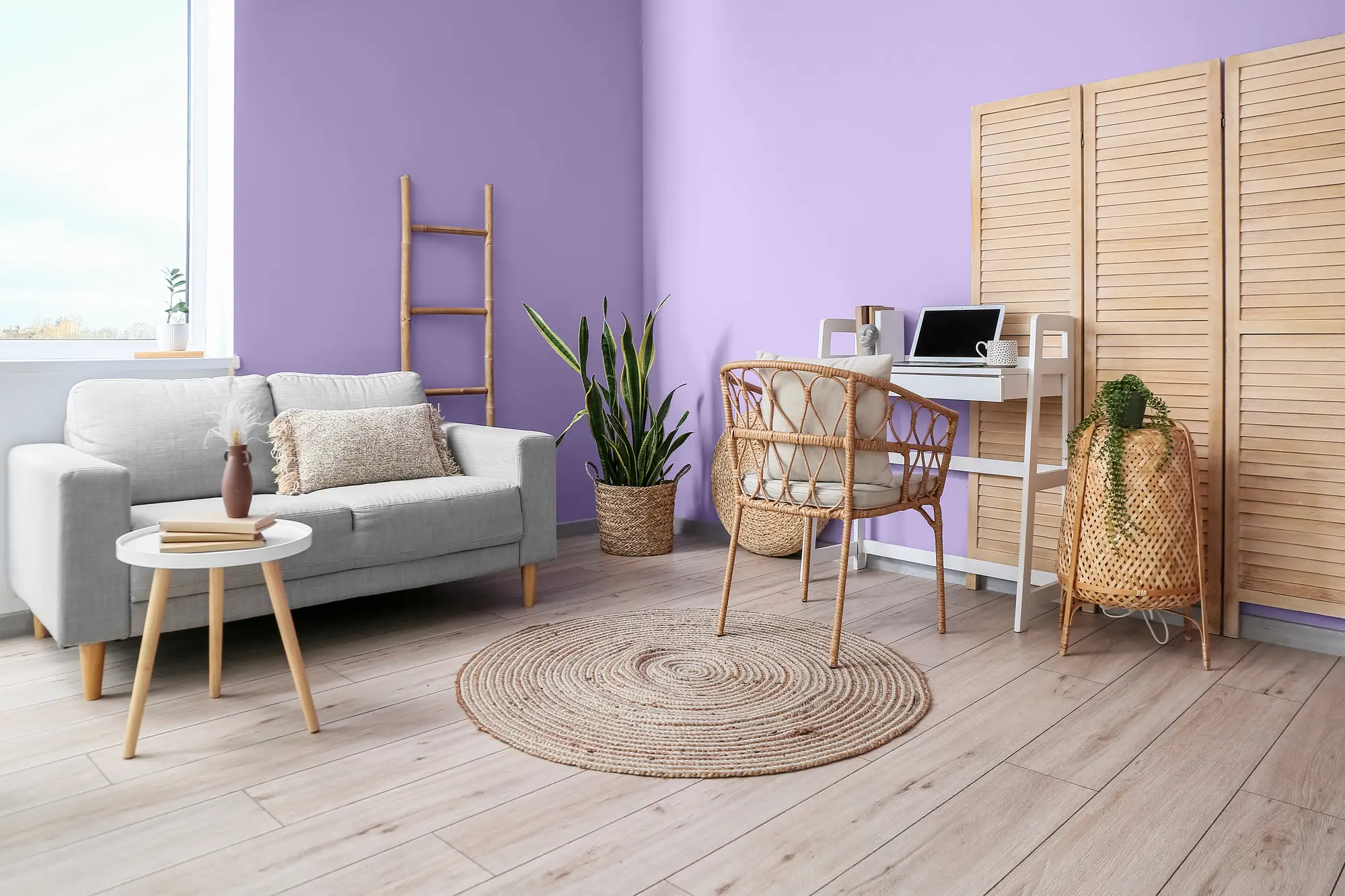
The lavender color is a popular color for nurseries and children’s rooms in interior design.
It is also a wonderful accent color in a wide variety of spaces.
Its somewhat neutral, pale, and calm tone works to create a sense of serenity in almost any space.
Experimenting with color is key to unlocking its full potential.
You can start with the color palettes we’ve suggested above, including complementary, triadic, and monochromatic color schemes.
From there, consider which neutrals would pair nicely with lavender.
We’ve suggested cream, grey, and others, but it depends on the look you’re going for.
Gold is a great metallic to go with lavender, bringing out a nice contrast from each other.
For materials, linens, cloth, and interesting patterns work well with lavender, where hard and rough woods are more of a mismatch, as well as steel and black metals.
Generally, a softer, calmer texture and color space works best with lavender.
Traditional Lavender Design
Creams, whites, pastel blues, and lavender tend to be timeless and traditional combinations.
The soft airiness of these together makes a room feel like it’s floating in the clouds.
It’s a popular choice for weddings.
This combination was common during the victorian era but had never quite lost its charm.
Patterns and wallpapers work particularly well with this aesthetic, as does plush furniture and upholstery.
Lavender Wellness Design
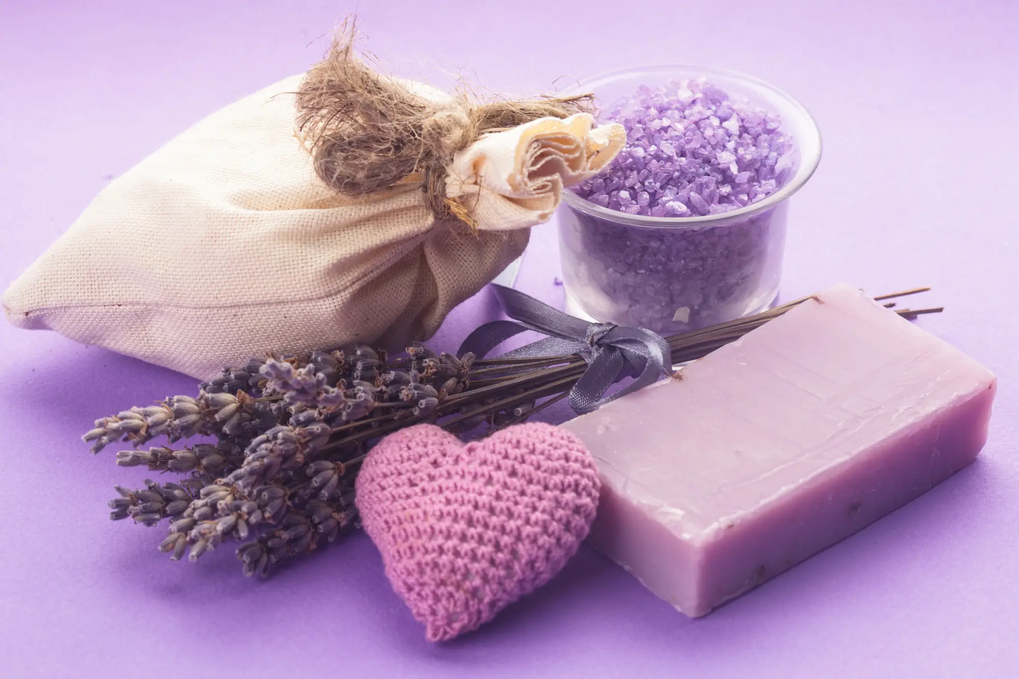
A popular contemporary use of lavender is in wellness spaces, pairing it with very soft woods and minimalist design for a contemplative, soothing design.
This pairs the minimalist aesthetic with a splash of subtle color for a more feminine, healing space.
Other features that work well with wellness design are off-white colors, natural stone, grey tones, and light pinks.
Keeping the aesthetic fresh and airy is important, but grounding it in natural materials close to the earth like stone and softwood helps balance the space.
This is also a place where you can use lavender’s complement, light green, representing nature. A range of greens can work in this kind of design.
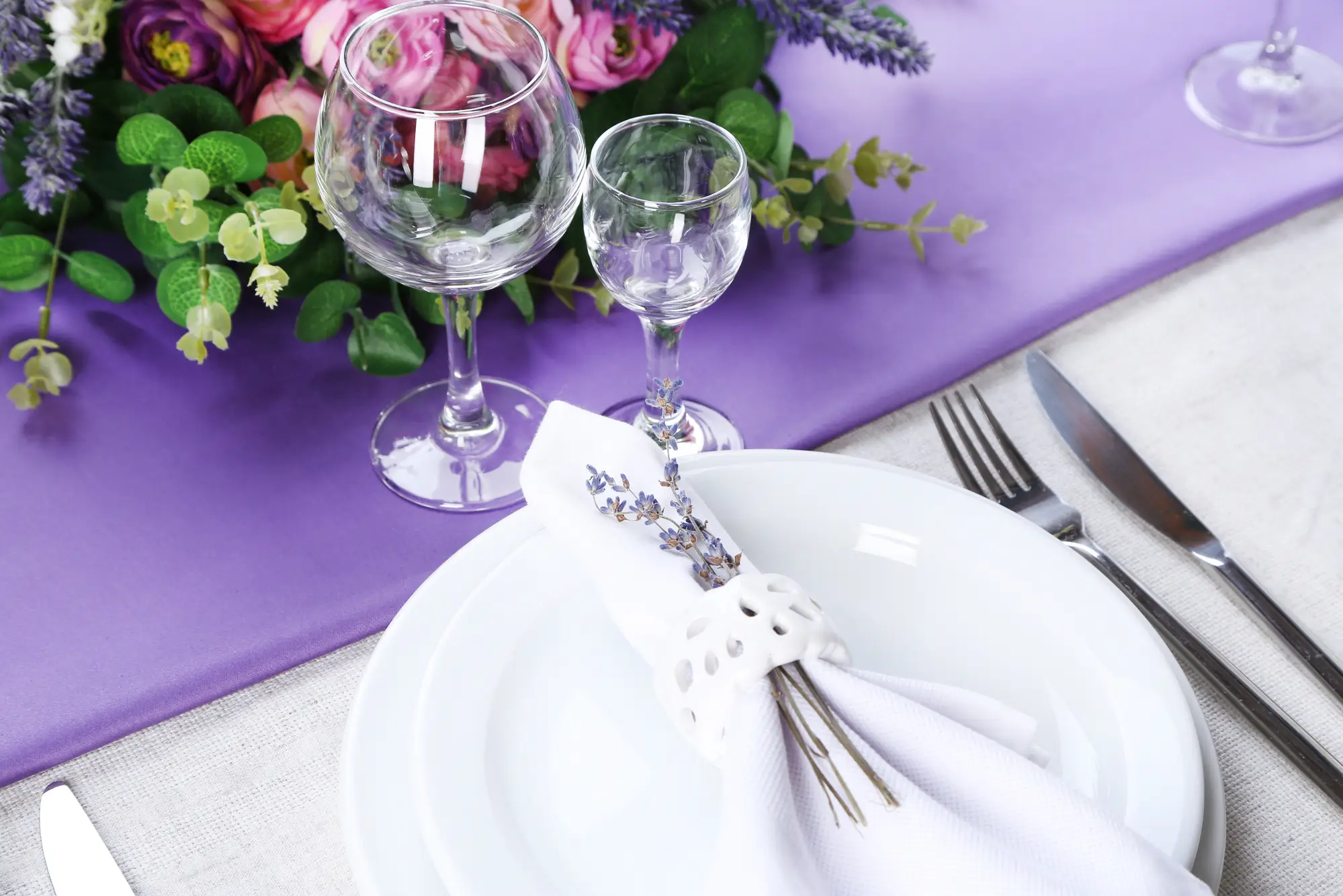
Lavender Linens
Another popular use of the lavender color in modern design is in linens, which can add a pop of color to any room.
Lavender works particularly well as a color for airy, linen items, sometimes more so than as a wall color.
Another great addition is to add darker purples for the pillows or a throw to bring out different layers of purple and violet in a room.
A monochromatic color scheme is a great pairing with this aesthetic.
Conclusion
Lavender is a rich color with a fascinating history, mostly tying back to the flower, but also influenced by the royal and rare history of purple dyes.
The association between lavender and wellness is stronger than ever in the 2020s and helps to give the color a significant meaning.
It’s now commonly used to invoke serenity, healing, and positivity into a space.
That being said, new uses for colors are always on the horizon.
There’s no harm in trying out something new and breathing new light into the color. Let your creativity run wild!
Lavender Color FAQ
What colors go with lavender?
Lavender works best with neutrals, such as off-whites and greys. Its complementary color, light green, also works wonders with pale purple. If you are more adventurous, you could try a triadic color scheme, which uses light yellow and light green in harmony with lavender.
What does lavender symbolize?
Lavender has many meanings from the flower, such as its rich scent and calming properties. But the color itself also has meaning. It also symbolizes royalty, elegance, and religion because of the rarity of purple throughout history. It can also symbolize spring, popular during Easter and Mother’s Day.
What colors make lavender?
Lavender is a mixture of purple and white. Essentially, it’s a light purple. To make purple, you can either begin with a ready-made one or combine equal parts of red and blue.