

If you want a color that works well in a variety of interior design spaces and/or is a great background color for paintings with a lot of green or orange, then use the periwinkle color.
The plant periwinkle gets its name from is also called myrtle herb or Vinca minor.
The periwinkle color has a rich history and special place in color theory.
If you want to know what the periwinkle color is, the best periwinkle color combinations, and how to make it, then get ready to discover more!


What Color Is Periwinkle?

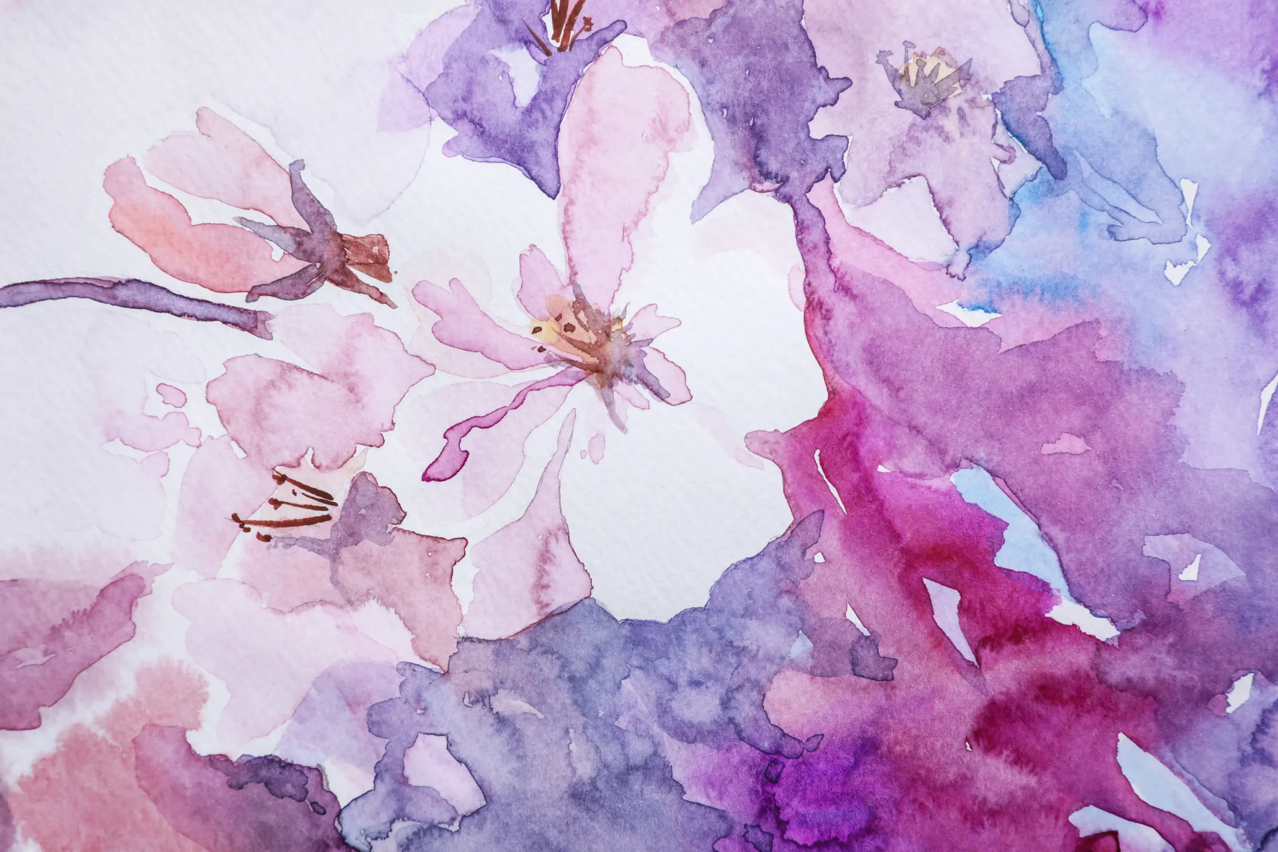
Periwinkle gets its name from the periwinkle plant, whose flower is the color we now know as periwinkle.
Periwinkle lies between a blue and a purple with a pale saturation.
Generally, it’s closest to the color lavender and further away from indigo in the range of purples.
Depending on the exact shade of periwinkle, some people may say it’s called periwinkle blue or lavender-blue.
Sometimes, periwinkle is similar to the color violet, also named after a flower.
Comparing periwinkle to lavender, periwinkle has more of a blue tone, while lavender is more of a straightforward purple.
This delicate color has been used throughout history to add a sense of tranquility and peace.
It is a calming color, commonly used in hospitals, nurseries, and retirement homes for its serene qualities.
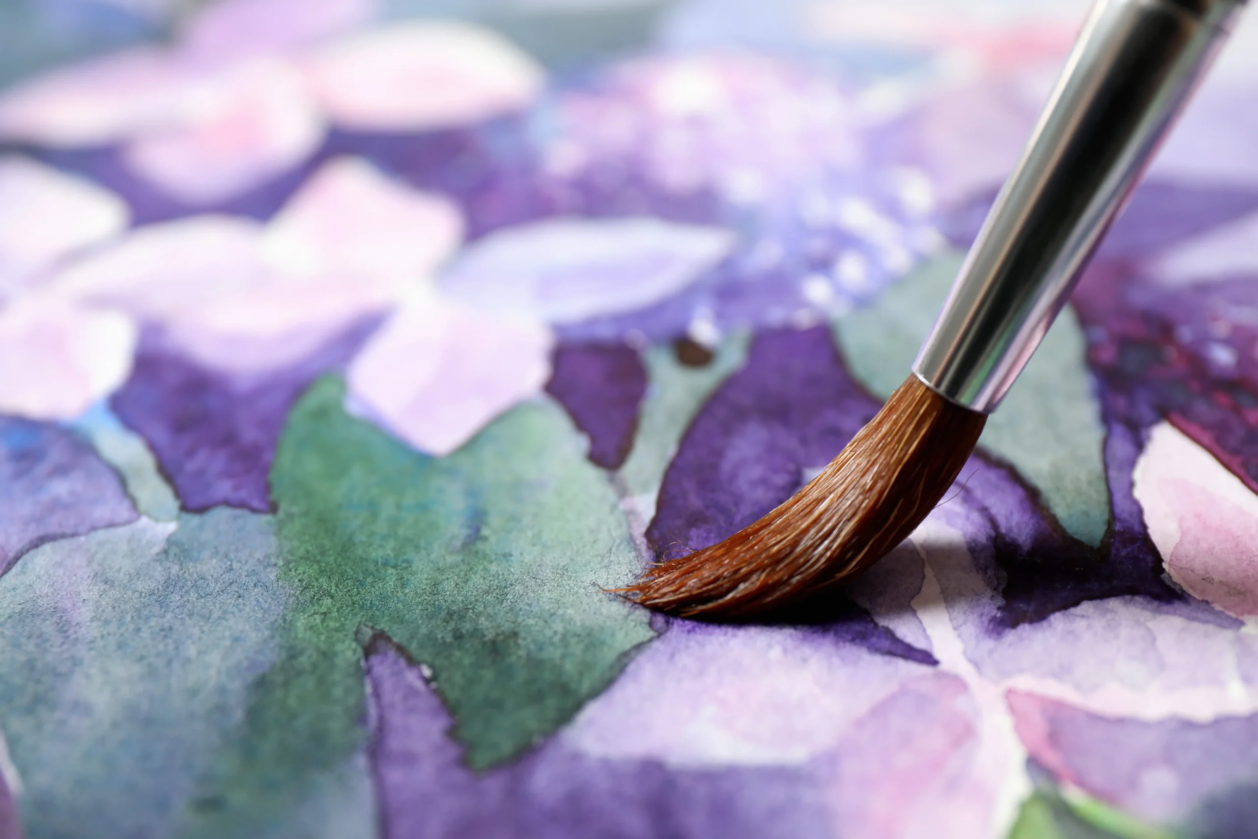
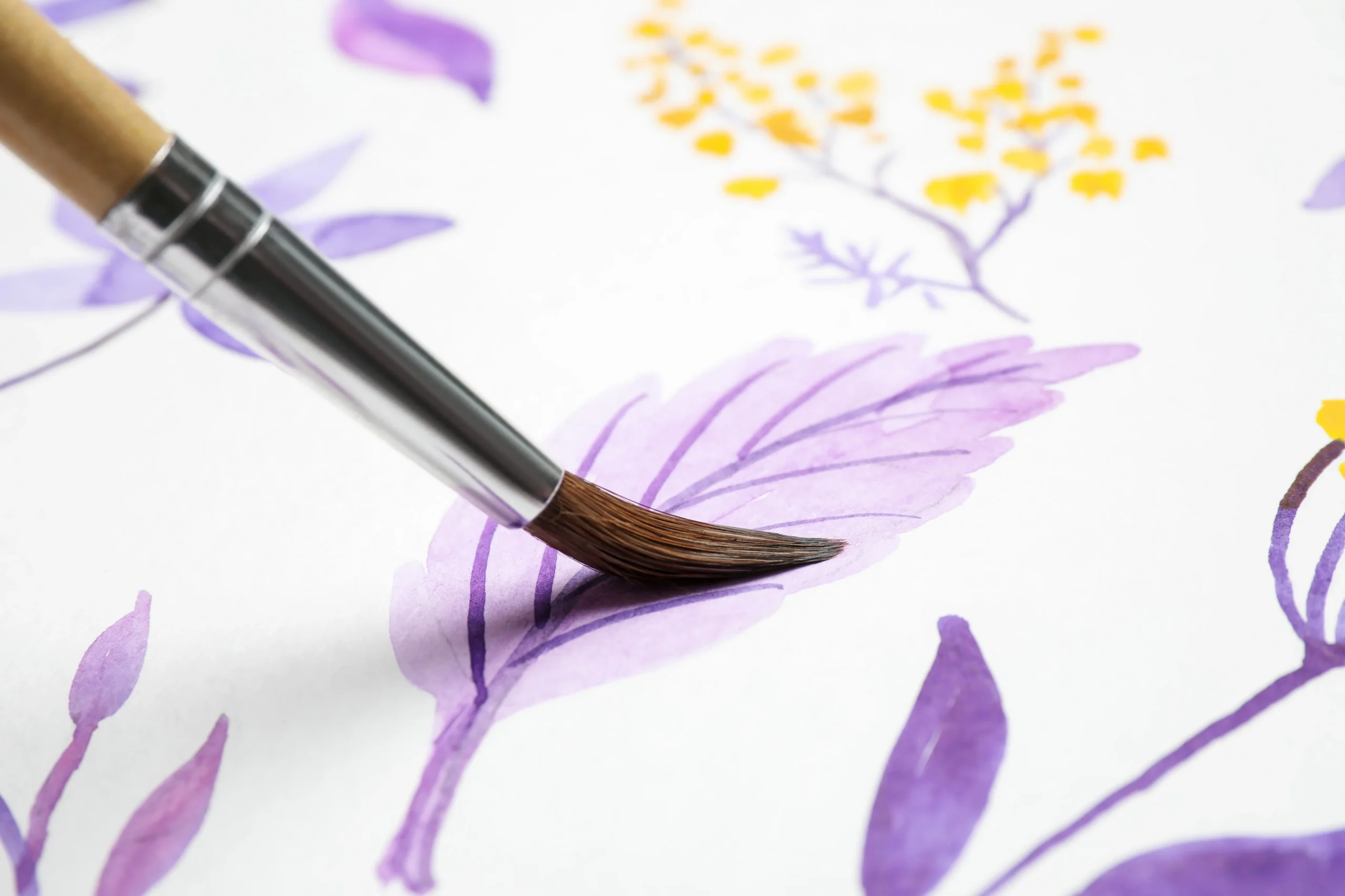
Paired with greens or oranges, periwinkle can be made to soften the background as a pleasant neutral color, giving more vividness to the colors around it.
It’s a color that tends to fade into the background, lending a soft, tender feeling to the subjects around it.
Periwinkle Color Names

Periwinkle goes by many other names, depending on the exact shade.
The name periwinkle itself comes from the flower, also known as Vinca Minor, that blooms in early spring.
It is known for its medicinal properties but is also called the flower of death due to its use in funeral rituals.
Periwinkle plants have small, star-shaped blooms of white to purple coloring, with periwinkle being the average color.
Also called lavender-blue, periwinkle blue, pastel purple, and many other names, the specific point between blue and purple that gives periwinkle its name is a distinctly blue-purple color.
There are countless shades of periwinkle that also have their own unique color names—everything from deep periwinkle, dark periwinkle, light periwinkle, and more.
After 2021, Pantone has attempted to inject a little hope into 2022 with a color that sparks hope, confidence, and creativity.
That color is Very Peri, a vibrant, more violet shade of periwinkle.
It finds itself landing between red, violet, and blue, giving just a hint of red’s passion and eagerness to soar, while still being held back and patient with the calm and deep thinking of blue.
Periwinkle Color History
Periwinkle referred to the plant first, then the color in the first references we have in the early 20th century.
Of course, the color was used broadly by artists before then.
It simply didn’t have the specific name of periwinkle.
The flower came originally from Europe.
Sometimes, the flower would be woven into head garlands for those sentenced to death, hence its nickname of the ‘flower of death.’
The flower has a complicated history because its vines can be poisonous if enough is ingested.
Yet, close cousins to the plant such as Madagascar periwinkle can be used to make lifesaving cancer treatments.
This tradition of being associated with death carried on in the US, where it was planted in cemeteries, and in Italy, where wreaths of periwinkle were made specifically for children who had died.
In Catholicism, the periwinkle is a symbol of the Virgin Mary and represents her absolute love and purity.
This dual connotation of love and death has given periwinkle a rich symbolic history that has many different meanings for different people.
Before its being known as periwinkle, the color was sometimes referred to as fairy’s paintbrush and sorcerer’s violet.
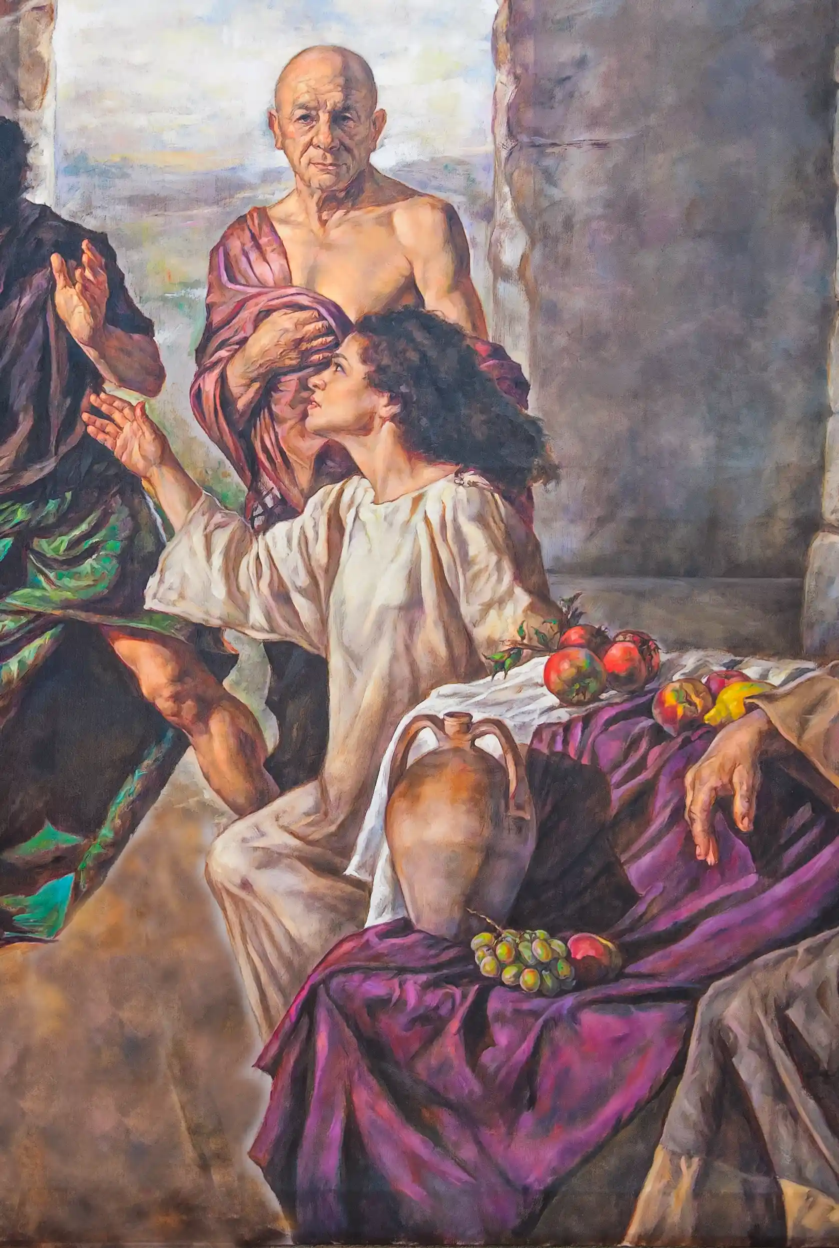
Many famous paintings highlight the color, including works by Monet, Degas, and Renoir.
By the time of the impressionists, the use of violet and periwinkle took on a new meaning and use, from its traditional association with royalty and the wealthy before then.
Its misty, pale, and muddy qualities allowed the impressionists to create beautiful hazy scenes with dusk or pre-dawn light.
In 2022, Pantone named their color of the year “Very Peri” in celebration of the wonderful color.
Their color is a bright periwinkle, which slightly differs from the traditional shade but is a clear nod to its influence.
Periwinkle Color Meaning
Periwinkle has had countless meanings over the centuries, and many are dependent on culture and religion.
In the most general sense for Western cultures, it represents calm, peace, and serenity, perhaps due to its soft lavender undertones.
Its childishness often links it with innocence and childhood friendship, bringing back a simpler time.
Generally, it is considered a more feminine color in the modern age.
Depending on how it’s used, it has connotations of elegance and simplicity.
Furthermore, it evokes a sense of cleanliness and purity, often used in hospitals or similar environments.
Its soothing presence can help with concentration and creativity, as many muted, pastel colors do.
Although within the family of romantic colors like pink and red, the soft, calm nature tends towards friendship and loyalty more than passionate romantic love.
Due to its generally harmless and soothing nature is popular in nurseries, nursing homes, and children’s rooms.
It can add a sophisticated touch to these places.
Psychologists studying the periwinkle color have found that it has an overall calming, positive effect on the mind.
Its muted tones give specific feelings of geniality, lightheartedness, and general optimism.
Therefore, it would also do well in offices and libraries, where these qualities are sought after to create quiet productivity.
Periwinkle Color Theory
To make periwinkle on your own, you’ll want to learn some color theories to mix it.
This is especially useful when trying to vary the shades of periwinkle you’ll be using.
Maybe you are looking for a darker periwinkle, more pastel, or more lavender.
Start with red and white to make a pink base color.
This provides the pastel shading for the base.
Then, begin adding light blue until it becomes a lavender purple color.
You’ll know you’ve gone too far with the blue when it starts looking like a cornflower or sapphire blue.
Once you have your lavender, add some violet or more blue or red to adjust to the proper periwinkle shade.
Too much violet will create a deep eggplant color, which can be fixed with more white.
This combination of red, white, and slightly more blue should bring you to the periwinkle range.
Too much red or violet, and your color will tend towards an aubergine, while too much blue will tend towards a sapphire blue.
Correct with the other two colors if you’re gone over the line.
Complementary Colors
Complementary colors refer to the opposite color on the color wheel.
They complement one another through their contrast, each highlighting the other.
Pale yellow is the complement of periwinkle.
On each side of that color are the split complementary colors, which can add depth and dimension.
For periwinkle, these are mint green and light peach color.
You can use complementary colors to create a nice color scheme around periwinkle, called a complementary color scheme.
That means using periwinkle and pale yellow, and you can throw in mint green or light peach if you like.
Complimentary color schemes bring out the color to its full potential by having our eyes bounce from it to its furthest contrasts, giving dimension to each other.
Contrasting Colors
Contrasting colors refer to the complimentary and the split-complimentary shades of a color.
These create an energetic contrast to your main color.
For periwinkle, that ranges from mint green through pale yellow to light peach.
Using these and periwinkle in the same piece will get rich results.
The blue within periwinkle gives one more alternative for contrasting colors if one changes the exact shade used.
The more blue one goes, the greater the amount of orange one can use as a contrasting color.
Blue and orange are one of the classic contrasting color combinations, giving rise to vivid imagery.
With a soft periwinkle, a bright orange can make a powerful contrast.
Other colors that work within the same field of contrasting colors include seafoam green, mimosa yellow, and apricot.
Is Periwinkle a Warm or Cool Color
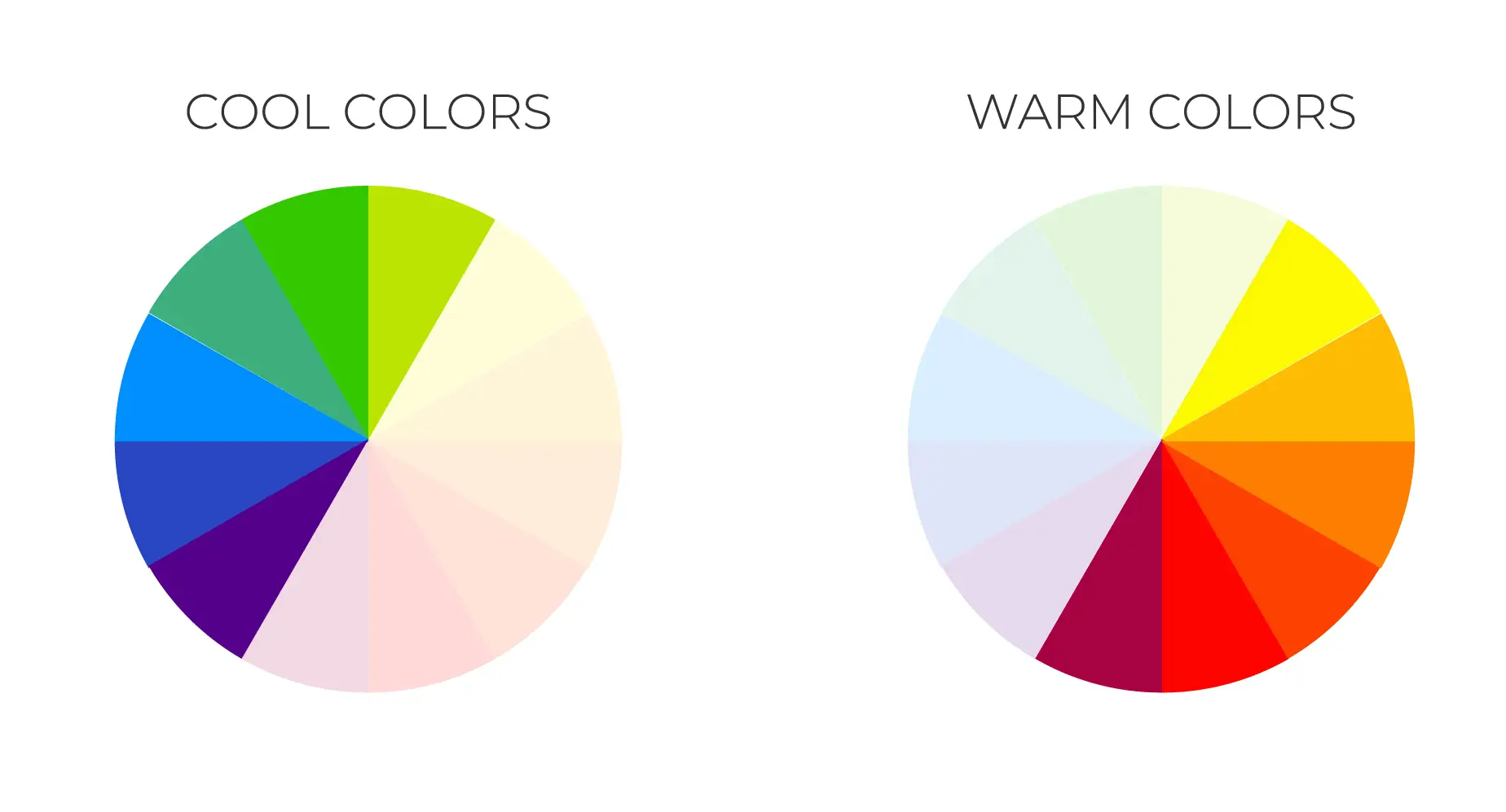
Warm colors tend to have more yellow or red than blue within them, while cool colors tend to have more blue or yellow than red.
Periwinkle is on the cool side, being made primarily of purple and blue.
The more blue, the cooler the periwinkle.
The more red on its purple side, the warmer it gets.
The softness of periwinkle makes it harder to see the full range of its coolness, but when paired with a bright, warm color like orange, the contrast is plain to see.
Shades of Periwinkle

There are many variations in shades of periwinkle that give off different moods.
You can move it from a vibrant, saturated, and bright color, all the way to a subtle, neutral, pastel one.
Generally, people see true periwinkle, hex code #8e82fe, as slightly richer and brighter than expected.
Hex code #ccccff, called lavender blue, tends to define most people’s normal association with periwinkle.
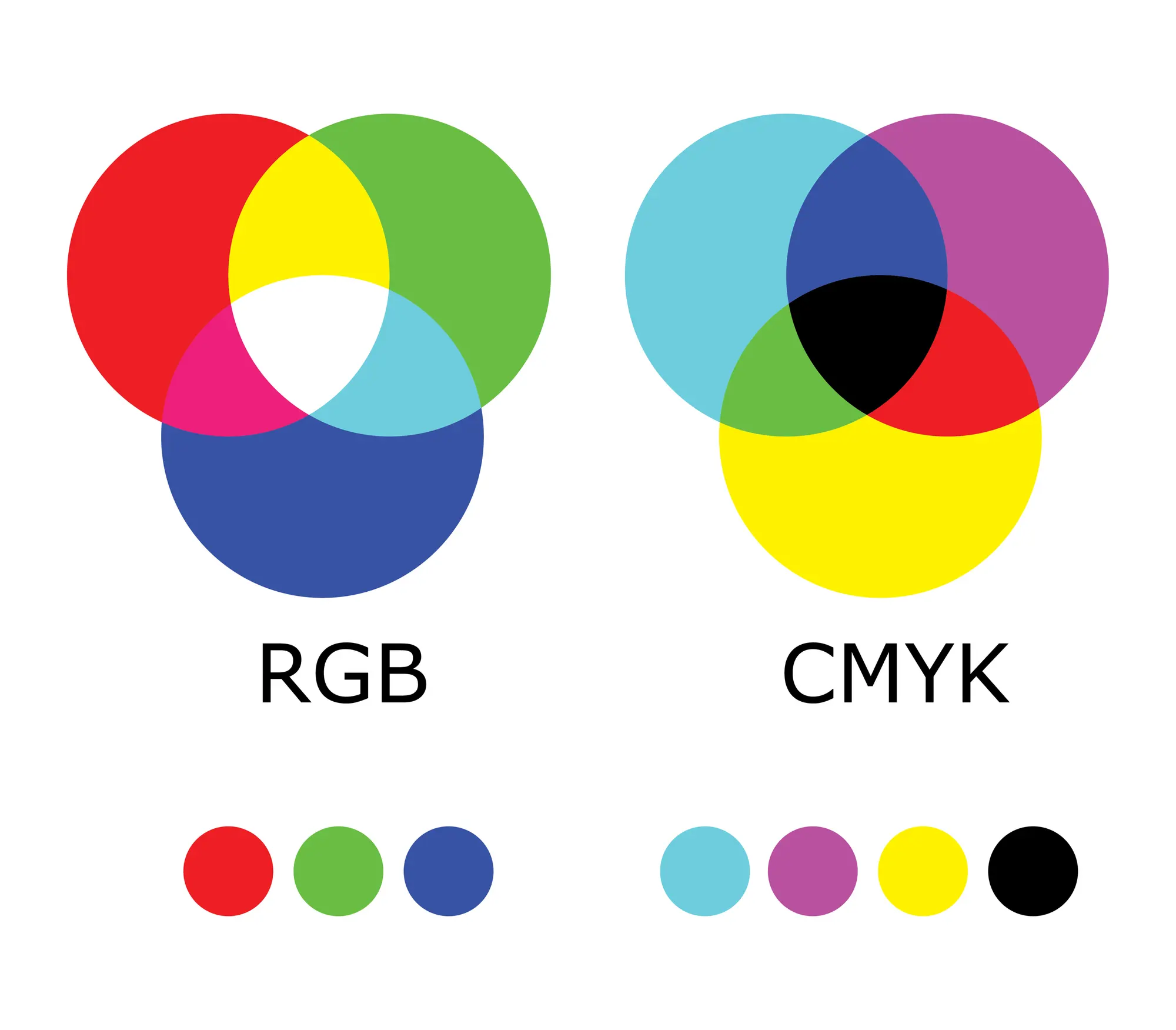
All colors have a hex code representing their color in the RGB (Red, Green, Blue) color space.
You can also use the RGB Code or CMYK (Cyan, Magenta, Yellow, Black) code to represent a color.
We’ll go through different variations on periwinkle and see how they compare, providing you with each of their respective color codes.
True Periwinkle
| Color Name | Hex Code | RGB Code | CMYK Code |
| True Periwinkle | #8e82fe | 142, 130, 254 | 44, 49, 0, 0 |
This is probably the most vibrant true periwinkle shade.
It may seem a bit too dark to some persons’ eyes, as periwinkle is often associated with a more pastel color.
However, true periwinkle fits the bill in terms of a well-saturated blue-purple.
Deep Periwinkle
| Color Name | Hex Code | RGB Code | CMYK Code |
| Deep Periwinkle | #7c83bc | 124, 131, 188 | 24, 30, 0, 26 |
Deep periwinkle is somewhere between a darker and richer periwinkle.
It adds an unexpected depth to the color that can add dimension and saturation to the otherwise pale background color.
Dark Periwinkle
| Color Name | Hex Code | RGB Code | CMYK Code |
| Dark Periwinkle | #665fd1 | 102, 95, 209 | 51, 55, 0, 18 |
Dark differs from deep in that it adds no saturation to the shade but only a darker color.
It is more violet than most periwinkles, leaning it closer to indigo.
The dark, in particular, comes from a deeper black tone within the shade.
Light Periwinkle
| Color Name | Hex Code | RGB Code | CMYK Code |
| Light Periwinkle | #c1c6fc | 193, 198, 252 | 23, 21, 0, 1 |
Light periwinkle is similar to lavender blue in that it rests closer to the pastel coloring expected of periwinkle than true periwinkle.
It is equal parts blue and purple, which a strong balance of white.
Periwinkle Gray
| Color Name | Hex Code | RGB Code | CMYK Code |
| Periwinkle Gray | #c3cde6 | 195, 205, 230 | 15, 11, 0, 10 |
Periwinkle gray is a silvery blue-purple that goes well with color schemes and other shades.
If you want something more neutral, look no further.
You can consider it an unsaturated shade of periwinkle.
Lavender Blue
| Color Name | Hex Code | RGB Code | CMYK Code |
| Lavender Blue | #ccccff | 204, 207, 240 | 15, 14, 0, 6 |
For many people, Lavender Blue might be considered the most ‘real’ periwinkle color.
Its pastel coloring has come to be highly associated with the color.
Sometimes this is called ‘lesser periwinkle’ due to its lighter tone than true periwinkle.
Very Peri Blue
| Color Name | Hex Code | RGB Code | CMYK Code |
| Very Peri Blue | #8f99fb | 143, 153, 251 | 43, 39, 0, 2 |
Very peri blue is Pantone’s color for 2022 and favors the blue side of a true periwinkle.
If you’re looking for a periwinkle with a bit more presence, very peri is the perfect compliment.
Creating Shades of Periwinkle
Different paints will, of course, have different blending techniques for mixing the paint. Your first option is often to just buy periwinkle straight from a tube, but this isn’t always the case for all types of paint, and may not be practical economically.
- Mix two parts ultramarine blue and a ½ part red as a base to blend your own periwinkle.
- Then, add two parts of titanium white to get the pale aspect. This should get you close to a true periwinkle.
- You can add more white, blue, or red to adjust to the exact shade of periwinkle you’d like.
- Mix slowly, careful adding more drops of color to reach the desired shade.
You’ll know you are leaving the periwinkle range with too much blue when you reach a cornflower blue color.
On the other hand, too much red will lend your periwinkle to an eggplant color.
Periwinkle Color Combinations
In color theory, there are three main ways to create a powerful color scheme using a central color.
In this case, Periwinkle.
The first is monochromatic. In this color scheme, you take the main color, periwinkle, and find a few variations of its tone.
This might mean indigo, violet, purple, or any of the above variations on periwinkle.
By using slight variations of the same color, you can create different shades of tone, which can look like highlights and shadows.
This looks smooth to the eye and pleasing.
The second is using complimentary colors.
The compliment of periwinkle is pale yellow. Together, they create a vibrant yet eerie presence.
You can also use the colors beside the compliment, called the split complements.
These are mint green and light peach.
A combination of all these colors will set off periwinkle as a soft neutral.
The third is using triadic colors. Using a color wheel, make an equilateral triangle instead of finding the opposite color to your primary color.
For periwinkle, this triangle’s other two vertices land on seafoam green and pale orange.
Combining these three colors creates a powerful palette that continuously harmonizes the three.
Colors that Work with Periwinkle
Navy
| Color Name | Hex Code | RGB Code | CMYK Code |
| Navy | #000080 | 0, 0, 128 | 100, 100, 0, 50 |
Navy works well with a monochromic periwinkle palette.
It brings out the blue in the periwinkle while still revealing the periwinkle’s purple side due to the contrast.
It is such a dark, rich blue also gives a nice contrast to the soft, pale tone of periwinkle.
Pale Yellow
| Color Name | Hex Code | RGB Code | CMYK Code |
| Pale Yellow | #FFFFA7 | 255, 255, 167 | 0, 0, 35, 0 |
Pale yellow is the true complement of periwinkle.
Still, they make a natural fit together and the contrast stands out to highlight the best of each color.
Other yellows can work too for a difference in saturation as well as color.
Mint Green
| Color Name | Hex Code | RGB Code | CMYK Code |
| Mint Green | #3eb489 | 62, 180, 137 | 66, 0, 24, 29 |
Mint green is one of the split complements of periwinkle and light peach.
These two can provide variety to a complementary color palette when working with periwinkle.
It’s such a light and fresh color as well, complimenting the vibe of breezy calm that periwinkle gives off.
Light Peach
| Color Name | Hex Code | RGB Code | CMYK Code |
| Light Peach | #ffe5b4 | 255, 229, 180 | 0, 10, 29, 0 |
Light peach or salmon can be a strange color to work with, but complements periwinkle quite nicely.
The pale, fresh color gives off a tone of morning light when paired with periwinkle.
Silver
| Color Name | Hex Code | RGB Code | CMYK Code |
| Silver | #c0c0c0 | 192, 192, 192 | 0, 0, 0, 25 |
Silver looks good with cool colors, and periwinkle is no exception.
Using chrome, stainless steel, or silver together with periwinkle in a room complements each other nicely.
How to Make Periwinkle Color
- Starting with a white base on your palette, you can mix in equal parts blue and red to get the initial blend of light purple.
- Then, add slightly more blue paint until the color appears as periwinkle.
- If it seems too saturated, you may need more white paint. You can also add purple directly if that’s more convenient for you.

Another method is to start with a white base and first and then add red to get pink.
After that, add small amounts of blue until you get a periwinkle.
Adjust as needed.
Always add your colors in small increments to control the color produced in either case.
If you go overboard with one color, you’ll have to compensate with all the others, which is more difficult.
A helpful tip is to start with a swatch of the exact shade of periwinkle you are trying to color match.
Using this as a guide, start with your base, add color, and mix until it matches your swatch.
If the color gets too dark or saturated, add more white to keep that pastel tone.
How is Periwinkle Different than other Common Colors
Periwinkle finds interesting contrasts on the color wheel.
Typically, when you look at complementary colors on the opposite side of the color wheel, they look great when paired with said color.
Periwinkle’s complement is pale yellow.
Belonging to the indigo family of colors, its beauty is timeless.
The delicate, pale indigo is perfect for adding a sense of tranquility to any art piece or interior.
That’s why professional artists and interior designers are so often used for this purpose.
So, if you’d like a sophisticated look, you can pair periwinkle with gold accents.
A bright lemon yellow creates a bold contrast for a more modern look, while a mustard yellow creates a more rustic tone.
One of the split complement sides, you can go for a vivid green or a vibrant orange to add variety and contrast to the pale periwinkle.
Its blue undertones will balance those other shades delicately.
The many choices of pairing give periwinkle a lot of versatility.
When comparing periwinkle to other purples, its two distinctive features are its pale tone and its bluish hue.
Compared with lavender, indigo, and violet, there is more of a distinct blue tone and generally a more pale saturation.
Periwinkle Color vs Lavender
| Color Name | Hex Code | RGB Code | CMYK Code |
| Periwinkle | #8e82fe | 142, 130, 254 | 44, 49, 0, 0 |
| Color Name | Hex Code | RGB Code | CMYK Code |
| Lavender | #e6e6fa | 230, 230, 250 | 8, 8, 0, 2 |
The main difference between periwinkle and lavender is the amount of blue.
Lavender is more of a pure pale purple, while periwinkle is a bluish pale purple.
You can see the difference in the two colors when comparing a periwinkle flower and lavender the plant.
Lavender, the color is named after the flower of the same name. It is a slightly lighter shade of purple.
Like periwinkle, lavender is known for being more associated with its blue side than its red side, making it slightly cooler.
Lilac is another color in the lavender family with a slightly pinker tone.
Periwinkle Color vs Cornflower Blue
| Color Name | Hex Code | RGB Code | CMYK Code |
| Periwinkle | #8e82fe | 142, 130, 254 | 44, 49, 0, 0 |
| Color Name | Hex Code | RGB Code | CMYK Code |
| Cornflower Blue | #6495ED | 100, 149, 237 | 58, 37, 0, 7 |
Cornflower blue differs from periwinkle in terms of the amount of blue vs. purple and its deeper color.
Periwinkle is paler and more purple than cornflower blue, containing a greater amount of white.
Cornflower blue is more of a straightforward medium to light blue.
It is a popular shade for its natural color, somewhere between sky and ocean.
Vermeer used the color extensively in his realistic paintings, mixed by himself using powdered lapis lazuli. It is the color of the turban in The Girl with a Pearl Earring.
You get the color when you overmix your blue when making a periwinkle.
It symbolizes fertility and reanimation, a magical cornflower being the plant that is said to have healed Achilles in Ancient Greek Mythology.
Periwinkle Color vs Mauve Color
| Color Name | Hex Code | RGB Code | CMYK Code |
| Periwinkle | #8e82fe | 142, 130, 254 | 44, 49, 0, 0 |
| Color Name | Hex Code | RGB Code | CMYK Code |
| Mauve | #e0b0ff | 224, 176, 255 | 12, 31, 0, 0 |
Mauve is more purple than periwinkle, being similar to lavender but even paler.
Periwinkle is more of a pale blue-purple, whereas mauve is a more pure pale purple.
Mauve comes from the French ‘malva,’ meaning mallow flower.
First discovered in 1856, it revolutionized the fashion world by the 1890s, going so far as to be called the “Mauve Decade.”
Perhaps because of this, it is now associated with nostalgia and sentimentality.
Symbolic Meanings of Periwinkle
1. Friendship
More than romance, periwinkle is associated with friendship above all in terms of relationships.
It represents the tempered strength of a long-held bond.
Periwinkle can strengthen a new friendship or solidify an old one.
If you’re interested in deeply appreciating a friendship, periwinkle can be a sign of that.
2. Innocence
Periwinkle is a color devoid of conflict, remaining in its sweet childhood innocence.
It’s an anti-cynical color, optimistic, giving a fresh start and a chance at life.
Periwinkle is a great choice if you’ve grown skeptical about everything and need to see things with new eyes.
3. Femininity
Periwinkle is a feminine color, simple and clean.
Its paleness makes it hard to relate to bold masculinity but it lays back and remains refined.
Due to its simple femininity, it is beloved by many as a color to retreat into without judgment.
It adds an air of elegance, different from a retreat into nature, reminding us of the pastel rebirth of Easter.
4. Lighthearted
Carefree and optimistic, periwinkle is for those who don’t want to take life too seriously.
It reminds us not to sweat the small stuff.
You can handle them patiently, with calm understanding when there are problems.
The peacefulness of periwinkle helps with that.
Therefore, to take life breezily, periwinkle is a beautiful color.
5. Productive
Unexpectedly, periwinkle can also be a productive color, not letting anything stand in its way.
It doesn’t waste time with distractions or worries, and in its sanctuary of peace, is able to get things done methodically.
Periwinkle sees these as senseless extras, letting negativity and passions swirl around them.
If we want to stay on track, a simple, deliberate approach led by hope is best.
6. Everlasting Love
Gifting periwinkle signifies everlasting affection, going beyond death or passion.
It is a sweet, innocent, and unconditional love, tempered by true feelings emerging through the calm of a serene mind.
It is about compassion and endearment, timeless and infinite love.
Periwinkle is loving with one’s whole heart.
7. Absentminded
Sometimes, periwinkle’s innocence moves into the territory of the carefree and careless.
Being easygoing is good, but sometimes it can lead to forgetting the essential things.
In this way, periwinkle can be a bit reckless.
There’s also a sense that one might avoid responsibilities to maintain a sense of calm and serenity, not to get themselves too stressed out.
8. Purity
Periwinkle has such a strength of character and independence that it doesn’t let impurities mess with it.
It preserves its own internal integrity above all else.
Never yielding to temptation makes serenity and care look easy.
This resilience and clear nature gives it its unyielding innocence, not giving in to immorality.
Rather than give in to impulses, periwinkle remains true to its core values.
Periwinkle Color in Interior Design

Periwinkle has a reputation as a feminine color due to its prevalence in wedding schemes and other places with a feminine touch.
However, used carefully, it can add dimension to many interior design spaces, masculine or feminine.
The color is calming and fresh, becoming a pale, neutral color in many different contexts.
In recent years, it has become a popular choice in many homes.
It’s most suited for nurseries and women’s bedrooms, but can be used just about anywhere, including the living room and kitchen.
The combination of energy and calm it gives off is always pleasant.
As a Wall Paint
As a paint color, periwinkle can add a bit of sophistication to a room.
Consider pairing it with blue and white furniture and accents for an overall calming effect.
Add some patterns to break up the textures of the room, and you should get a balanced look.
Periwinkle often works best as an accent wall, but a light periwinkle can be used for all the walls in a room without overwhelming the space.
Bathrooms especially are a great place for a periwinkle wall color due to their fresh and soapy feeling and soothing undertones.
Periwinkle Accents
If periwinkle walls feel a bit too bold for you, you can go for accent pieces and accessories.
These enhance a space by adding a pop of color, and you can control almost the exact amount of periwinkle you’ll get in a room.
For example, you can add a periwinkle throw pillow to a couch, a vase to a table, or a painting with periwinkle within it to a wall.
Perhaps the easiest ways to introduce a decent amount of color is through bedding, pillows, and lamps.
Adding decorative pieces on top of shelves or side tables is another easy way to incorporate more colors into your design.
A periwinkle candle or knick-knack can go a long way to adding life to a room.
Metallic accents make a great choice with periwinkle, giving it a sophisticated, elevated look.
A stripe of periwinkle color on a piece of furniture can also can a splash of color in a room.
When to use Periwinkle Paint at Home
There are a few factors to take into consideration when choosing to use periwinkle paint.
First, get some paint swatches with different variations of periwinkle on them and bring them into the home.
Make sure to test them under different lighting conditions to see how you like them.
Then, try a square of at least a couple of different colors on the wall to see how it really looks.
You can skip this step, but seeing color in real coordination with a room is the best way to know if it’s for you.
You’ll also want to consider whether it will be matte paint, or whether it will be glossy, or semi-glossy. Gloss and semi-gloss can withstand greater amounts of marks, stains, and scuffing.
Conclusion
Periwinkle only got its name in the 1920s, but the color has had a major impact on the history of art and design for centuries before that.
The way the impressionists took up the color as one of the dusk, water at dawn, and certain flowers have stuck in the minds of artists.
Today, the color is being celebrated by Pantone and given its day in the sun.
Periwinkle’s place between blue and purple is an often neglected section of the color wheel, not appearing as its own distinct range of colors to some people.
We’ve now seen just how versatile and distinct periwinkle really is.
FAQ – Periwinkle Color
Is the periwinkle color purple or blue?
Periwinkle is between purple and blue, usually seen within the purple family. Periwinkle can be considered a purple that leans on blue, but the debate still goes on for many people. It’s perhaps easiest to consider it truly between blue and purple, giving it its own color identity.
What color goes with periwinkle?
Periwinkle goes well with other purples and blues, making for a monochromatic yet varied color scheme. Alternatively, one can go for a pale yellow to complement periwinkle, which is its natural complementary color.
Finally, the triadic color scheme of periwinkle gives seafoam green and pale orange as the other points on its color triangle. A balance of these three colors will make a good color scheme.
What does periwinkle symbolize?
Periwinkle has a rich history stemming from the flower from which its name originates. It is associated with hope, faith, innocent friendship, and calm. Today, it is often used as a peaceful color for its cool, serene feeling.
There are many other meanings gathered around the color from its association with the Virgin Mary, funerals, and the dual properties of medicine and poison from the plant.