
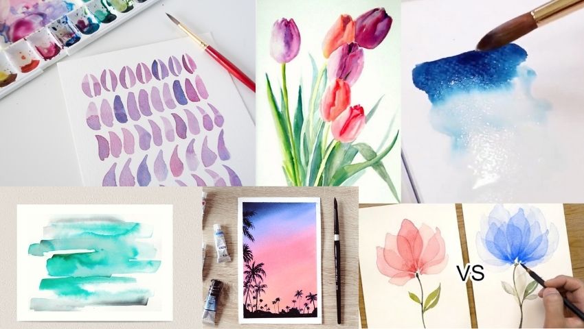
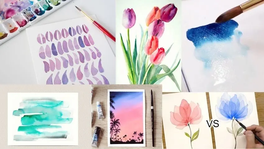
Do you want to paint with watercolors but don’t know how and where to start? Here are 55 easy watercolor painting ideas for beginners.
Moreover, you will explore new and different techniques in watercolor that will make you a pro in no time!
There are many basic techniques and watercolor tutorials that will help you get different results.
Essential Materials You’ll Need
- Watercolor paper (140 lb / 300 gsm, cold‑press, 100 % cotton if possible): Thick, slightly textured sheets prevent buckling and let pigment flow naturally.
- Paint palette or mixing wells: A white plastic or ceramic palette with deep wells makes it easy to judge color strength and mix clean washes.
- Watercolor paints: Begin with a small set of artist‑ or good student‑grade tubes or pans (at least primary yellow, magenta, cyan, plus burnt sienna and ultramarine) for flexible color mixing.
- Brushes: Round sizes 4–8 for general work, a 1″ flat for washes, and a small detail liner; synthetic or natural sable blends both work for starters.
- Water containers (two jars): One for rinsing dirty brushes and one for clean water keeps colors bright.
- Masking tape or washi tape: Secures paper edges to a board and leaves crisp white borders.
- Optional extras: Pencil and kneaded eraser for light sketching, masking fluid for reserving highlights, a spray bottle for re‑wetting paints, and paper towels or a clean cloth for blotting.
Watercolor Basics Refresher
- Washes (flat & graded): Load a large brush with diluted pigment and move in even horizontal strokes for a flat wash; tilt your board and add clear water as you go for a smooth light‑to‑dark graded wash.
- Wet‑on‑wet: Apply clear water to the desired area first, then drop in color. Paint blooms outward in soft, blurred edges—perfect for skies, florals, and abstract effects.
- Wet‑on‑dry: Paint directly onto dry paper for sharp‑edged shapes and controlled details. Layering multiple wet‑on‑dry passes builds crisp textures (e.g., tree branches, lettering).
- Layering & glazing: Once a layer is bone‑dry, brush a transparent tint over it to deepen values or shift hue. Glazing keeps earlier strokes visible while adding richness.
- Lifting: While paint is still damp, dab with a clean, lightly damp brush or paper towel to lift pigment and create quick highlights (cloud edges, reflected light).
- Hard vs. soft edges: Controlling moisture at the boundary between shapes decides whether edges stay crisp (dry paper) or blend smoothly (pre‑wet paper).
- Timing matters: Count to 60–90 seconds after a wash for the “damp but not shiny” stage—ideal for adding soft details without back‑runs.
Preparing Your Workspace
- Choose a flat, well‑lit surface: Natural daylight (or a 5000–6500 K lamp) shows true colors and reduces eye strain.
- Protect the table: Lay down kraft paper, a plastic sheet, or a cutting mat to catch spills and allow easy clean‑up.
- Secure your paper: Tape all four edges to a sturdy board (wood, foam core, or a clipboard). This keeps the sheet flat, prevents buckling, and lets you lift/tilt the board for controlled drips.
- Arrange materials within arm’s reach: Palette on your dominant‑hand side, two water jars just above it, brushes flat on a towel, and paper towels or a rag nearby for blotting.
- Keep test scraps handy: A strip of watercolor paper beside your palette lets you preview colors and water‑to‑paint ratios before committing to the artwork.
- Mind the moisture: A small spray bottle can re‑mist your paints or pre‑wet paper; avoid placing drinks or electronics near your workflow zone.
- Ventilation & comfort: Crack a window or use a small fan if using masking fluid or other mediums with an odor. Sit or stand at a comfortable height to prevent hunching during longer sessions.
Warm‑Up Exercises (5 Minutes Each)
- Smooth Gradient Stripe
- Load a 1″ flat brush with a juicy mix of color.
- Paint a horizontal stripe, re‑dipping the brush in clear water every two strokes to dilute the pigment as you move across.
- Aim for an even fade from full strength to almost clear water—great for judging water‑to‑paint ratios.
- Five‑Step Value Scale
- Draw a small row of five 1‑inch squares.
- Paint the first square at full saturation; then, with each square, add more water to lighten the wash.
- Focus on keeping the jump between steps equal—this trains your eye for tonal control.
- Brush‑Control Doodles
- Using a round #6, practice thin‑to‑thick pressure strokes, S‑curves, and quick spirals.
- Try lifting the brush at the end of each stroke to form clean points—handy for leaves and petals later.
- Wet‑on‑Wet Burst Test
- Pre‑wet a 3‑inch circle, then drop in two colors at opposite edges.
- Watch how they bloom and mingle; tilt the board slightly to steer the blend.
- Note timing: adding more pigment right before the sheen disappears yields soft, controlled bursts.
- Negative‑Shape Squares
- Lightly sketch a 2×2 grid. Fill the background of each square with a flat wash, leaving different simple shapes (circle, star, leaf, teardrop) untouched white.
- This quick drill sharpens your edges and prepares you for negative‑space techniques later on.
Wet-on-Wet
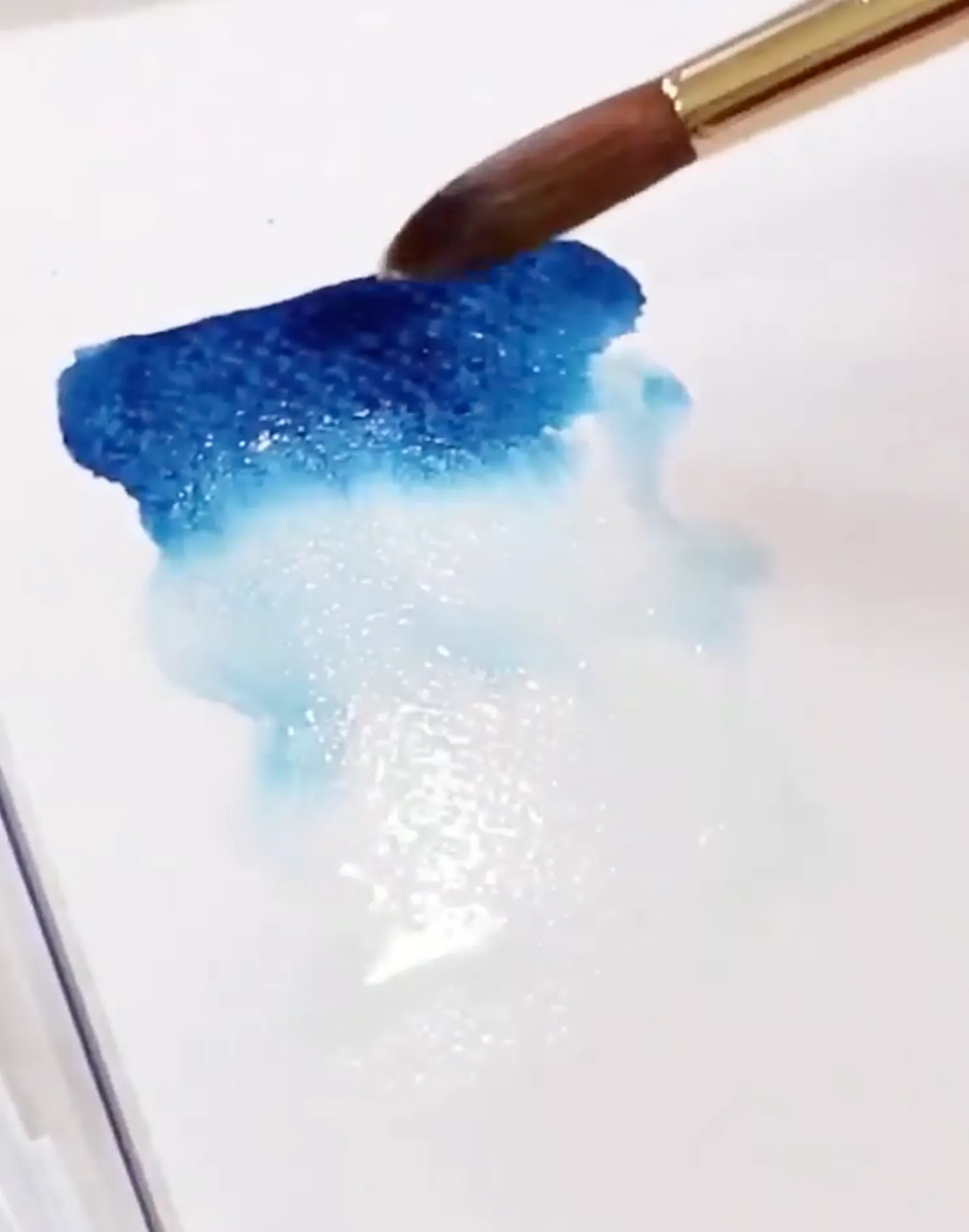
The Wet-on-wet technique is famous among watercolorists.
For this technique, apply a little bit of clean water to make the paper moist.
Now add your desired watercolor to the wet paper.
The wet paint will follow the water to create aesthetic effects.
The results depend on your skill level, but practice will enable you to master this technique.
Read Also:
- Dull Watercolor Painting (Avoid This Mistake)
- 9 Ways to Remove Watercolor from Clothes
- 11 Best Watercolor Brushes
- The Best Ways to Make Watercolor Darker
- 100 Easy Watercolor Painting Tutorials Anyone Can Do
Wet-on-Dry
Beginners find the wet-on-dry technique more effortless than the wet-on-wet method.
First, add wet watercolor to dry paper.
The paint follows your brush, giving you complete control.
As a result, you can create various visual textures.
Moreover, this technique produces more intense and less muddy paintings.
Ombre Effect
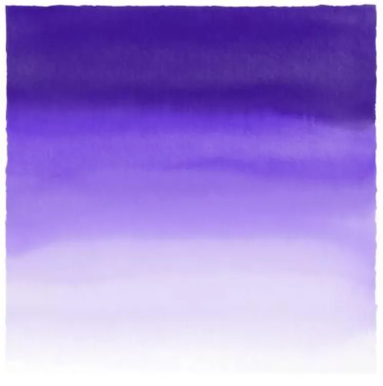
The Ombre technique uses a single color to create different hues.
Apply a concentrated amount of color to watercolor paper.
Drag the paint downwards by moving the brush.
Keep adding more water to create lighter shades.
This technique will result in a transition from darker to opaque color.
Monochromatic Painting
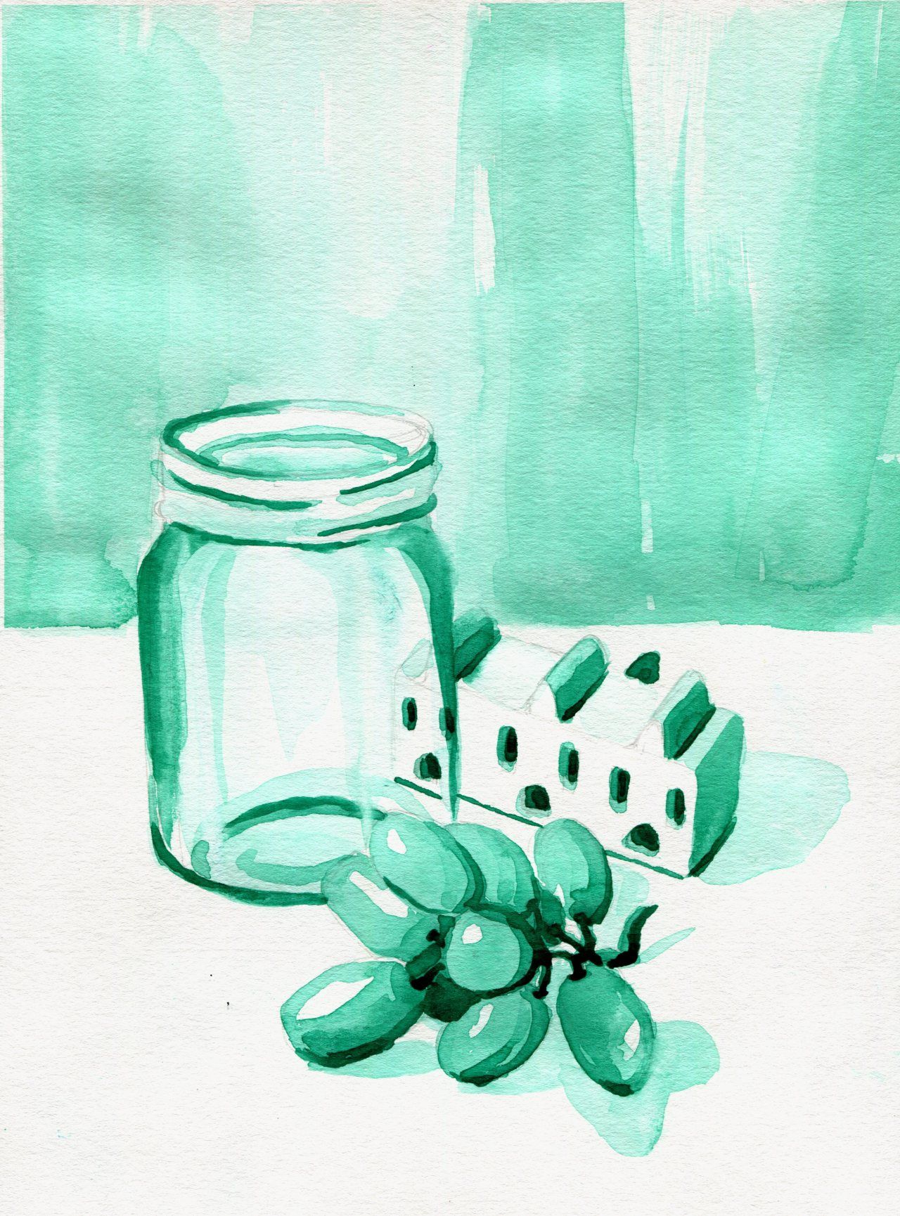
Even with basic skills, you can create an aesthetic painting with one watercolor!
Mix green paint in a lot of water.
Create mountains at the top of the paper.
Combine more green in water for the next one.
Keep adding mountains, and each one should be darker than the previous.
Get creative by painting monochromatic still life.
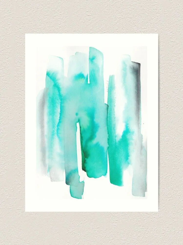
Watercolor Gradient Effect

In gradient effect, one color transforms into another smoothly.
Start by adding an orange color.
Keep it concentrated at the top and lighter as you move it downwards.
Now add yellow with a lot of water.
Make it darker at the bottom.
You should dilute the colors at the contact point.
Watercolor Wheel of 12 colors
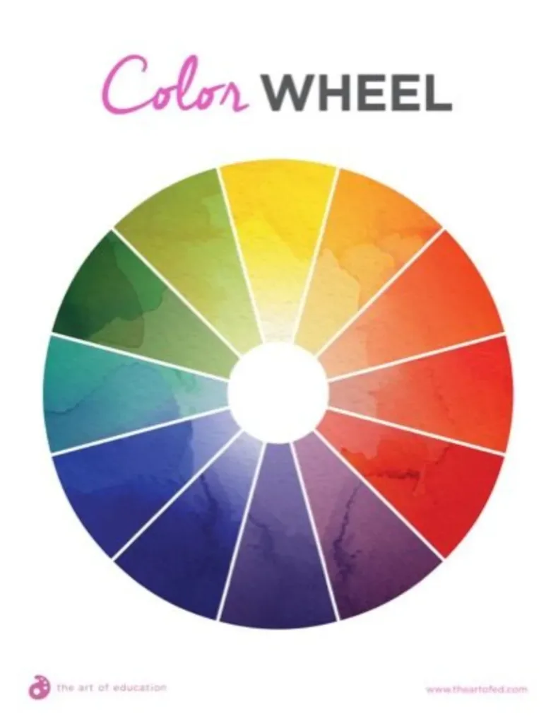
Learn color theory with a watercolor wheel.
It’s a great technique to create a beautiful painting of a color wheel.
Draw a perfect circle and cut it into 12 slices.
Now you will add the primary colors (red, yellow, blue) at equal distances.
Next, include secondary colors (orange, green, purple) by mixing primary colors.
Finally, add six tertiary colors formed by mixing one primary and one secondary.
Water to Paint Ratio
The ideal water to paint ratio is 50/50 for a saturated color.
You can reduce their amounts for different shades.
Add more water for a lighter hue.
On the flip side, increase the paint to intensify the painting.
Geometric Watercolor Painting
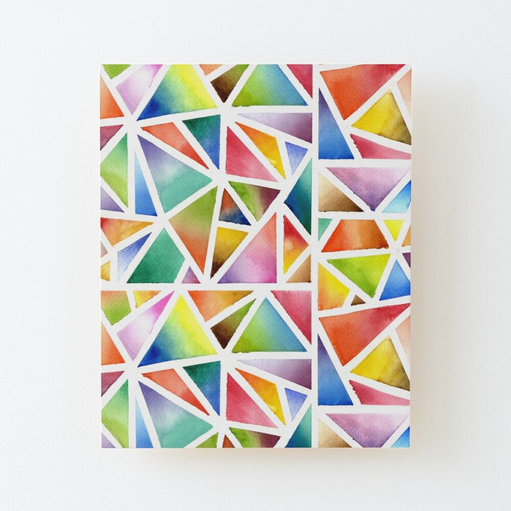
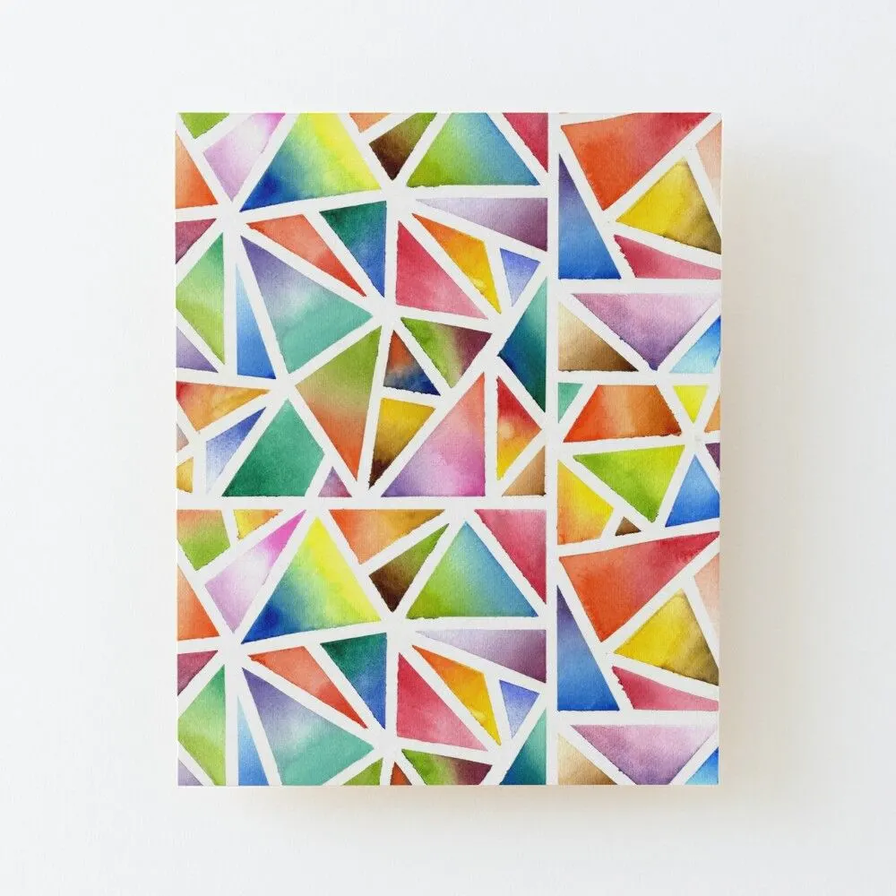
You can practice blending watercolors with this fun activity.
Draw any geometric shape.
For instance, you can draw different triangles.
Fill each with various color gradients.
You can also add ombre effects to some triangles.
Geometric painting doesn’t let you get bored.
Simple Shapes

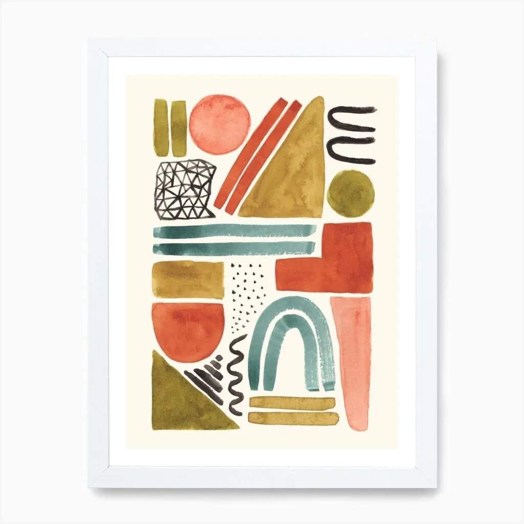
Painting a simple shape is one of the best watercolor painting ideas.
You can create alluring abstract art with simple shapes and even irregular figures and lines.
Then, add discrete colors to them. You may use gradient and ombre effects too.
Popsicle Sticks
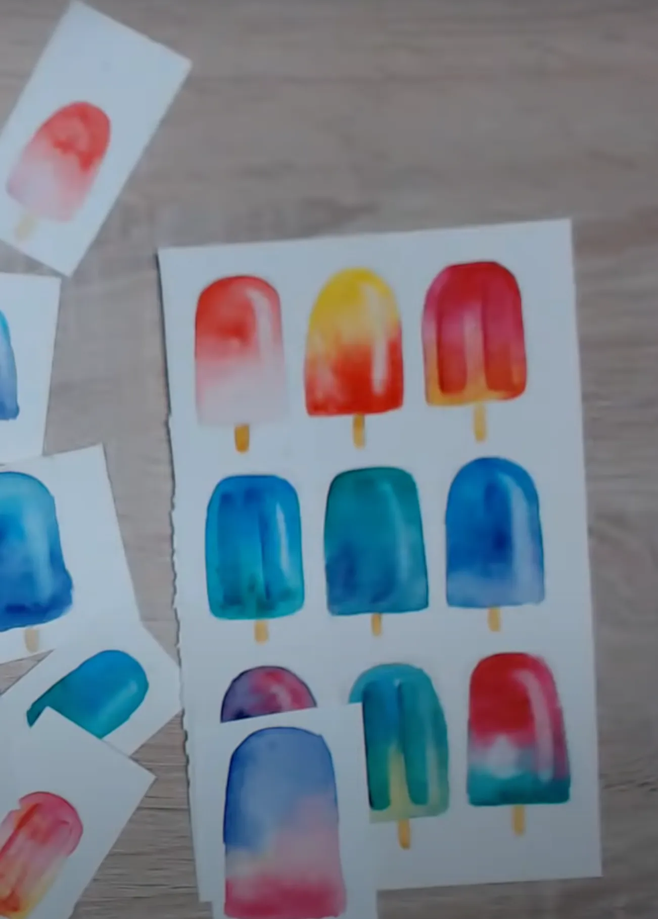
This watercolor idea is a great way to utilize your free time.
Draw popsicle sticks with a pencil.
Paint the bar with brown color (mix the three primary colors if you don’t have brown watercolor).
Fill the ice part with different colors, textures, and gradients.
Practicing Precision to Avoid Color Bleeding
Many beginners face color bleeding.
This activity will help you practice precision by drawing a circle and dividing it into unequal segments.
Then, color each portion with a different color.
Avoid painting closer segments simultaneously to prevent one paint from seeping into another one.
Dry Brush Technique

In this technique, you don’t need to damp watercolor brushes.
Instead, the dry brush technique lets you create unique textures and add life to your paintings.
For instance, paint a tree with brown watercolor.
Then, once it is dried, draw various strokes with brown paint loaded on a dry brush.
Brush Strokes Tips
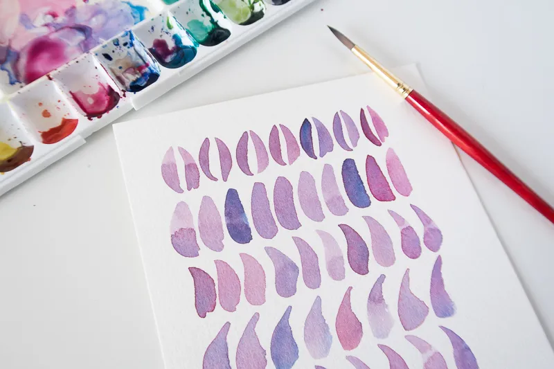
You can create different strokes with your brush.
Hold your brush closer to the bristles to control the color better.
Start with the tip of a round brush.
Apply pressure as you pull down into the belly of the encounter.
Then again, release it lightly.
This tip helps paint various leaves.
Interesting Textures
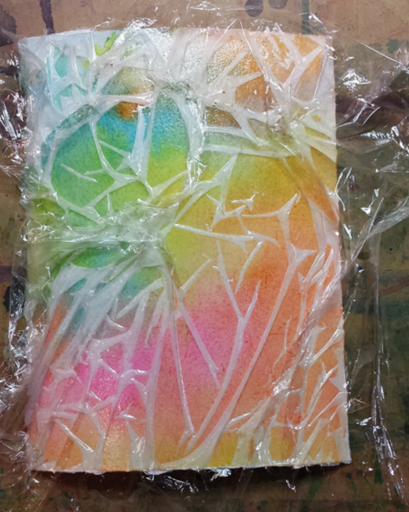
You can experiment with watercolors to produce interesting textures.
Once you have painted your paper by blending various colors, cover it with plastic.
Crumpling the plastic will create unique patterns.
Remove the cover once the paint is completely dry.
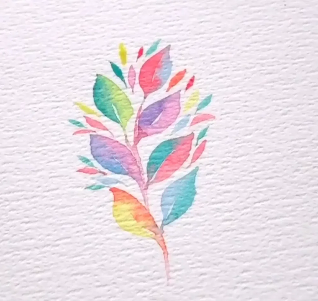
Watercolor Flowers
Painting flowers with watercolors is the best thing you can do to relax.
Take watercolor paper and draw flowers of various types like roses, lilies, lavenders, etc.
Fill every flower with bright colors.
Then, you can add green leaves to them.
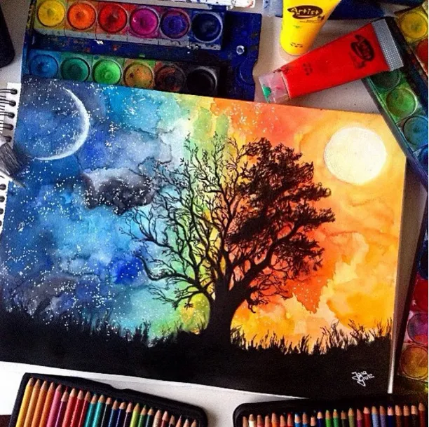
Midnight Sky
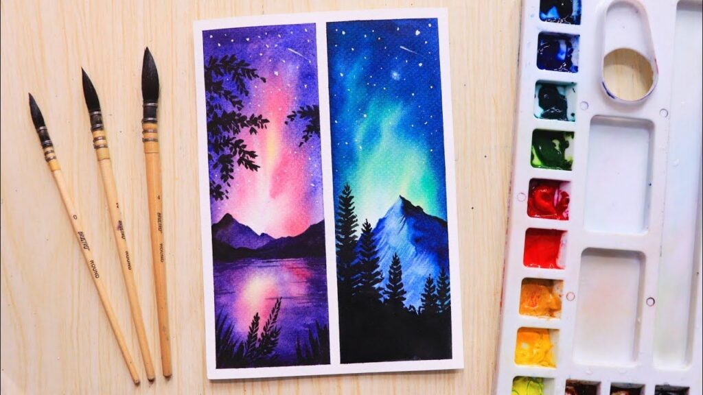

Midnight sky paintings are appealing and refreshing.
You can use shades of blue or purple to paint your night sky.
Use the gradient technique, prepare the background sky and ocean.
Add dark mountains at the horizon and some trees and grass.
Happy Watercolor Painting
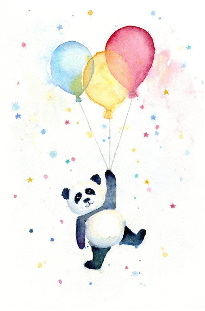
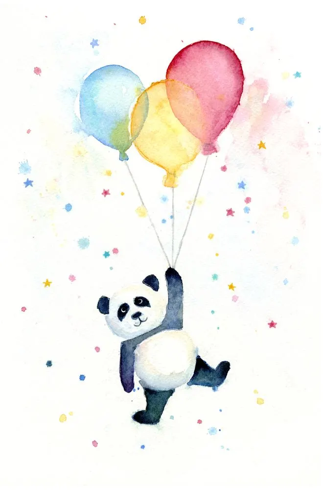
Are you feeling happy? Express your emotions through your watercolor paintings. Don’t think; just draw what makes you happy.
It is one of the best watercolor ideas. For example, you can draw a cute mushroom hut or a panda with balloons.
Dark Colors to Intensify Watercolor Paintings

Dark paintings are tough to create with watercolors.
Even if you think your artwork has the right dark colors, they will fade when it dries.
So it is better to have more paint than you need.
Add a second layer after the first one dries.
But avoid too much water.
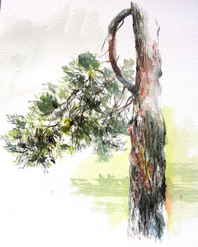
Simple Landscape
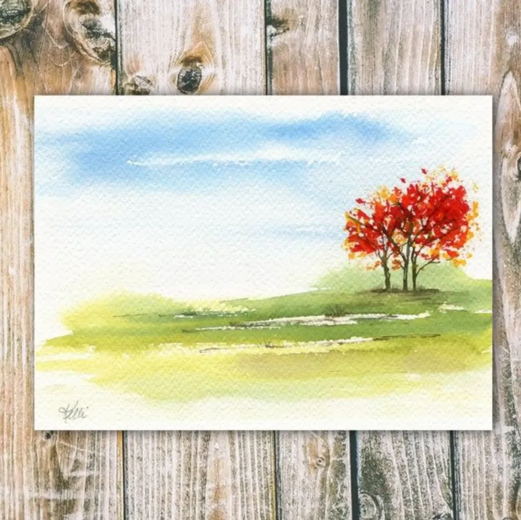
As a beginner, start with simplicity.
Simple watercolor landscapes are easy yet attractive.
With the wet-on-wet technique, paint the blue sky.
Add different layers of green at the bottom.
You can create grass with the dry brush technique. Complement your landscape with trees.
Abstract Art With Watercolors

Creating abstract art with watercolors is effortless.
You can apply the wet-on-wet technique to add contrasting colors.
The colors will flow randomly to create beautiful fluid effects.
You may splatter colors and move them around with your brush to get different styles.
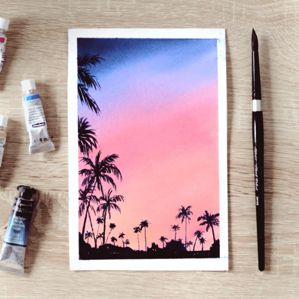
Palm Trees
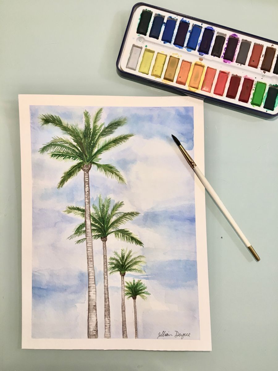
Paint the desired background. Now add brown stems of palm trees.
With a thin brush, draw curved lines emerging from the top of trees.
Next, add small lines to create the leaves of palm trees.
Load your brush with green color only as water causes color bleeding.
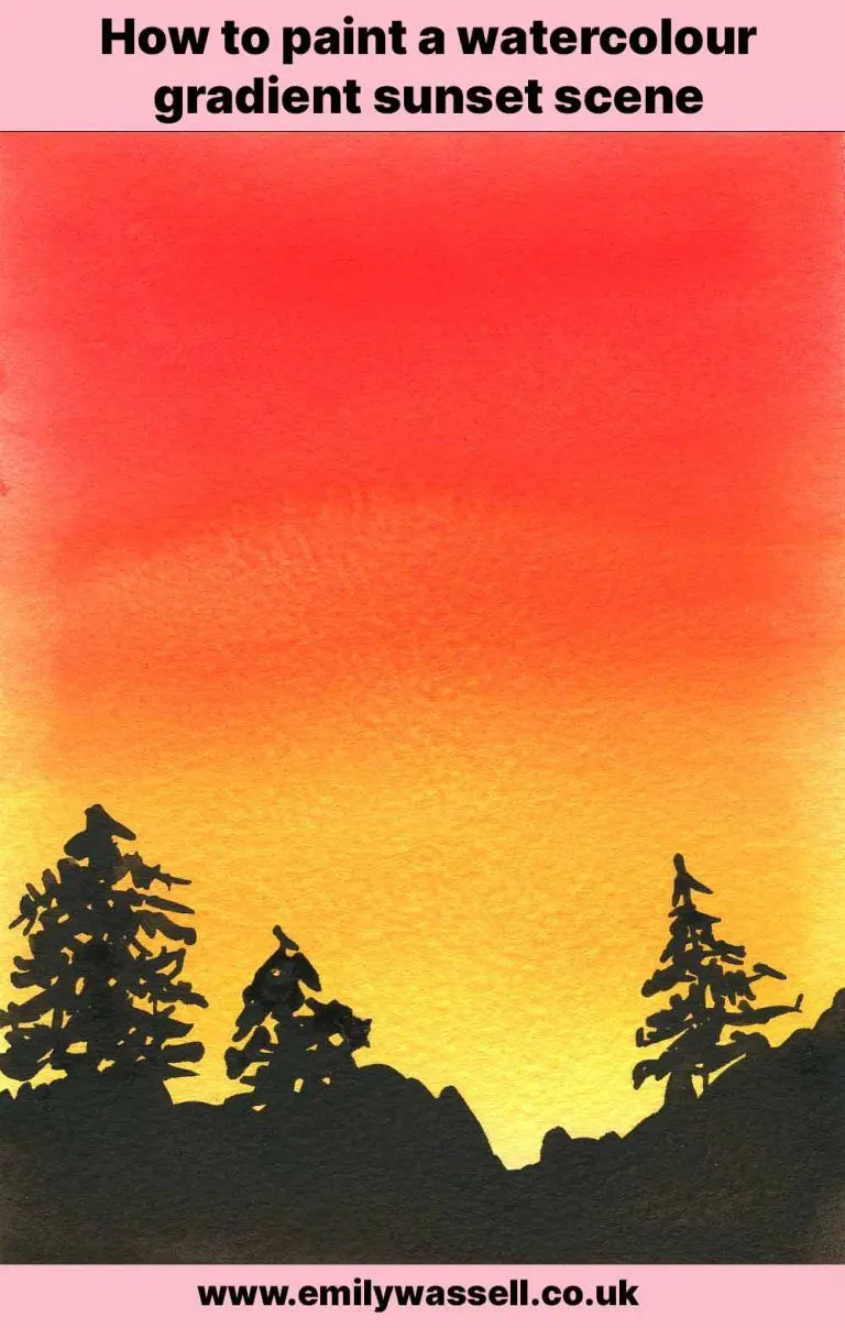
Sunset Painting
Create a beautiful sunset painting with only three colors: orange, red, and yellow.
Draw a straight line segment to divide the paper into two parts: sky and sea.
Use some of the best watercolor paints you can get and paint them with gradient technique, such that the red changes into orange, which further changes to yellow.
Add other elements with black.
Free as a Bird
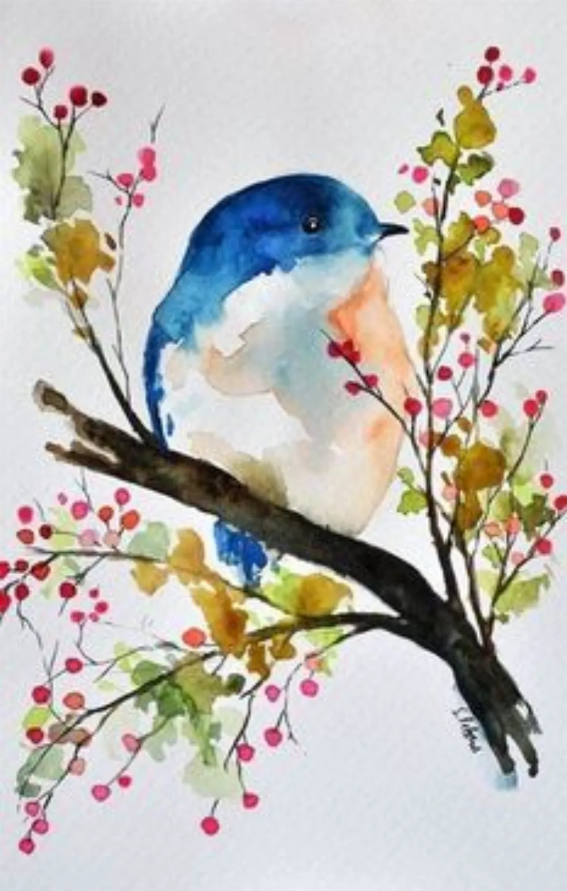
Draw peacefully with these watercolor painting ideas.
Birds symbolize freedom and hope.
So why not paint a cute bird with watercolors?
Paint a branch with leaves and flowers.
Draw a bird.
Fill its head and wings with blue color and leave the rest in white.
Watermelon

You can draw a watermelon slice with these easy steps.
First, make a triangle with a round bottom.
Now apply water.
Add red and move it around.
Do not add too much.
Once it’s dry, add light green at the bottom and move it upwards a bit.
Finally, draw some seeds.
Window with Flowers
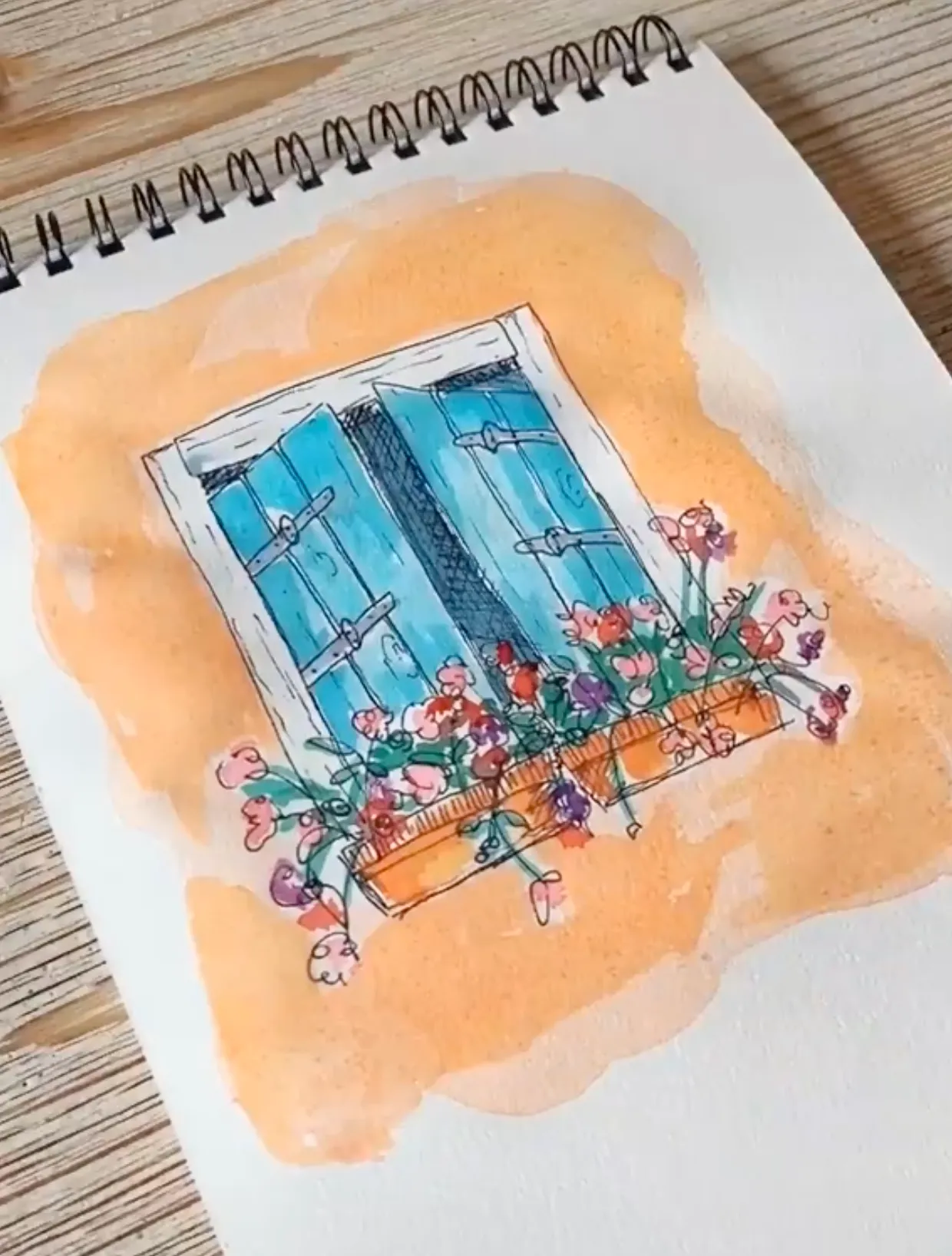
Experiment with watercolors by trying different objects and elements from real life, just like a window.
Make a rough sketch of your window.
Then make it vibrant with various bright colors.
Flowers give more charm.
So, add tiny flowers to the window.
Butterfly with One Watercolor

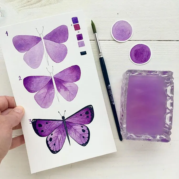
Pick your favorite color and some paper towels.
Draw a butterfly with a pencil.
You can create different shades of that color in your watercolor palette.
Add those shades to various parts of the wings.
When switching from one shade to another, clean your brush with paper towels.
You may outline it with black color.
Galaxy Painting
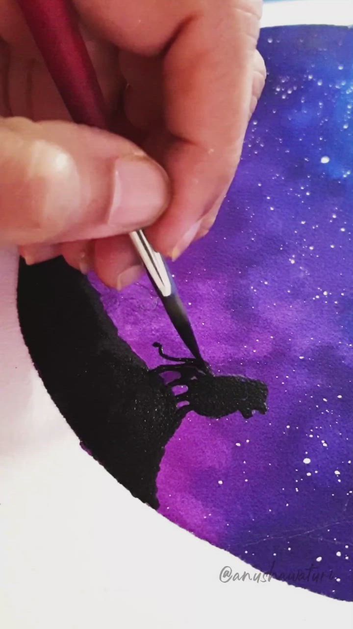
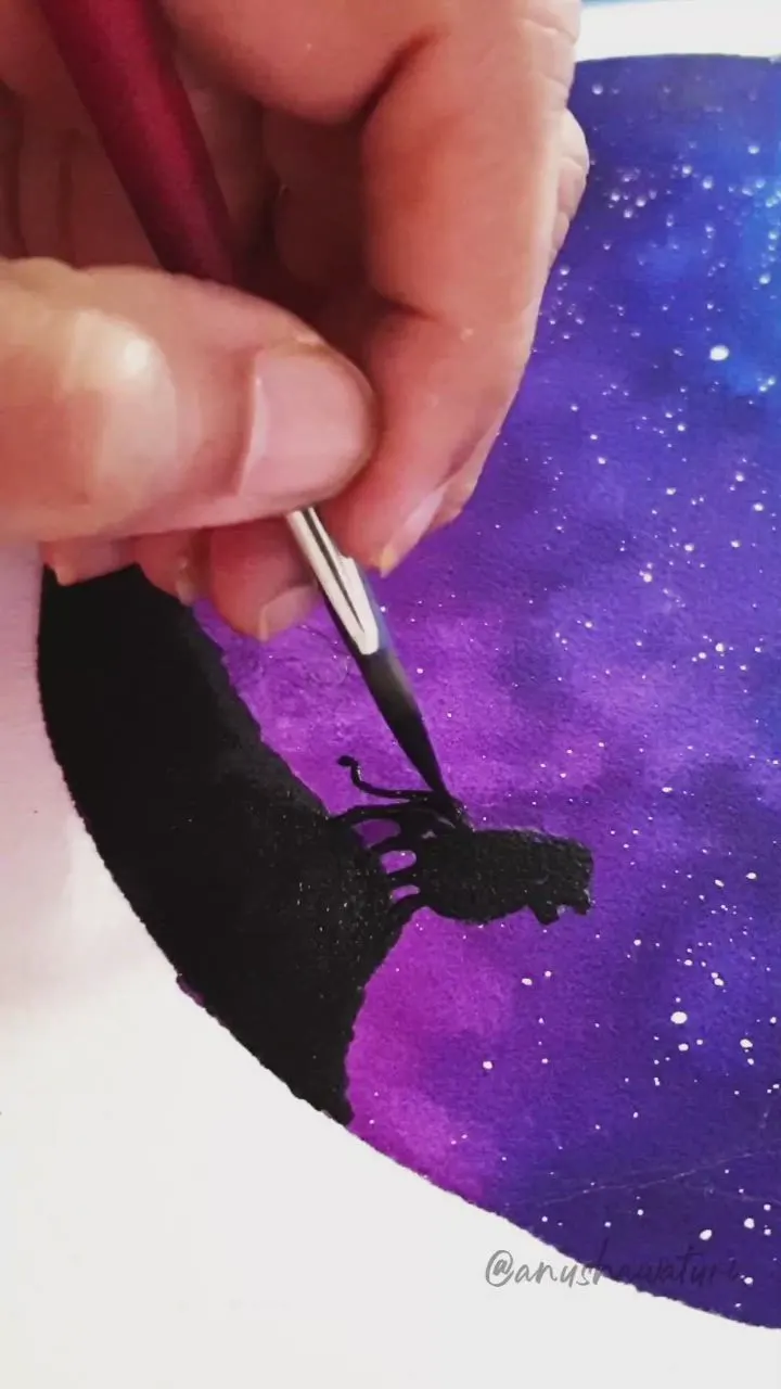
Painters draw these a lot, especially with acrylic paints.
There are no rules.
You just have to get creative to achieve an aesthetic galaxy.
You may use various colors or only one color (different shades).
Splatter some white paint using a toothbrush to create stars.
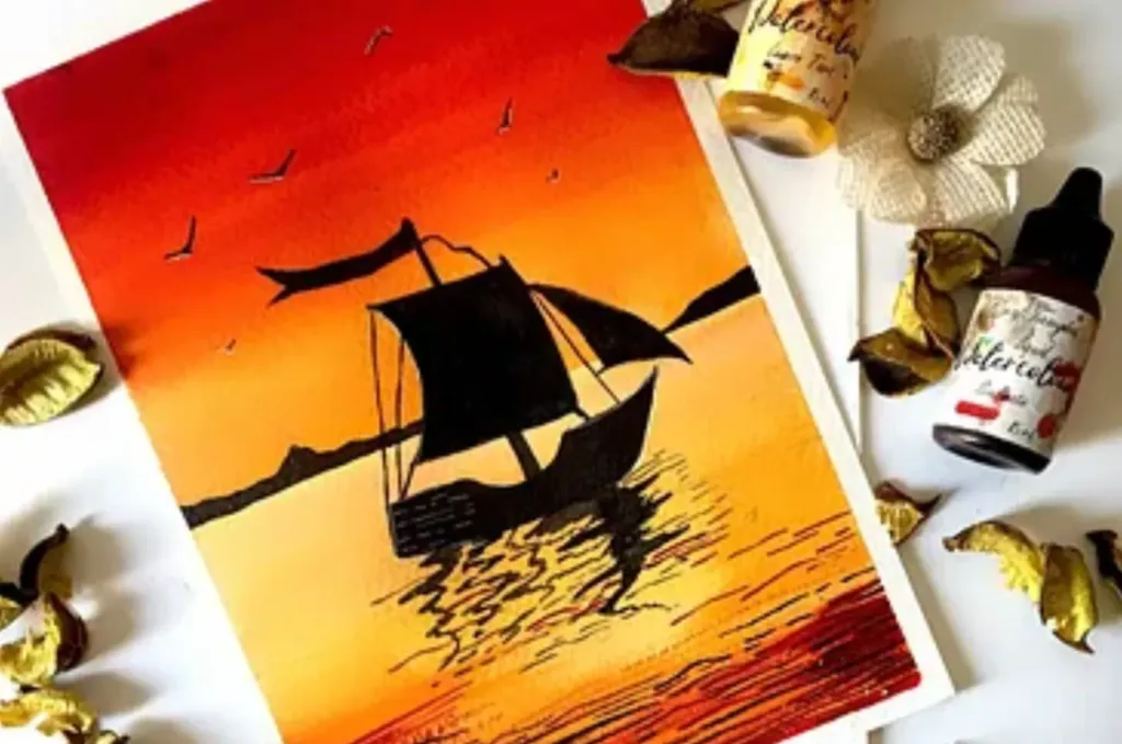
Boat Painting

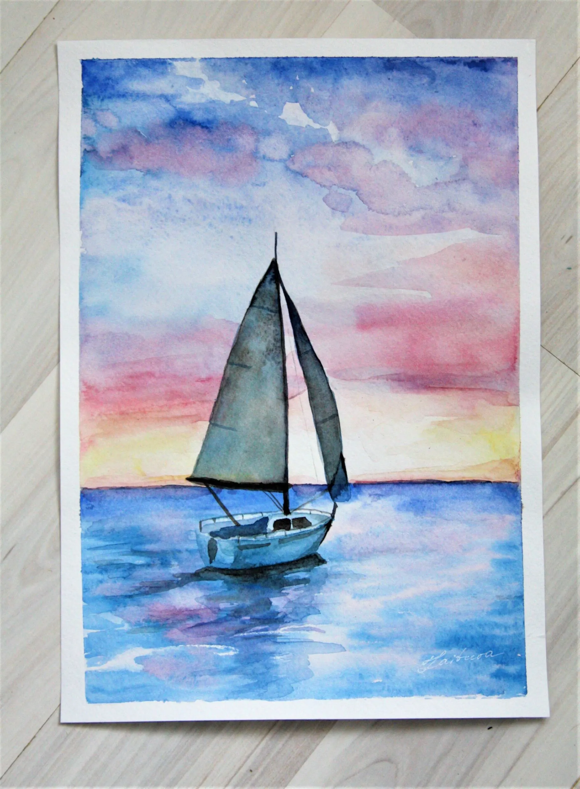
Enjoy a sea adventure with watercolors!
Paint blue colors on your watercolor paper using the ombre technique.
Or you may paint a pastel sky instead of a blue one.
Add a simple boat that is darker than the background.
Create the shadow effect of a ship in the sea by moving the brush in random motion.
Lemon Painting
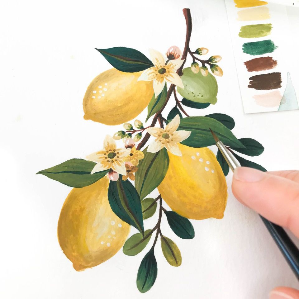

Draw lemons and leaves on your watercolor paper.
Fill the lemon with yellow paint.
Try moving your brush in circles to create a round ombre effect.
The color should be opaque at the part where light reflects.
Color the leaves with different green shades.
Ice-cream
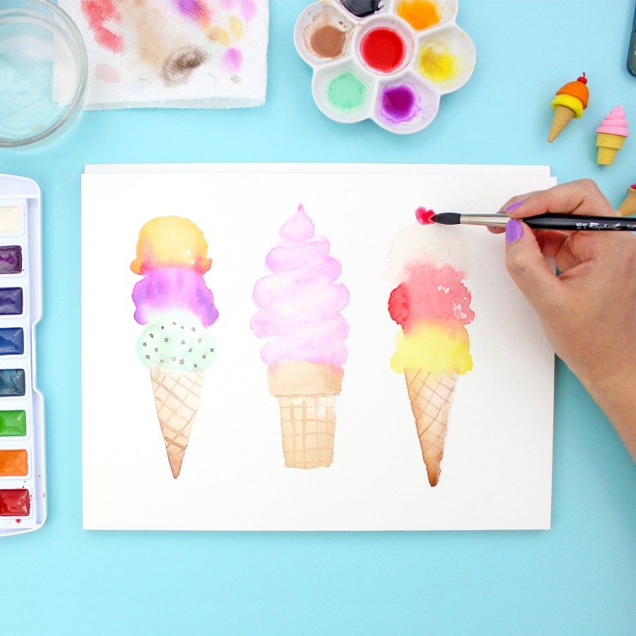
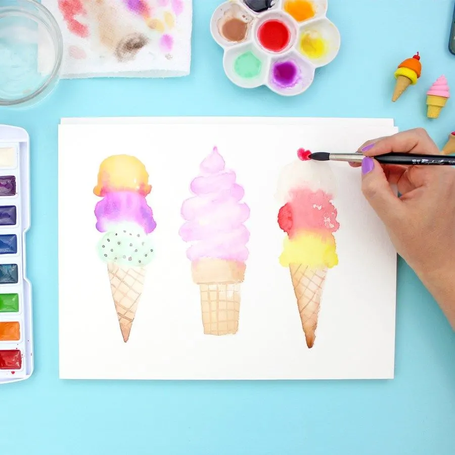
Practice watercolors by drawing cone ice cream in different ways.
You can draw small squares with gaps in the cone part.
Fill the squares with light shades of brown.
You can try adding more layers to the ice cream and coloring each one with different paint.
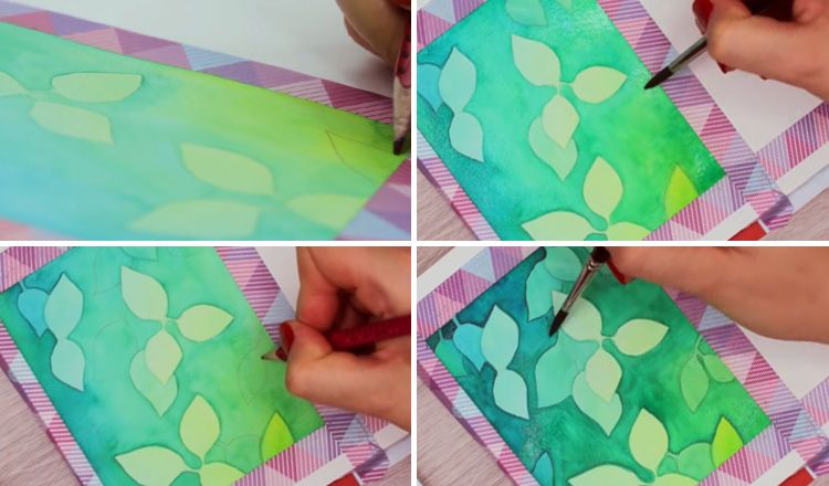
Pastel Blending Technique
Pastel blending is one of the unique watercolor ideas.
Start by sketching some leaves.
Apply water.
Taking two soft colors like a combo of pink and purple will be great.
Paint each leaf with two colors.
Let the colors blend for a creative effect.
Bookmarks
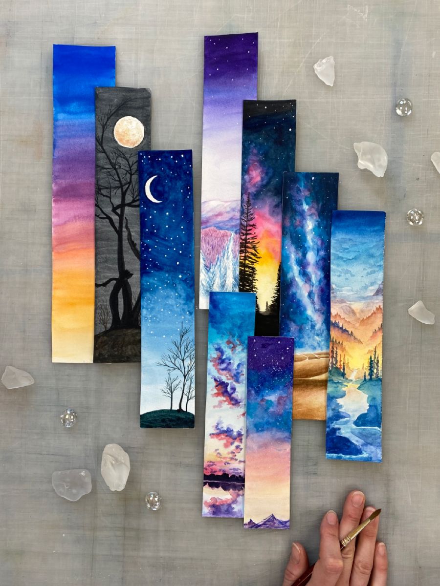

Design your watercolor bookmarks.
Cut out rectangular pieces of paper.
Paint each differently.
You may paint galaxies, sunset, or only flowers.
Go Green
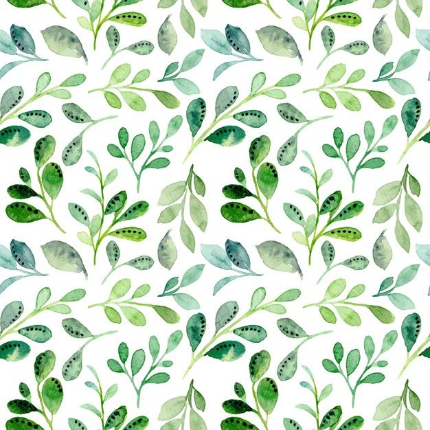
Have fun with the green color.
Search for different leaves on Google and draw them on your paper.
Try making various shades of green by changing the color to water ratio or mixing more colors in green.
Fill your leaves with beautiful shades that you have created.
Cotton Candy Sky
Give your watercolor paintings a pastel effect with these watercolor painting ideas.
Paint a gradient of the following colors: ultramarine blue, pink, and yellow.
These colors will turn your sky into a cotton candy sky.
Do not add dark colors.
Dilute them with water.
Colorful Animals
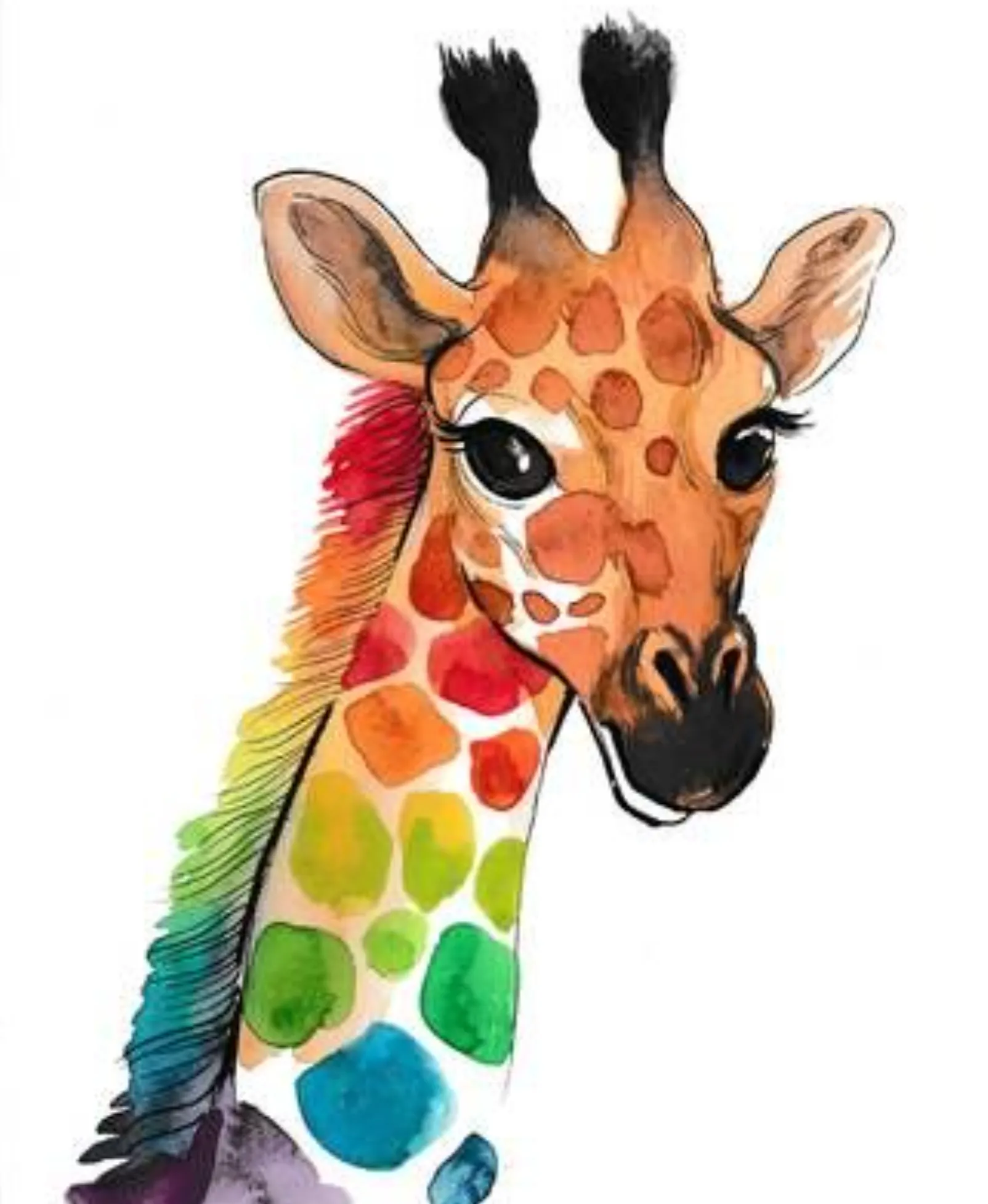
Instead of drawing usual animals, get creative by painting colorful ones.
For instance, sketch the head and neck of a giraffe.
Fill the spots of the giraffe with different colors and gradients.
You can create any animal that you like but uniquely.
Splattering technique
You can splatter watercolors over the paper with different brushes to make various textures.
You can create abstract art with this technique.
When you finish painting a midnight sky, splatter some white paint over it to create stars.
You will notice a significant difference after this.
Sponge Technique

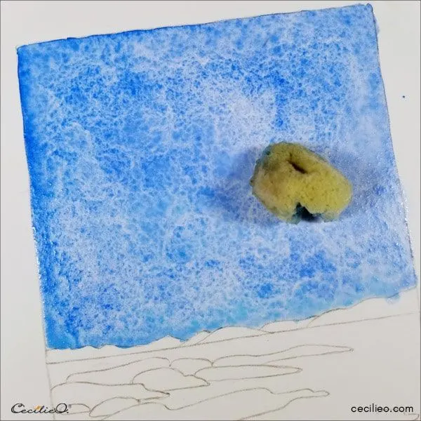
If you find watercolor brushes difficult to create textures, use a sponge instead.
Cut out sponges of different sizes.
You can produce various visual effects with sponges.
Moreover, you can use them to make the paper wet or remove excess paint.
Flowers in a Jar
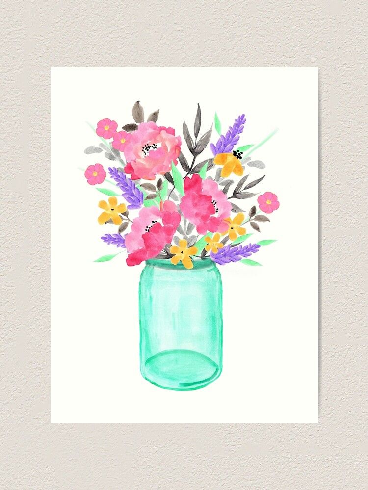

Instead of drawing flowers scattered over your paper, assemble them in a jar to display your watercolor painting.
To paint flowers in a jar, draw a rough sketch with a pencil.
Then, paint your jar.
After that, add various flowers and leaves to it.
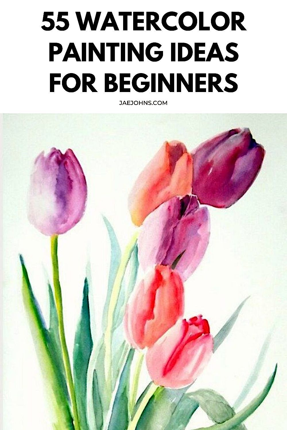
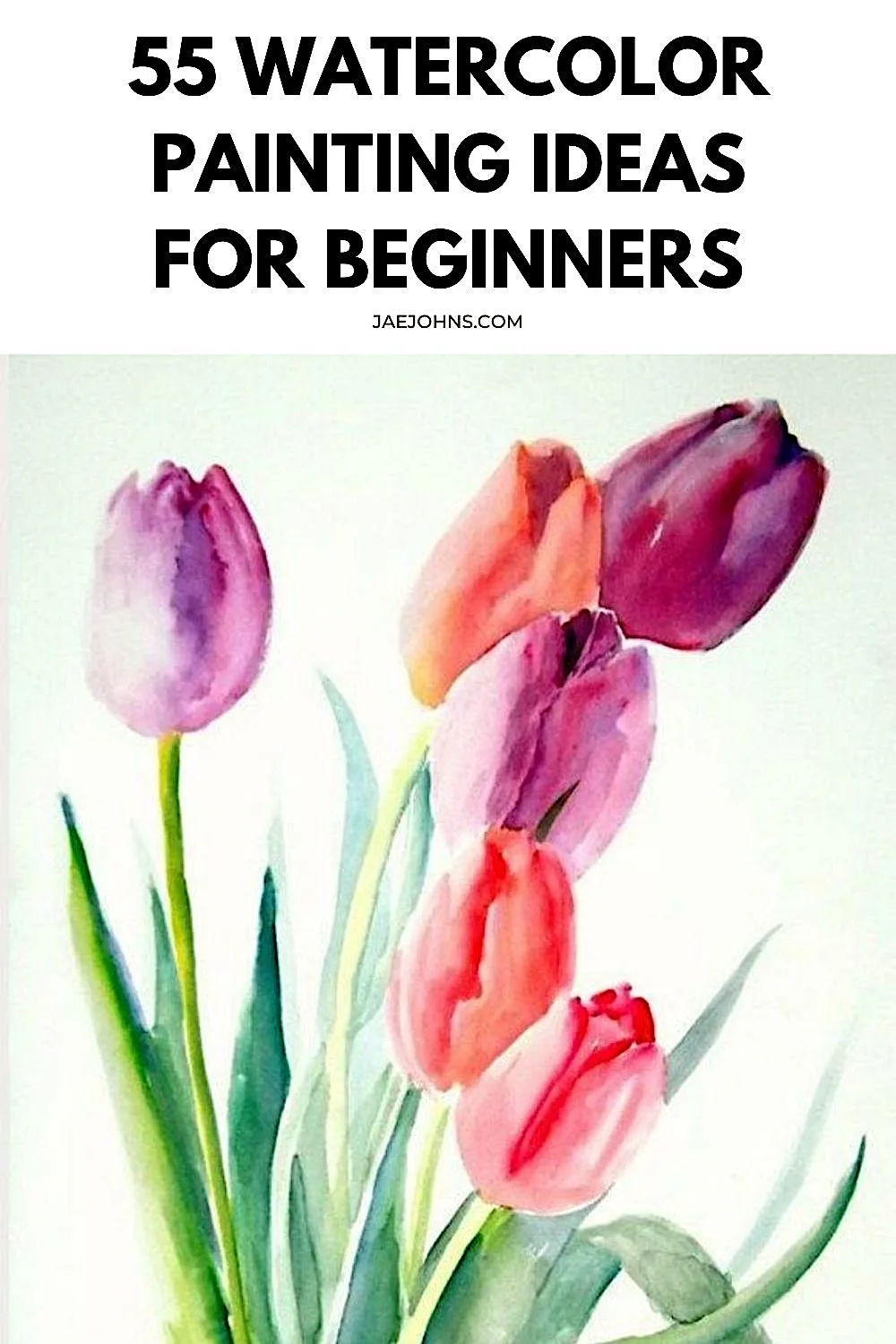
Loose Watercolor Tulips
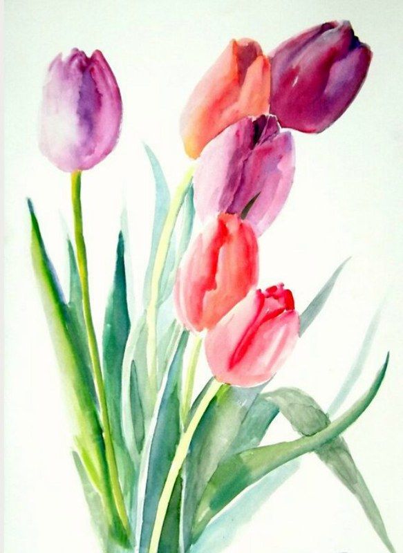
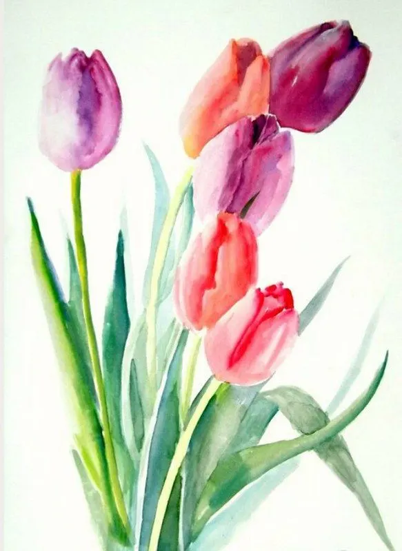
Relax by painting loose watercolor tulips.
Draw tulips at equal distances.
Blend two different colors for each tulip.
Then, join them with thin stems and complete the painting by adding long green leaves.
Creating Soft Texture with Salt!
Salt soaks water and produces interesting textures.
Sprinkle some salt over your painting when it is still wet.
The salt will make some areas lighter.
This method is an excellent technique for adding variety to a flower field or bark of a tree.
Dress Designing
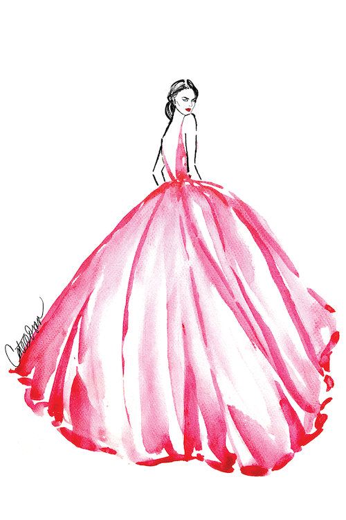

Do you love fashion?
Then, you can become a fashion designer with watercolors.
Draw models wearing different styles of dresses.
Design the dresses with gradient and ombre techniques.
You may add various patterns using colorful markers.
Be creative and create unique gowns.
Bicycle with Flowers

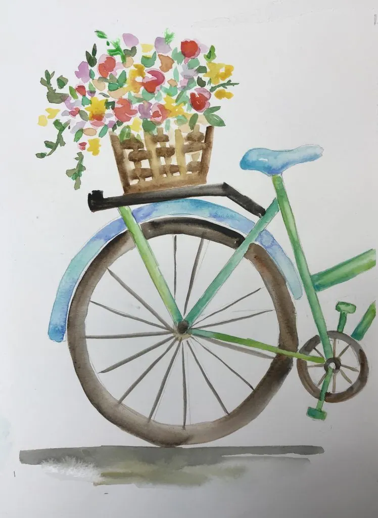
Draw elements from real life with these watercolor ideas.
You can paint a bicycle with flowers in watercolors.
Draw a bike and paint it creatively.
Add a basket full of flowers on the rack or in the front of the cycle.
Fill the flowers with your favorite colors.
Cute Cactus
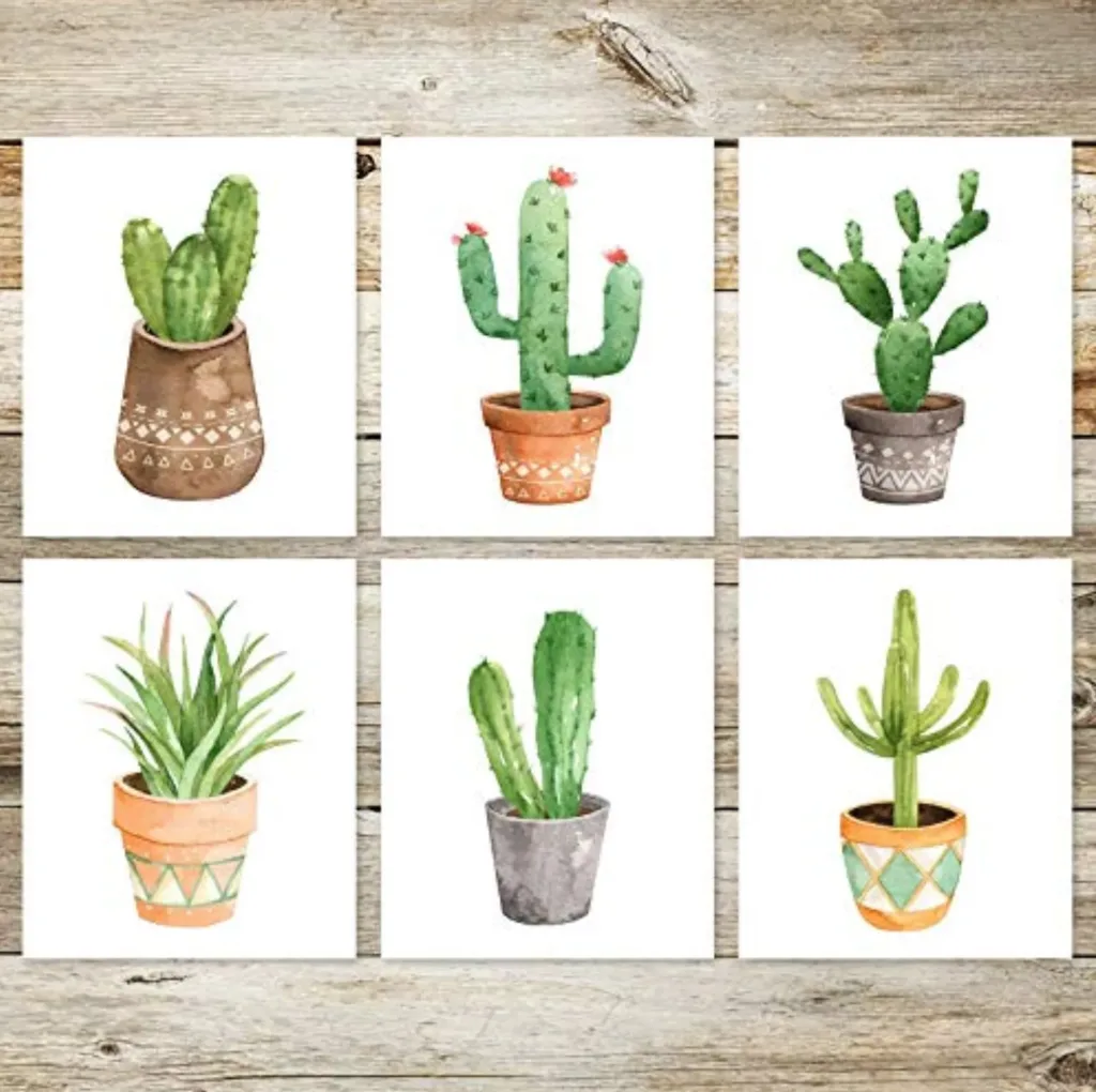
Paint cute, little cacti with watercolors.
Divide your paper into equal boxes.
Fill each container with cacti of various shapes and sizes in pots.
Now it is time to get creative.
Mix and produce different shades of green to color them.
Add spines with a black marker.
Sunflowers

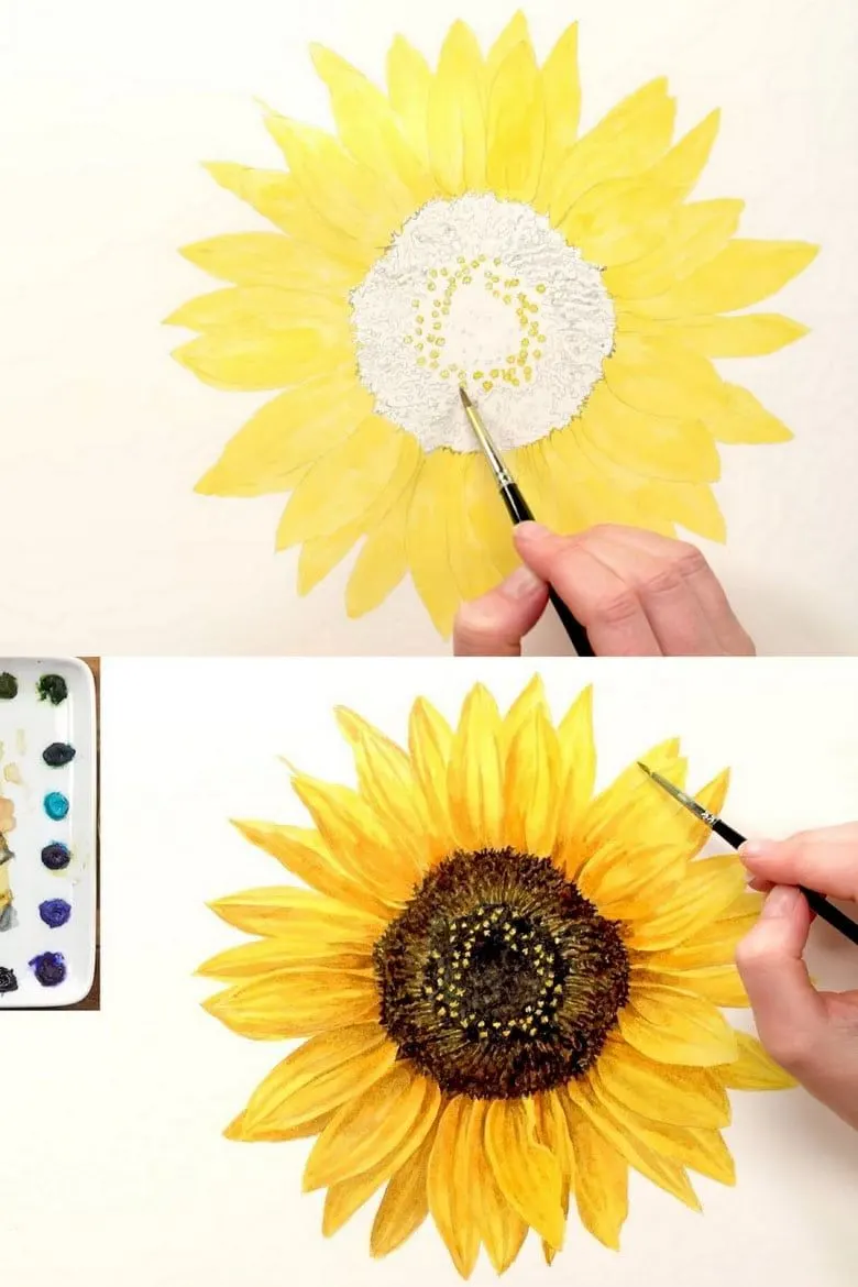
Painting sunflowers is one of the best watercolor painting ideas.
The vibrant yellow color is fun to work with.
Create different shades by mixing the yellow color with red and orange.
Next, add dark and light shades to the petals.
Finally, fill the center with dark brown.
Powerlines

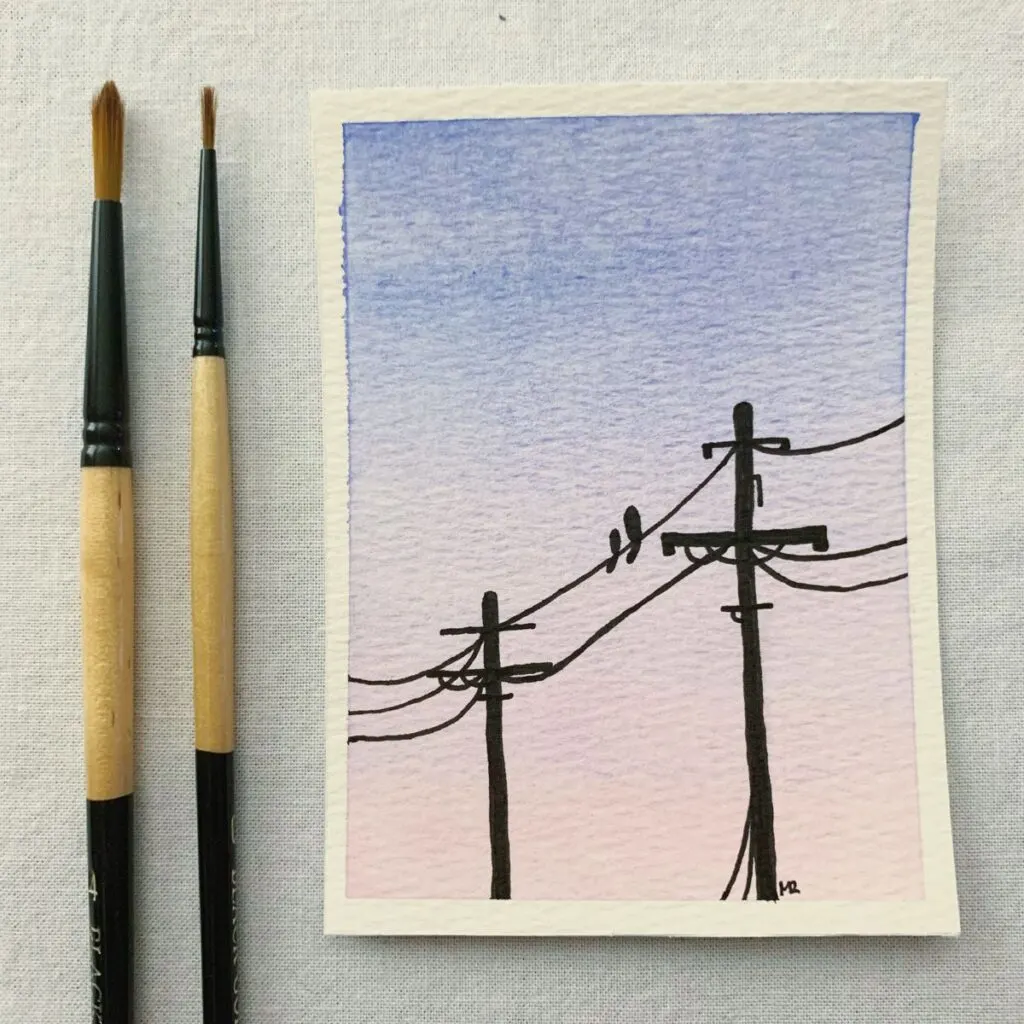
This painting is one of the most straightforward yet creative watercolor painting ideas for beginners.
You can start by painting the background with a gradient effect using any contrasting colors.
Then, after the painting is arid, draw power lines with soaked black paint.
Two Different Worlds
Portray two people from different worlds with these watercolor painting ideas.
You can divide the paper into two equal portions.
Paint one side with brighter shades to depict a fire world.
On the other side, add cool colors to display a water world.
Finally, draw a black tree in between.
World Map in Watercolors!
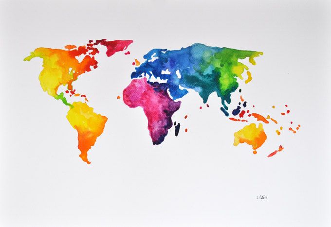
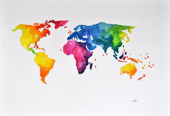
Make the world colorful with watercolors.
First, draw the world map on your watercolor paper.
Next, apply water in the land portions.
Now have fun by blending different colors to create beautiful continents.
Moreover, this activity will make you a master at controlling the paint.
Hot Air Balloons
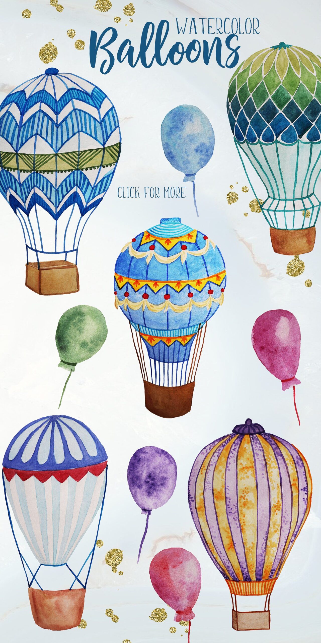

Practice watercolors with this fun activity.
Paint the background with dilute blue to create the sky.
Next, draw hot air balloons on your watercolor paper.
Make each balloon unique by adding various styles and patterns.
Color them with watercolors.
Try producing textures with the dry brush technique.
Layering Technique
The layering technique in watercolors is also known as glazing.
It is not complicated at all.
You simply add multiple layers of the same color.
The layers get gradually darker.
You can create a beautiful flower with this technique.
Add light petals and then darker ones over them.
Lifting Colors
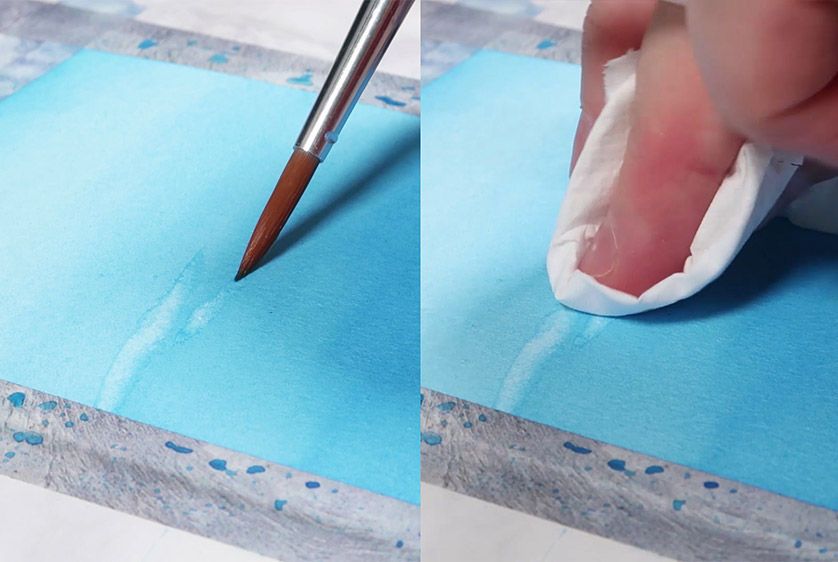

You can create a cloudy effect with the lifting technique.
After painting the sky, blot some areas with paper towels.
If the sky paint has dried, then dampen it with a brush.
Then, dab it with your paper towels.
Moreover, this technique helps erase paint from your painting.
Feathering Effect
Feathering in watercolor means creating soft edges or moving from dark color to no color.
Draw a circle or use the entire paper to practice feathering.
Damp your brush and load the tip with paint.
Do not use excessive paint.
Apply the paint in a circular motion.
Move your brush slowly until the color fades.
Scumbling Technique
The scumbling technique means to add wet color over dry color.
It enables you to produce different hues of the same color.
For example, you can add textures to grass, tree leaves, feathers of birds and create water ripples.
With this technique, you can create scratchy and speckled effects.
Doodling with Watercolors
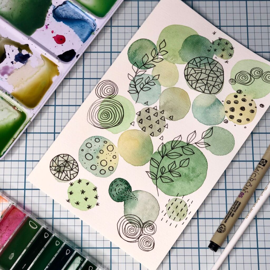
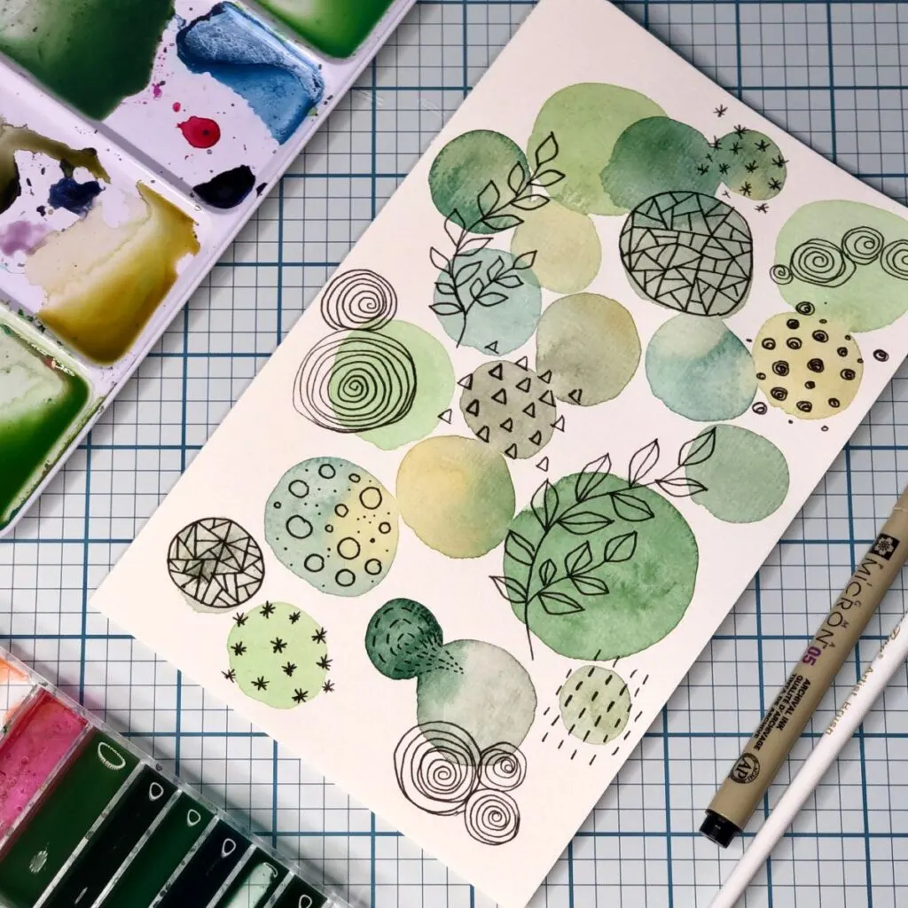
Are you getting bored?
Then DOODLE!
Complement your regular marker doodling with watercolors.
Create various paint spots on your watercolor paper.
Then, draw different shapes, elements, and patterns over the colors.
Watercolor doodling is one of the most amusing watercolor painting ideas.
Still Life Painting
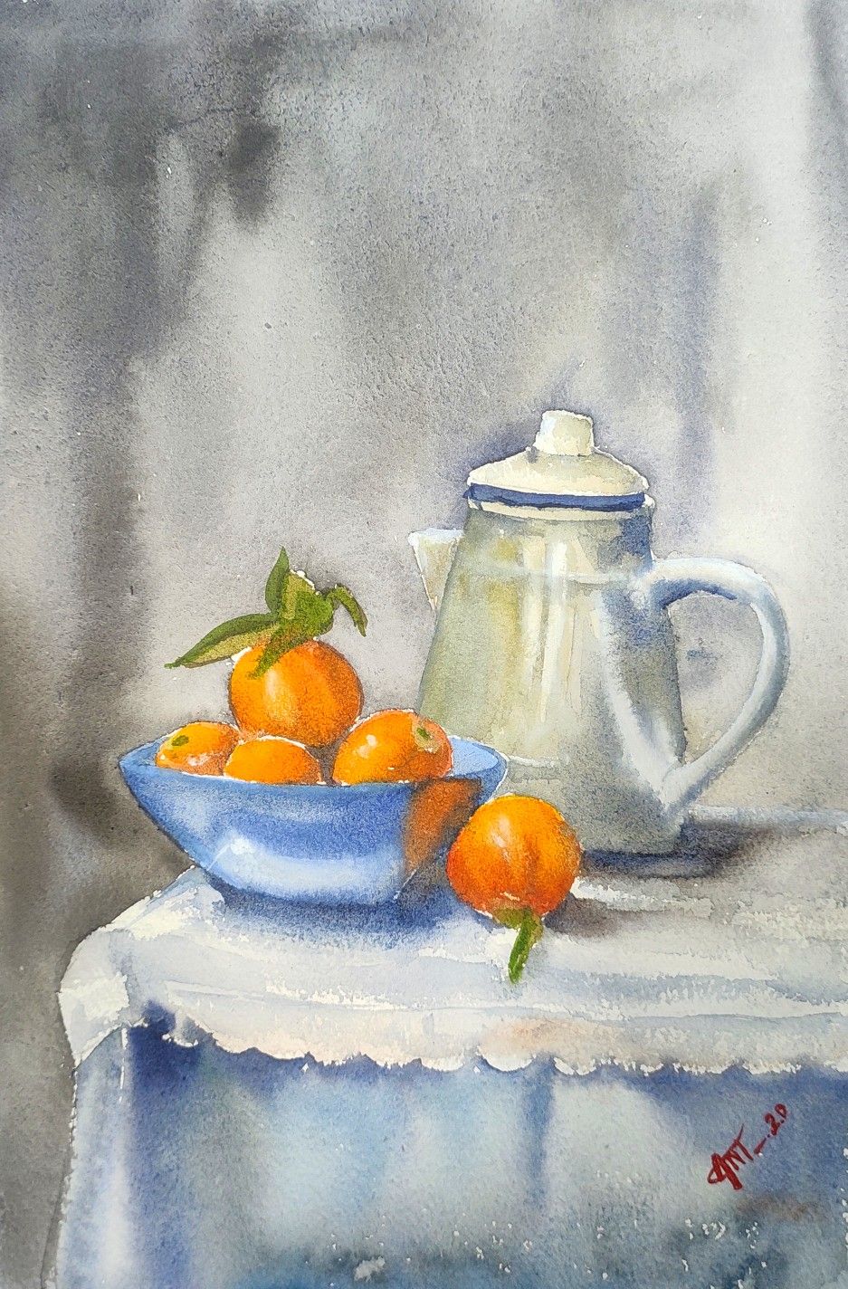
Still-life paintings are a great way to enhance your watercolor skills.
Assemble some objects like glass, fruits, teapots, bottles, etc.
Sketch them on your paper.
Now bring them to life with watercolors.
The colors don’t need to be exact.
Add your imagination to the paper.
Creating Colorful Background for Calligraphy
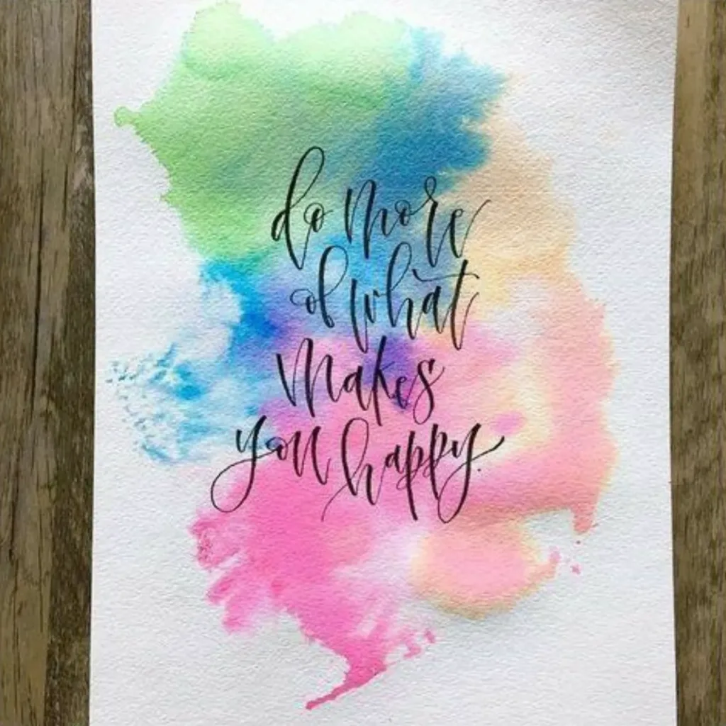
Do you love calligraphy?
Then, create beautiful watercolor backgrounds for your writings.
First, wet your paper and then add colors to it.
The colors will blend and produce amazing effects.
You can also use the plastic technique for more texture.
Then, write over it when dried.
Guided Project Ideas
Loose Floral Bouquets
Goal: Capture the lively essence of tulips, roses, and wildflowers without over‑sketching. Focus on flowing shapes, transparent layers, and color harmony.
Step 1 – Light Guideline Sketch
- With an HB pencil, draw three loose oval “blobs” of varying sizes for flower heads and a few sweeping lines for stems.
- Keep it minimal—just enough to map composition and spacing.
Step 2 – First Wet‑on‑Wet Petal Layer
- Pre‑wet each oval one at a time.
- Drop in a diluted mix of your chosen petal hue (e.g., Quinacridone Rose for roses, Hansa Yellow Light for tulips).
- Let the paint spread organically; leave soft white highlights by skipping small areas.
Step 3 – Intensify Centers & Shadows
- While the petals are still damp but not shiny, tap a richer pigment (e.g., Alizarin Crimson or Burnt Sienna) at the flower centers and inner petal bases.
- Tilt the board slightly so darker pigment feathers outward—this creates depth without hard outlines.
Step 4 – Add Leaves & Stems
- Mix a mid‑green (Ultramarine + Hansa Yellow). Use a round #6 to paint stems in confident, single strokes.
- For leaves, press and lift the brush to form tapered ovals; drop in a dash of Sap Green or Indigo at the base for shadow while still wet.
Step 5 – Define Select Petal Edges (Optional)
- After petals are dry, glaze a thin, slightly darker edge on a few front petals to suggest layering.
- Avoid outlining every shape—just hint at form where petals overlap.
Step 6 – Splatter & Final Touches
- Load a brush with diluted complementary color and gently flick for subtle background splatters (adds energy).
- Lift tiny highlights in petal tips with a clean, damp brush if needed.
Quick Tips
- Use a limited palette: 1–2 petal colors, 1 stem/leaf mix, and a neutral accent keeps the bouquet cohesive.
- Work flower‑by‑flower to maintain fresh edges; re‑wetting dried blooms can muddy colors.
- Practice on scrap first to gauge how far pigment spreads in your specific paper/water ratio.
Minimalist Mountain Landscapes
Goal: Create dramatic, layered silhouettes with just two or three colors, using wet‑on‑wet blends for misty depth and a clean horizon line for modern appeal.
Step 1 – Horizon & Masking
- Lightly pencil a straight horizon about one‑third from the bottom of the sheet.
- (Optional) Mask the sky area with painter’s tape if you want a razor‑sharp skyline.
Step 2 – First Distant Ridge (Pale Wash)
- Mix a light, cool gray‑blue (Ultramarine + a touch of Burnt Sienna, diluted).
- On dry paper, paint a simple mountain outline just above the horizon. Keep edges soft by adding a touch of clean water to the base and letting pigment feather downward.
Step 3 – Middle Ridge (Mid‑Value)
- Once the first layer is bone‑dry, mix a slightly darker version of the same hue.
- Paint a second, taller ridge with overlapping peaks. Maintain a clear value step between this layer and the first to suggest atmospheric distance.
Step 4 – Foreground Ridge (Dark Value)
- Mix a rich indigo or Payne’s Gray.
- Paint a bold, closer ridge with fewer peaks but more angular shapes; use confident strokes and leave small gaps for implied trees or texture.
Step 5 – Sky Wash & Color Pop
- Pre‑wet the sky area from horizon upward.
- Drop in a warm dusk gradient—e.g., dilute Quinacridone Rose fading to a pale Hansa Yellow at the top. Let colors mingle softly for a sunset glow.
- Carefully remove masking tape once fully dry for a crisp divide.
Step 6 – Finishing Touches
- Deepen shadows on the foreground ridge by glazing a second dark pass along its base.
- Add minimal details (tiny negative‑painted trees or distant birds) only if desired; keep the overall look clean and spacious.
Quick Tips
- Three distinct values (light, mid, dark) are key—squint to check the contrast.
- Tilt the board slightly downward to avoid sky washes bleeding into mountains.
- Less is more: resist over‑texturing; open space conveys calm and scale in minimalist scenes.
Simple Sky & Cloud Studies
Goal: Master soft‑edged clouds and luminous gradients while experimenting with salt texture for natural atmospheric effects.
Step 1 – Wet‑on‑Wet Sky Gradient
- Lightly mist or brush clean water across the entire sky area (top ½–⅔ of the sheet).
- Load a 1″ flat brush with a juicy mix of Cerulean Blue (or Phthalo Blue diluted).
- Starting at the top edge, paint horizontal strokes, gradually adding more water as you work downward so the wash fades to near‑white at the horizon.
Step 2 – Cloud Shapes by Lifting
- While the wash is still glistening, roll a clean paper towel or use a dry, soft round brush to blot out cloud forms.
- Vary cloud sizes—larger, fluffier shapes near the top; smaller, flatter ones toward the horizon for perspective.
Step 3 – Depth & Shadow Pass
- As the paper reaches a damp sheen (no puddles), mix a slightly grayer blue (Cerulean Blue + a hint of Payne’s Gray).
- Lightly drop this into the undersides of clouds, letting it bleed upward for soft shadow edges.
- Feather with a damp brush if transitions feel too stark.
Step 4 – Salt Texture Sparkle (Optional)
- While some areas are still damp—but no visible pools—sprinkle coarse sea salt lightly across sections of the sky.
- Allow to dry completely; salt crystals will absorb pigment, creating star‑like blooms perfect for wispy cirrus or a dreamy twilight effect.
- Brush off salt once dry.
Step 5 – Finishing Touches
- Deepen the zenith (topmost sky) with a second glazed layer if more contrast is needed.
- Add a faint warm glaze (very diluted Quinacridone Rose or Hansa Yellow) along the horizon to suggest sunrise/sunset glow.
- Optional: paint tiny silhouetted birds with a fine liner once everything is bone‑dry.
Quick Tips
- Timing is everything: lift clouds within the first 60 seconds for soft edges; wait too long and hard halos form.
- Test salt on scrap first—different brands/papers yield varied textures.
- Keep gradients smooth by tilting the board about 10–15° so excess water flows downward evenly.
Everyday Objects in Two Colors
Goal: Train your eye for value and simplicity by painting small household items—mugs, fruit, or potted plants—using just one hue plus its complement (or a neutral). The exercise sharpens contrast control and keeps mixes clean.
Step 1 – Select a Limited Palette
- Pick one main color (e.g., Ultramarine Blue) and one partner color: either its complement (Burnt Sienna) or a neutral gray/Payne’s Gray.
- On scrap paper, create five value mixes for each color—full strength to very light—to reference during painting.
Step 2 – Quick Contour Sketch
- Lightly pencil the outline of your object, focusing on accurate proportions and contour flow.
- Keep details minimal; indicate only essential shadow shapes.
Step 3 – First Light Wash (Local Color)
- Dilute your main color to a pale tint.
- Apply an even wash over areas that catch direct light, leaving any bright highlights as bare paper.
- Let dry to the “damp sheen” stage (about 60 seconds).
Step 4 – Define Mid‑Tones & Core Shadows
- Mix a mid‑value of the same hue and paint the form’s mid‑tones, feathering edges into the light wash.
- For deepest shadows and cast shadow on the table, switch to the partner color (or mix both hues) at 60–80 % opacity.
- Soften transitions with a clean, damp brush to avoid harsh lines unless stylistically desired.
Step 5 – Accent & Texture Details
- Once fully dry, glaze a slightly darker stroke along key edges to sharpen form: lip of a cup, underside of fruit, or leaf veins.
- Add subtle texture—tea‑cup patterns, citrus pores, or wood grain—using the partner color in thin lines or dry‑brush speckles.
Quick Tips
- Check value: Squint at your work; the darkest darks should be at least three steps deeper than your lights.
- Avoid mud: Rinse thoroughly when switching between complementary hues—dirty rinse water quickly dulls colors.
- Reflective surfaces: For glossy objects, lift tiny highlights with a clean, damp brush at the end to suggest shine.
- Time saver: Paint multiple objects on one sheet, staggering stages so one dries while you work on the next.
Abstract Geometric Shapes
Goal: Explore color interactions and clean edges by layering simple shapes—squares, circles, triangles—using masking tape and transparent washes.
Step 1 – Plan & Tape
- Lightly sketch a loose grid or overlapping shapes on the paper.
- Apply low‑tack masking tape along shape edges you want razor‑sharp. Burnish tape firmly to prevent seepage.
Step 2 – First Wash Layer
- Choose three harmonious colors (e.g., Turquoise, Quinacridone Magenta, Hansa Yellow).
- Paint the first set of shapes with diluted washes, varying intensity for interest.
- While still wet, drop in a second hue at one corner to create subtle gradients inside the shape.
Step 3 – Dry & Re‑Mask for Overlaps
- Let the layer dry completely (use a hair dryer on low/cool if needed).
- Re‑mask new shapes that overlap the first layer, offsetting them slightly to reveal transparent intersections later.
Step 4 – Second & Third Wash Layers
- Paint new shapes with different colors or stronger values of the same palette.
- Where shapes intersect previously painted areas, the transparent pigments will blend optically, producing new hues—an instant lesson in glazing and color theory.
Step 5 – Texture Play (Optional)
- Before the final layer dries, sprinkle clean water droplets or table salt for extra blooms.
- Alternatively, lift stripes with a damp brush to add subtle highlights.
Step 6 – Reveal & Refine
- Once all layers are bone‑dry, gently peel off tape at a 45° angle for crisp edges.
- Touch up any minor bleeds with a fine brush and clean water.
Quick Tips
- Work from lightest to darkest washes to keep overlaps luminous.
- Use artist‑grade transparent pigments (e.g., Phthalo, Quinacridone series) for the cleanest color mixes.
- Keep tape pieces short—long strips are more prone to gaps and buckles.
- Try odd numbers of shapes and vary sizes to avoid a rigid, checkerboard look.
Quick Tips for Success
- Control your water ratio: Start every mix with a puddle of clean water on the palette, then add pigment until you reach the milk/tea/coffee strength you want. This habit prevents accidentally loading a brush with opaque, chalky paint.
- Work light‑to‑dark: Transparent pigments build depth best when each layer is a step darker than the last. Squint periodically to check value contrast before glazing.
- Mind the sheen: Paint behaves differently at three stages—shiny‑wet (colors bloom), damp‑sheen (soft edges), and bone‑dry (hard edges). Add details during the correct window for the effect you want.
- Keep two water jars: One “dirty” rinse jar and one “clean” jar maintain bright colors and prevent unwanted gray casts. Change water as soon as it turns cloudy.
- Tilt, don’t blow‑dry (unless rushed): A slight board tilt lets gravity create smooth gradients and prevents back‑runs; hair‑dryers can over‑push pigment or leave hard lines if aimed too close.
- Lift mistakes early: A clean, thirsty (almost dry) brush can erase blooms or lighten areas within the first 1–2 minutes—after that, staining pigments set permanently.
- Limit your palette per piece: Three to five colors—ideally a warm/cool pair of each primary plus an earth tone—keeps mixes harmonious and reduces muddiness.
- Test on scrap first: Before every new glaze or bold stroke, try it on a small off‑cut of the same paper to confirm value and edge softness.
- Let layers fully dry: Use the back of your hand—if the paper feels cool, moisture remains; wait or gently air‑dry to avoid lifting the underlying wash.
- Stay relaxed: Loosen your grip, paint from the shoulder, and remember that fresh, confident strokes read better than over‑worked corrections.
Common Mistakes & How to Avoid Them
| Mistake | Why It Happens | Fix It Fast |
|---|---|---|
| Muddy mixes | Over‑mixing too many pigments or rinsing in dirty water | Limit palette to 3–5 colors per piece; refresh rinse water frequently and mix on a clean area of your palette. |
| Paper buckling | Excess water on lightweight paper | Use 140 lb (300 gsm) or heavier paper and tape all edges to a board; blot excess puddles with a thirsty brush. |
| Back‑runs & blooms | Adding wet paint onto a still‑damp area that’s begun drying unevenly | Work wet‑in‑wet quickly, or wait until the first layer is bone‑dry before glazing; keep surface sheen consistent. |
| Over‑working | Continually brushing the same spot, lifting pigment and scarring paper | Plan strokes; lift mistakes early, then stop and let dry before re‑addressing. Embrace happy accidents! |
| Uneven edges on washes | Pausing mid‑stroke or letting the brush run dry | Load enough paint for the full pass; keep a wet edge by slightly tilting the board and working swiftly. |
| Unwanted hard outlines | Painting wet color next to a fully dry neighbor | Slightly re‑wet the bordering edge to soften, or leave a micro‑gap and let capillary action close it. |
| Colors drying lighter than expected | Watercolor dries 20–30 % lighter | Paint a test swatch first; if too light, glaze an additional layer once dry rather than trying to darken while wet. |
Next‑Level Challenges (When You’re Ready)
1. Negative‑Space Painting
- Concept: Paint everything around the subject (leaves, petals, lettering), leaving the object itself as untouched white paper.
- How‑To:
- Lightly sketch your subject.
- Flood the background with a light wash, avoiding the subject edges.
- Once dry, glaze progressively darker washes—each time shrinking the painted area—to “carve” the shape out of the background.
- Skill Gains: Improves edge control, planning, and value awareness.
2. Mixed‑Media Accents
- Ink & Line Work: After the watercolor is bone‑dry, add fine‑liner pen or dip‑pen ink for crisp outlines and texture (e.g., hatching on buildings, stippling on florals).
- Metallic Gouache or Finetec: Dot highlights or decorative patterns with gold/silver for eye‑catching sparkle.
- Colored Pencil Details: Layer colored pencils over dry paint to refine highlights and subtle shading without disturbing underlying washes.
3. Limited‑Stroke Challenge
- Rule: Complete a mini painting (e.g., a single fruit or landscape) in no more than 20 brushstrokes.
- Benefit: Forces economy of mark‑making and boosts confidence—each stroke must be deliberate and descriptive.
4. Large‑Scale Wash (A3 or 11 × 15 in)
- Goal: Maintain a smooth, streak‑free gradient across a big surface.
- Tips: Use a 2″ mop or hake brush, pre‑wet generously, and keep the board tilted ~10°. Work swiftly, reloading the brush before it runs dry.
5. Experimental Textures Sampler
Create a grid of 2″ squares and test unconventional textures:
- Rubbing alcohol droplets for icy blooms.
- Plastic wrap presses for crystalline patterns.
- Cling film scrunch for marbled veining.
- Dry‑brush scrapes on rough paper for fur/grass effects.
Document results to build a personal texture reference library.
Conclusion
Please take time to go through these simple watercolor painting ideas.
Even if you have to bookmark this page and come back to it later, there’s a lot of easy things you can do that don’t take much time.
With these easy watercolor techniques, some basic supplies, and this detailed tutorial, you can improve your watercolor paintings in no time!
Get the FREE Improve Your Paintings Right Now Ebook
Frequently Asked Questions
How long should I let each layer dry before glazing?
Watercolor dries 20–30 % lighter as water evaporates; wait until the paper surface feels room‑temperature and shows no cool dampness when touched to the back of your hand—typically 5–10 minutes for thin washes, up to 30 minutes for heavier ones. Glazing too soon risks lifting or back‑runs.
Is it safe to speed up drying with a hair dryer?
Yes—set the dryer on cool or low‑warm and hold it at least 12 inches (30 cm) away, directing airflow parallel to the paper so pigment isn’t blown across the surface. Avoid concentrated heat, which can warp paper or dull colors.
How should I store finished watercolor paintings to prevent fading or warping?
Let the piece dry overnight, then store it flat in an acid‑free portfolio or between sheets of archival glassine. Keep artwork away from direct sunlight, high humidity, and temperature swings; ultraviolet light is the main culprit in color fading.
Do I need to seal or varnish a watercolor painting?
Sealing is optional. If the piece will stay behind glass, a varnish isn’t necessary. For unframed works or sketchbook covers, you can spray two light coats of a matte, UV‑protective fixative (labeled safe for watercolors). Spray outdoors, 12 inches away, letting each coat dry for 10 minutes.
What’s the best way to clean and store brushes?
Rinse brushes in lukewarm water until it runs clear, gently reshaping the tip with your fingers. Lay them flat or hang them bristles‑down to dry; storing brushes upright while wet lets water seep into the ferrule and loosen glue. Once dry, stand them upright in a jar or roll them in a brush wallet.
How long do tube paints last once squeezed onto the palette?
Most artist‑grade tube paints re‑wet beautifully for months—just mist the dried puddle with clean water and wait 1–2 minutes before painting. Discard only if mold forms or the paint smells sour.